


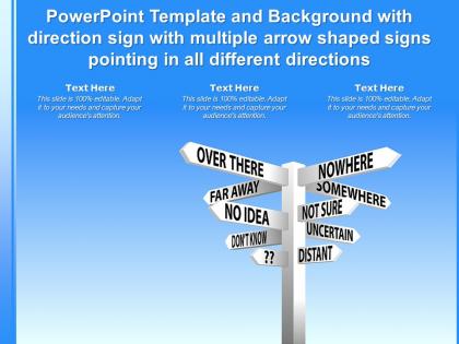
Template with direction sign with multiple arrow shaped signs pointing in all different directions




Try Before you Buy Download Free Sample Product
 Impress Your
 Audience
 100%
100% Editable
 Save Hours
 of Time


The following Powerpoint Image slide titled Template With Direction Sign With Multiple Arrow Shaped Signs Pointing In All Different Directions is an editable Powerpoint template available in Standard as well as Widescreen size. This slide has an image pasted strategically on a slide with sections for text that you can fill in. You can move and edit any element and paste your own image in place of this provided image if required.
People who downloaded this PowerPoint presentation also viewed the following :
Template with direction sign with multiple arrow shaped signs pointing in all different directions with all 2 slides:
Use our Template With Direction Sign With Multiple Arrow Shaped Signs Pointing In All Different Directions to effectively help you save your valuable time. They are readymade to fit into any presentation structure.
FAQs for Template with direction sign with multiple arrow shaped signs pointing in
Key elements for directional signage templates include clear destination labels, intuitive arrow indicators, consistent color coding, readable typography, and strategic placement markers. These components work together by reducing navigation confusion, enhancing user experience, and minimizing wayfinding errors, with many organizations finding that well-designed directional systems significantly improve visitor flow and operational efficiency.
Color psychology significantly influences directional signage effectiveness by triggering emotional responses, enhancing visibility, and guiding behavior through strategic hue selection. Red creates urgency for emergency exits, blue conveys trust for information desks, and green signals safety in hospitals and airports, while high-contrast combinations improve readability and wayfinding speed, ultimately delivering clearer navigation experiences and reduced confusion.
Effective directional signage templates should prioritize clear typography, high contrast color schemes, intuitive iconography, consistent spacing, and logical information hierarchy. These design principles work together to enhance wayfinding efficiency, reduce user confusion, and improve navigation experiences, with many organizations finding that well-designed templates significantly streamline facility management while delivering better visitor satisfaction.
Incorporating icons in directional signage improves user comprehension by providing universal visual cues that transcend language barriers, reducing cognitive load, and enabling faster information processing. These visual elements streamline navigation in airports, hospitals, and shopping centers by delivering instant recognition, minimizing confusion for diverse audiences, and ultimately enhancing user experience while reducing reliance on text-heavy instructions.
Best practices for font selection in directional signage templates include prioritizing sans-serif fonts like Helvetica or Arial, ensuring adequate size contrast between primary and secondary information, maintaining consistent font families throughout, and optimizing letter spacing for maximum readability. These typography principles enhance wayfinding efficiency by delivering clear visual hierarchy, reducing cognitive load, and ensuring accessibility compliance, with many retail centers and corporate facilities finding that strategic font choices significantly improve navigation experiences and reduce user confusion.
Directional signage templates can be adapted through material selection, color contrast adjustments, weather-resistant coatings, size modifications, and lighting considerations to suit specific environmental demands. Indoor templates prioritize aesthetic integration with existing décor, while outdoor versions emphasize durability and visibility, with hospitals, retail complexes, and corporate campuses finding that environment-specific adaptations ultimately enhance wayfinding effectiveness and reduce maintenance costs.
Consistency in directional signage creates unified navigation experiences through standardized colors, fonts, symbols, and layouts across all locations. This strategic approach reduces cognitive load, minimizes confusion, and enables faster wayfinding decisions, with hospitals, airports, and retail complexes finding that consistent design systems significantly improve visitor confidence and operational efficiency.
Businesses ensure accessible directional signage through high contrast colors, clear sans-serif fonts, braille integration, multilingual options, and strategic placement at appropriate heights and viewing angles. These design elements enhance navigation for users with visual, mobility, and cognitive disabilities, while many organizations find that accessible signage ultimately improves wayfinding experiences for all visitors, delivering broader usability and regulatory compliance.
Adobe Illustrator, Canva, InDesign, CorelDRAW, and Sketch are recommended for designing customizable directional signage templates, each offering vector graphics capabilities, typography controls, and template functionality. These tools enable organizations to create professional wayfinding systems through scalable designs, brand consistency features, and export flexibility, with many finding that vector-based solutions deliver long-term cost efficiency and seamless adaptability across multiple locations.
User feedback integrates into directional signage design through surveys, usability testing, observational studies, focus groups, and digital analytics tracking user navigation patterns. Organizations in healthcare, retail, and corporate environments increasingly incorporate this feedback during prototyping phases, enabling designers to refine clarity, positioning, and visual hierarchy, ultimately delivering more intuitive wayfinding experiences and reduced user confusion.
Key trends in directional signage design include minimalist aesthetics with bold typography, digital integration through QR codes and interactive displays, sustainable materials, enhanced accessibility features, and mobile-responsive wayfinding systems. These design approaches streamline navigation experiences while reducing operational costs, with many retail centers, hospitals, and corporate campuses finding that modern directional signage significantly improves visitor satisfaction and operational efficiency.
Cultural differences significantly impact directional signage interpretation through varying color associations, symbol meanings, reading patterns, and spatial orientations across different societies. While red signifies danger in Western cultures, it represents good fortune in many Asian contexts, and left-to-right reading assumptions don't apply universally, with organizations increasingly adopting culturally adaptive signage strategies that combine universal symbols with localized elements, ultimately delivering more inclusive navigation experiences and broader accessibility.
Common mistakes include cluttered layouts, inconsistent typography, poor color contrast, oversized text blocks, and inadequate spacing between elements. These design flaws compromise readability and user navigation, with many organizations finding that streamlined templates featuring clear hierarchies, consistent branding, and strategic white space ultimately deliver better wayfinding experiences and reduced confusion.
Businesses can measure directional signage effectiveness through foot traffic analysis, customer journey mapping, user surveys, digital analytics from QR codes, and staff feedback collection. Through heat mapping technology and customer experience assessments, organizations streamline navigation metrics, reduce visitor confusion, and enhance operational efficiency, with many retail and healthcare facilities finding that strategic signage placement ultimately delivers measurable improvements in customer satisfaction scores.
Legal considerations include ADA compliance for accessibility, local zoning and permit requirements, liability protection standards, intellectual property rights, and emergency evacuation regulations. These requirements vary significantly across jurisdictions, with many municipalities requiring specific font sizes, contrast ratios, and multilingual options, while healthcare facilities and educational institutions face additional federal compliance standards that ultimately ensure public safety and legal protection.
-
Excellent products for quick understanding.