


Three staged donut infographic for business data flat powerpoint design




Try Before you Buy Download Free Sample Product
 Impress Your
 Audience
 100%
100% Editable
 Save Hours
 of Time


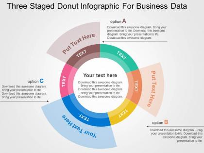
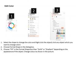
Give a professional look to your important presentation by downloading our three staged donut infographics for business data PowerPoint slide design. Presenting the data in the corporate world is not an easy task as you have to present it in the well-organized way. This PPT template allows you to work on each and every element and give it the look that is required as per the industry you are engaged in. The presentation image shows three options which are perfect in demonstrating the information that is useful for your business development. The PowerPoint Infographic has been designed by our proficient designing experts and that too after complete research about the topic. The text boxes are provided with each option so that you may add your information. Apart from this, the PPT slide is entirely modifiable that provides you the scope of changing it as per your industry requirement. All an all this presentation diagram is resourceful when it comes to impress and engage the viewers. Visit our entire gallery to search more appealing designs that can prove beneficial for your business. Build your edifice around our Three Staged Donut Infographic For Business Data Flat Powerpoint Design. They are great for good architecture.
People who downloaded this PowerPoint presentation also viewed the following :
Three staged donut infographic for business data flat powerpoint design with all 4 slides:
Find the golden fleece with our Three Staged Donut Infographic For Business Data Flat Powerpoint Design. You will enjoy the great adventure.
FAQs for Three staged donut infographic for business data
Label each ring clearly with your three stages - percentages work great for showing progression. For colors, go light to dark or cool to warm so it flows naturally. Don't waste that center space! Put your main metric there instead of leaving it empty. Brief explanatory text around the edges helps tons. Icons make each stage pop and feel more recognizable. I'd honestly test it on someone first - you want the progression to make sense instantly when they look at it. Also make sure the data hierarchy flows from inner rings outward, otherwise people get confused about where to look first.
Honestly, three-staged donuts are perfect when you've got layered data that would look messy in regular charts. Put your main categories on the outside ring, then subcategories in the middle, and all the detailed stuff in the center. It's way easier for people to follow than cramming everything into bar charts - trust me on this one. The circular thing actually works because your eye naturally follows the flow from outside to inside. You'll spot patterns you'd miss otherwise. They look pretty clean too, which doesn't hurt when you're presenting to higher-ups.
Pick three colors that flow together like a story - your eye should move naturally from one stage to the next. I usually go with shades from the same family for that smooth gradient look, but complementary colors work too if you're feeling bold. Just don't pick anything too jarring. Nobody wants their retinas fried by neon green next to hot pink (trust me on this one). The key is contrast between sections so they don't muddy together. Quick test: squint at your screen. Can you still tell them apart? Then you're good to go.
Your three-stage donut thing works great for showing progression - think quarterly numbers, market breakdowns, whatever. The circular setup keeps people looking at the center while each segment tells its own story. Way more interesting than those dead bar charts everyone uses. Put it early in your deck when people are still paying attention. Walk through each piece step by step, and definitely use colors that actually contrast so the stages stand out. Oh, and if you can animate the segments to pop up one at a time, do it - makes a huge difference.
Honestly, I'd go with **Canva** first - their donut chart templates are pretty solid and you can easily set up three stages. Super beginner-friendly too. **Adobe Illustrator** is obviously more powerful if you want precise control over everything, but ugh, the learning curve is real. PowerPoint can work in a pinch if you're already comfortable with it. I've seen people do some surprisingly decent charts there. But yeah, start with Canva and mess around with their templates. If it doesn't cut it, then maybe consider upgrading to the fancier tools.
Yeah totally! Those three-part donut charts work everywhere. Healthcare teams use them for patient journeys - like prevention, treatment, recovery stuff. Budget breakdowns are huge in finance. Manufacturing shows the whole raw materials to production to shipping flow. Tech companies are obsessed with these for user funnels honestly. The main thing is making sure your three pieces actually connect logically - don't just throw random categories together. Once you've got that down, it's just swapping colors and labels to match whatever industry language you need. Pretty straightforward really.
Use three-staged donuts when your data has natural parent-child relationships. Budget categories breaking into subcategories work great. So do customer segments split by demographics, then behavior. Each ring should flow logically from the previous one - total sales to product types to specific items. Honestly they look really clean when the data actually fits this structure. The outer rings need to sum up into the inner segments though, or it gets messy fast. I've seen people force data that doesn't really have three levels and it just confuses everyone.
Honestly, the biggest thing is picking colors that actually look different from each other - I've seen way too many charts where everything blends together. Don't go crazy with fonts either, just stick to one or two that are big enough to read. Put the percentages right on each slice instead of making people hunt for a legend. Oh, and give everything room to breathe - cramped charts look messy. I always test mine by showing my coworker first. If she can't figure it out in like 3 seconds, I know I screwed something up.
Ugh, the worst thing you can do is cram way too much text in there - it'll look like total chaos. Keep labels super short. Make sure your three colors actually contrast so people aren't squinting trying to figure out what's what. Don't randomly make stages different sizes just because it looks cool (I swear everyone does this). Your data should justify the proportions. Flow clockwise, add percentages so viewers know what they're seeing. Oh, and definitely test it on someone first - if they look confused, you need to simplify more.
Think of each section as a chapter in your story. First stage? Present the problem. Middle shows the journey or how things change. Final stage reveals what happened. I'd use the same characters or icons throughout - maybe follow one customer's experience or track how a process develops. The circular shape actually works perfectly for storytelling since stories naturally loop back around anyway. Throw in some connecting words like "then" or "next" between sections. Just make sure each part builds on the last one so people feel like they're following something that makes sense from beginning to end.
Oh man, these three-ring donuts are literally everywhere once you notice them. Budget breakdowns are huge - cities showing where tax money goes across departments. Marketing teams eat this stuff up for campaigns: reach on the outside, engagement middle, conversions center. They work great for customer journeys too (awareness to purchase). Healthcare does patient treatment flows. Honestly, the trick is making sure each ring actually connects to tell one story instead of just shoving random stuff together. I'd sketch out your data first before opening whatever design tool you're using.
So basically, interactivity takes your three-stage donut chart from being just another boring static image to something people actually want to click around and explore. You can do hover effects that show detailed data for each slice, or add clickable transitions between stages. Animated progressions are cool too - they show how your data changes over time. It's honestly like the difference between staring at a photo versus actually experiencing something firsthand. People get to control how they move through your data story instead of just looking at it passively. Start with simple hover tooltips though. Even that tiny change makes viewers feel way more connected to what you're showing them.
Honestly, those three-stage donut infographics work so well for teaching! You can break down tough concepts into manageable pieces - kinda like building blocks but way more visual. The circular design keeps students engaged since their eyes follow the flow naturally. Plus there's that center space perfect for your main idea. I've noticed kids grasp things faster with these than boring linear formats. Different learning styles seem to click with the visual setup too. Oh, and definitely use contrasting colors for each stage - makes the progression super obvious. Worth trying in your next lesson for sure!
Check your Google Analytics for basics like time on page and click-throughs. But honestly? Grab a few people and watch them go through your three stages - their facial expressions will tell you more than any metric. I always do this before launching anything. Social shares are good to track too. Throw up a simple feedback form asking if they actually understood what you're trying to say. Pretty graphics mean nothing if your message isn't clicking. You need both engagement AND comprehension data, so don't just rely on one or the other.
Think about who's actually looking at your chart first. Executives? Keep it simple with big-picture results and clean design. Technical people can handle way more detail and insider terms they're used to. For regular consumers, honestly just pretend you're making an Instagram story instead of some boring corporate thing. Brighter colors, simpler words - way more engaging that way. Oh, and if you're going global, double-check what colors mean in different cultures. That's bitten people before. I'd sketch out who your audience is first, then figure out what each donut slice should emphasize for them specifically.
-
Nice and innovative design.
-
Informative design.