


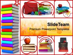
Training powerpoint templates colored books education ppt theme





Try Before you Buy Download Free Sample Product
 Impress Your
 Audience
 100%
100% Editable
 Save Hours
 of Time


Use our bewitching Training Powerpoint Templates Colored Books Education Ppt Theme. They will delight your audience with the magic of your words.
People who downloaded this PowerPoint presentation also viewed the following :
Training powerpoint templates colored books education ppt theme with all 3 slides:
Suspend disbelief with our Training Powerpoint Templates Colored Books Education Ppt Theme. Convert them into believers with yout thoughts.
FAQs for Training powerpoint templates colored books
Honestly, tech is like having a superpower in the classroom. Kids get personalized learning that actually matches their pace, plus you can make boring stuff way more interesting - like VR field trips to ancient Rome (which is honestly pretty cool even for us adults). Your students aren't stuck with crappy old textbooks anymore since everything's online now. The best part? You get instant feedback on how they're doing instead of waiting weeks to figure out who's struggling. Don't go crazy trying to use every app though - just pick one thing that fixes whatever's driving you nuts right now.
Templates are honestly a game-changer for keeping kids engaged. Clean, consistent slides mean they're actually looking at your content instead of getting distracted by random fonts everywhere. I used to waste hours picking colors - now I just plug into my go-to templates and I'm done. The interactive ones with polls or discussion prompts get them talking without you having to beg for participation. Students also take you more seriously when your slides don't look like a hot mess (harsh but true). Find 2-3 solid templates you can tweak for different subjects.
Honestly, less is more with visuals. Pick high-quality images that actually relate to your topic - those cheesy stock photos of people in suits pointing at charts are the worst. One solid visual per slide works better than cramming everything together. Make your text big enough so people in the back can read it without squinting. Diagrams are perfect for breaking down complicated stuff. Animation's cool for showing step-by-step processes, but skip the crazy transitions that make you look like you just discovered PowerPoint. Oh, and definitely have a backup plan because technology loves to fail at the worst moments.
Yeah, this stuff actually matters way more than people think! Stick with simple fonts - Arial, Calibri, whatever's clean. Those decorative ones just make reading harder. Dark text on white backgrounds is still king, even though everyone's obsessed with dark mode lately. Your eyes will thank you during those marathon study sessions. Colors help students remember things, but honestly? Less is more. I'd go with maybe blue for headings and save red for deadlines or super important stuff. Too many colors just becomes visual chaos. High contrast between text and background is non-negotiable though.
Honestly, start with clear objectives so people know what they're getting into. Use visuals that actually matter—not just text dumps (seriously, death by PowerPoint is real). Break everything into chunks they can digest. Throw in polls or quick discussions because nobody wants to just sit there for an hour straight. Oh, and connect stuff to things they actually deal with at work. Practice your transitions beforehand too—awkward pauses kill the vibe. Wrap up with next steps so they don't just walk away confused. Trust me on this one.
Mix up your presentations with different stuff - slides for visual people, discussions for those who learn by hearing things. Kinesthetic learners need to actually move around or do something with their hands. I swear, even just having people turn to their neighbor for 2 minutes makes a huge difference. Charts work great for visual folks. Stories and group talks hit the auditory learners. Here's what I do: pick 2-3 learning styles first, then figure out one specific thing for each group. Don't let people just sit there the whole time - that's boring for everyone honestly.
Dude, everything's shifting toward interactive stuff now. Students want videos, animations, infographics - basically anything that's not walls of text. Mobile-friendly is huge since everyone's doing hybrid learning. Also accessibility matters way more than it used to - high contrast colors, readable fonts, screen reader support, all that. Modular designs are clutch because teachers need to swap things around fast for different learning styles. Honestly? The best templates feel more like experiences than boring old slideshows. Oh and collaborative features are everywhere now - makes sense since kids are used to working together online anyway.
Honestly, group projects are so much less painful when you use collaboration tools. Google Workspace is probably your best bet - kids can edit docs together in real time, share calendars, assign tasks. No more dealing with "oh I never got that file" or having like 6 versions of the same presentation. Slack works too if they're into that. The key is picking ONE thing instead of throwing every tool at them at once. Trust me, it's night and day compared to the old way where everyone just splits up work and crosses their fingers it'll mesh together somehow.
Skip the generic "good job" stuff - call out specifics like their eye contact or how they nailed that curveball question. I always do the sandwich thing: positive, then what to work on, then encouraging wrap-up. Ask them questions too, like "how'd you feel during the opening?" Honestly, peer feedback can be just as valuable as yours sometimes. Give it while it's fresh in their memory. Oh, and write down maybe 2-3 concrete things they can actually use next time - nobody remembers a laundry list of notes anyway.
Honestly, presentation skills are like a total confidence booster for kids. They have to organize their thoughts and actually speak up instead of staying quiet. What's cool is once they get comfortable presenting, they're way better at expressing themselves everywhere - not just in class. Plus they figure out how to read the room and adapt when something isn't working. I'd definitely start small though. Maybe have them share quick weekend stories for like 2 minutes before doing any big research stuff. Actually, my nephew's teacher does this and he went from super shy to can't shut him up! Build it up gradually and they'll surprise you.
Look, storytelling just makes stuff stick better. Instead of boring facts, you're giving kids something they can actually picture. Pizza party math problems? Way better than random numbers. Historical events through personal stories? They'll remember that. Your brain loves familiar things to connect new info to - it's like having mental velcro or something. Plus stories hit you in the feelings, which honestly is half the battle with memory. Just try opening with "imagine you're..." next time. I swear the difference in attention is crazy obvious.
Honestly, data viz is a game changer for breaking down tough concepts. Instead of drowning kids in text, show them charts, graphs, interactive maps - whatever fits your topic. Like climate data makes way more sense as a temperature graph than reading endless statistics, you know? Match the visual to what you're teaching: timelines work great for history, flowcharts for step-by-step processes, scatter plots when you're showing how two things relate. Oh and definitely let students mess around with the data themselves - they'll actually retain it better. Start simple though, don't go overboard right away.
Honestly, interactive stuff is a total game-changer for keeping students awake. Instead of just staring at you blankly, they're actually clicking buttons and thinking. Retention goes way up too. The real-time feedback is clutch - you can tell instantly if they're lost or getting it. My favorite part? Shy kids finally participate through polls and anonymous Q&A instead of never raising their hands. Kahoot's super easy to start with, or try Mentimeter. Even just one interactive thing per class completely changes the vibe in the room.
Honestly, cultural context is huge for educational design. Your examples need to make sense to your audience - like don't use football analogies if they've never watched a game, you know? Colors mean different things everywhere. Some cultures prefer direct instruction while others want collaborative stuff. Authority dynamics are totally different too - what works in one place might feel weird or even rude somewhere else. I always dig into who I'm actually designing for first. Then test it with real people from that group before launching anything major. Saves so much headache later.
Ugh, the hardest part is figuring out where to even begin. You've got visual people wanting charts, others who learn better through talking stuff out, students needing captions or screen readers - oh and don't get me started on how differently people interpret things based on their backgrounds. Internet speeds are all over the place too. Honestly? Just pick one thing and nail it first. Maybe start with captions or something simple. Don't try fixing everything at once or you'll go crazy.
-
Understandable and informative presentation.
-
Attractive design and informative presentation.