


Web and mobile application software company pitch deck ppt template




Try Before you Buy Download Free Sample Product
 Impress Your
 Audience
 100%
100% Editable
 Save Hours
 of Time


Mobile Web applications are applications for mobile devices that only require the installation of a Web browser. Mobile Web applications differ from mobile native apps in that they are built using Web technologies and are not restricted to a single platform. Here is an efficiently designed Web and Mobile Application Software Company pitch deck that consists of various problems related to software technology faced by many companies with their solutions. Some of the significant issues associated with web and mobile application software companies include adapting multi-platform devices, web application integration, etc. This pitch deck covers various slides related to company overview, mission details, major performance highlights, top clients details, etc. This pitch deck also shows various slides related to new market trends in the software industry, projections details for future growth, etc. Also, this pitch deck includes different slides for competitive analysis with the competitors, target customers details, the business model of a software company, etc. In the end, this pitch deck also includes the companys investment details and the usage of funds. Get access now.
People who downloaded this PowerPoint presentation also viewed the following :
Content of this Powerpoint Presentation
Slide 1: This slide displays title i.e. 'Web & Mobile Application Software Company Pitch Deck'.
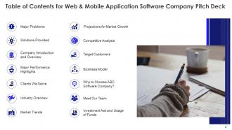
Slide 2: This slide presents table of contents.
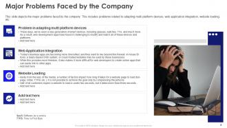
Slide 3: This slide depicts the major problems faced by the company.
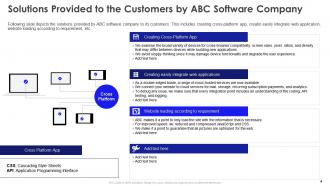
Slide 4: This slide depicts the solutions provided by ABC software company to its customers.
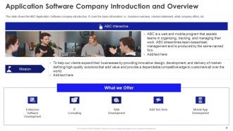
Slide 5: This slide shows the ABC Application Software company introduction.
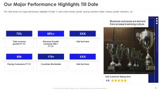
Slide 6: This slide shows our major performance highlights till date.
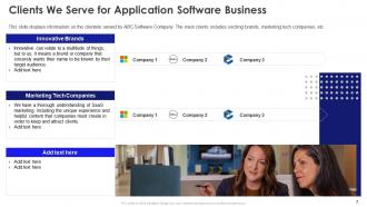
Slide 7: This slide displays information on the clientele served by ABC Software Company.
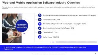
Slide 8: This slide shows the industry overview related to web and mobile applications.
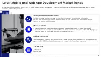
Slide 9: This slide depicts the latest market trends for mobile and web software development.
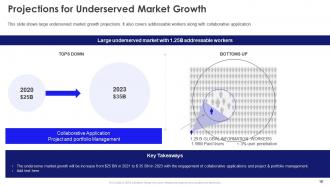
Slide 10: This slide shows large underserved market growth projections.
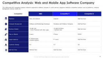
Slide 11: This slide shows the competitive analysis related to application software company.
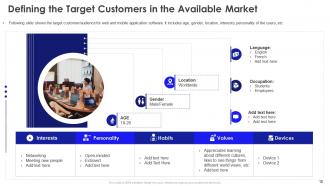
Slide 12: This slide shows the target customer/audience for web and mobile application software.
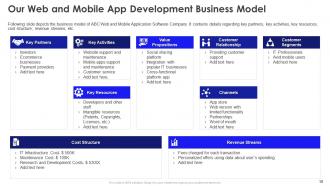
Slide 13: This slide depicts the business model of ABC Web and Mobile Application Software Company.
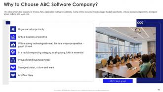
Slide 14: This slide shows the reasons to choose ABC Application Software Company.
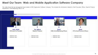
Slide 15: This slide shows the top management team details of ABC Application Software Company.
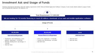
Slide 16: This slide depicts information about the funding requirement of ABC Web and Mobile Application Software Company.
Slide 17: This slide shows the contact details for Web and Mobile App Software Company which includes company logo, company name, etc.
Slide 18: This slide presents title for additional slides.
Slide 19: This is the icons slide.
Slide 20: This slide exhibits goals of the company.
Slide 21: This slide showcases hierarchy.
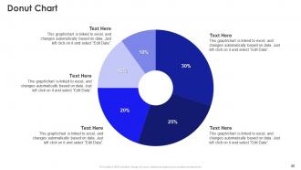
Slide 22: This slide exhibits donut charts for different products. The charts are linked to Excel.
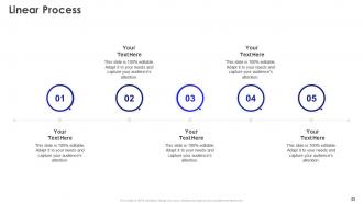
Slide 23: This slide presents linear process.
Web and mobile application software company pitch deck ppt template with all 28 slides:
Use our Web And Mobile Application Software Company Pitch Deck Ppt Template to effectively help you save your valuable time. They are readymade to fit into any presentation structure.







FAQs for Web and mobile application software company pitch
So you definitely need: problem, solution, market size, business model, traction, team, financials, and funding ask. Plus a good title slide and clear next steps. Honestly, I can't believe how many people skip the problem slide - like, how are investors supposed to care if they don't get why this matters? Each slide should focus on one thing. Visuals beat text dumps every time. Make sure it all flows together logically too. Oh and practice actually presenting it out loud! You won't just be emailing this thing around - you'll need to pitch it in person.
Honestly, visuals are what turn a boring data dump into something people actually want to watch. Like instead of droning on about market growth, you show them a graph that makes investors sit up and pay attention. Charts and mockups help people actually visualize what you're talking about - way more memorable than text slides. Everyone's attention span is basically nonexistent now anyway, so good visuals keep them hooked. Just make sure each one actually supports your story though. Don't just throw in random pretty pictures that don't move things forward.
Honestly? Stick to around 10-12 slides max. I've watched too many people lose their audience after slide 15 - it's brutal. Hit your basics: problem, solution, market size, team, money stuff. But don't just check boxes. Some of the best pitches I've seen were only 8 slides because each one actually mattered. Think of it like telling a story at a bar, not reading a textbook. If something doesn't push your main point forward, cut it. Save the extra data for follow-up questions later. Oh, and practice out loud first - you'll catch the boring parts way faster that way.
Don't get abstract with your problem statement - make it hit home. Instead of "the invoicing market lacks efficiency," try "small business owners waste 10 hours weekly on manual invoicing." Way more relatable, right? I usually test this stuff by seeing if my mom would get it over dinner. Real numbers help, but don't go overboard with the drama. You want investors nodding along thinking "ugh, I've totally dealt with that headache." Keep it personal and specific - that's what makes people actually care about your solution.
Honestly, just nail the big four: revenue projections, gross margins, CAC, and LTV. Investors always dive deep into those. Your burn rate matters too - how fast you're bleeding cash and when you'll need more money. MRR is critical if you're SaaS, obviously. Unit economics will make or break you since it proves your model actually scales. Keep projections realistic though. Those crazy hockey stick charts just make people roll their eyes now. I'd go with 3-5 years max and have solid reasoning behind every number. Oh, and maybe prep for them to grill you on assumptions - they love doing that.
You definitely need to tailor your key slides for each industry. Tech investors want to see your user acquisition costs, scalability numbers, and tech stack details. Healthcare is totally different though - they expect regulatory timelines, clinical data, and honestly they're way more patient about returns than other sectors. Your market size and competitive analysis slides should reflect industry norms too. I'd also tweak your problem statement to use language that sector experts actually recognize. Before you start, look up some successful pitch decks in your space. It's crazy how different the focus can be between industries, but that research will show you exactly what matters to those specific investors.
Dude, skip the wall of text slides - nobody reads those anyway. Those cheesy stock photos? Total amateur move. Lead with your actual problem and solution, then hit them with real numbers (not BS vanity metrics). Your market size calculations shouldn't sound like you made them up in the shower. Be real about your team too - relevant experience matters, but don't oversell it. Oh and seriously, practice your timing. I've seen so many people rush through their ask because they spent forever on the setup. You'll thank me later.
Honestly, templates are lifesavers because they force you to get your value prop crystal clear. You get dedicated slides for the problem, your solution, competitive advantage - all that stuff you need to nail down anyway. Without one, most founders (myself included lol) just ramble and jump around randomly. The structure helps you build an actual story instead of word vomit. Plus investors won't get distracted by wonky formatting when everything looks clean and consistent. I'd grab a solid template first, then tweak it to show off what makes you different. Way easier than starting from scratch.
Dude, branding can totally make or break your pitch deck. Investors see like 20 presentations a day, so you need something that sticks. Keep your colors and fonts consistent throughout - but seriously, don't turn it into some fancy art project. I've watched people bomb because they got too creative with the design. Your brand should show personality without drowning out the actual business stuff. Clean and professional wins every time. Oh, and make sure your logo's visible but not obnoxious about it. The whole thing should feel cohesive so they'll actually remember you later.
Dude, you HAVE to nail the market research part. Investors can smell BS from a mile away when founders just throw around "trillion dollar market" without any real data. I've watched so many pitches crash and burn right there. Show them actual numbers - market size, who you're competing with, growth trends, whatever you can dig up. Doesn't have to be perfect, but you need something solid. It's honestly what separates the serious founders from people just winging it. This section alone can make investors either lean in or mentally check out.
Check out Airbnb's original pitch deck first - the storytelling is incredible and shows you how to present market opportunity without being boring. Buffer's is solid too, super clean design and nails the problem-solution thing. Oh, and Uber's early one is perfect for seeing how they pitched something totally disruptive but kept it simple. Honestly the best decks are way more straightforward than you'd expect, which is weirdly hard to pull off. I'd grab whichever one matches your industry closest and steal their structure. Then just plug your own story into their flow - works every time.
Your pitch deck isn't set in stone - keep tweaking it after every investor meeting. Pay attention to questions they ask over and over. Those gaps need their own slides or way clearer explanations. I've watched founders totally flip their deck structure once they realized investors didn't care about the flashy product demo at all. Unit economics? That's what got them excited. Start addressing common concerns right upfront - market size, competitive stuff, all that. Keep notes on feedback so you can spot patterns. Honestly, this approach will save you from fielding the same annoying questions every single time.
Honestly, just use PowerPoint or Google Slides - investors are used to seeing those. Canva's pretty solid too if you want templates that don't look like they're from 2005 (seriously, PowerPoint's defaults are rough). Keynote works great on Mac, looks cleaner. Figma gives you tons of design control but that's probably way more than you need right now. Oh, and don't stress too much about the tool itself. Pick whatever your team already knows and spend your energy getting the story right instead of learning new software. That's what actually matters.
Think of your pitch deck like telling a story - problem, journey, solution. Hook them with the pain point first. Then walk through your fix like it's a hero's journey, but here's the thing: you're the guide, not the hero. Your customer is the hero. Skip the feature lists honestly - nobody cares. Use real customer stories instead. Each slide should flow into the next one, building up to your ask. Oh, and make sure your call-to-action feels natural, like the obvious next step after everything you've just shown them. It's way more convincing that way.
Honestly, investors don't care about fancy job titles - they've seen tons of impressive resumes from failed startups. Focus on why YOUR team is perfect for THIS specific problem. What relevant wins do you each have? How do your skills actually complement each other? Keep the bios short but show what each person brings. Like, don't just say "former Google engineer" - explain how that experience directly helps you crush this particular challenge. Oh, and if you're missing key expertise? Just be upfront about it and your hiring plan. Investors appreciate the honesty.
-
Appreciate the research and its presentable format.
-
Really like the color and design of the presentation.