

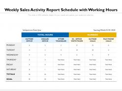
Weekly sales activity report schedule with working hours





Try Before you Buy Download Free Sample Product
 Impress Your
 Audience
 100%
100% Editable
 Save Hours
 of Time


Give folks an example of your commitment with our Weekly Sales Activity Report Schedule With Working Hours. Declare your devotion to the cause.
People who downloaded this PowerPoint presentation also viewed the following :
Weekly sales activity report schedule with working hours with all 2 slides:
Create devoted followers with our Weekly Sales Activity Report Schedule With Working Hours. Folks get highly impressed by your example.
FAQs for Weekly sales activity report schedule
Track your core stuff first - revenue, units sold, conversion rates. Then add average deal size and sales by rep. Pipeline velocity matters too (how fast deals close). Lead sources are huge since you gotta know what's actually bringing people in. Year-over-year comparisons help, plus customer acquisition costs if you're tracking that. Honestly, I'd rather see fewer metrics that actually help you make decisions than a bunch of pretty charts that don't change anything. Start simple and build from there - you can always get fancy later.
Dude, charts and graphs are a lifesaver for weekly sales data. People can spot trends right away instead of staring at boring spreadsheet rows. I'd go with bar charts when you're comparing different products or regions. Line graphs work better for showing how sales moved over time. Seriously though, I've sat through way too many presentations where someone just slaps up a screenshot and everyone's eyes glaze over. Color-code your wins and problem areas - makes a huge difference. Keep labels clear and don't clutter things up. Your audience will actually remember what you showed them instead of checking their phones.
Looking at your weekly sales reports side-by-side will show you tons of useful stuff. Revenue patterns jump out first - seasonal ups and downs, whether you're actually growing, which products are hot vs dying. Customer habits change too, like people buying more often but cheaper items (or the opposite). Different regions perform totally differently, which honestly surprises most people at first. The cyclical patterns are where it gets interesting though - once you spot them, you can actually predict what's coming next. I'd pull like 12-16 weeks minimum to see real trends. Then use that data to tweak your inventory and marketing budget.
Dude, seasonal swings mess with your numbers big time - holidays, back-to-school, summer dead zones, you know the drill. January sales always tank because everyone's tapped out from Christmas spending (learned that one the hard way). I'd throw in year-over-year comparisons so you don't freak out over normal dips. A 4-week rolling average helps smooth things out too. The real trick? Call out those seasonal patterns in your reports. Otherwise your boss will think you're screwing up when it's just normal business cycles. Definitely start tracking this stuff now for next year's planning.
Honestly, you gotta look at customer feedback alongside those weekly sales numbers. Sales might dip but if satisfaction's still solid? Probably just seasonal stuff or market weirdness. When both tank though - that's when I start panicking. Here's the thing: you could totally nail your sales targets while customers are secretly miserable and planning their exit. Been there, seen that mess unfold. I always pull both reports at the same time now because sales data by itself doesn't tell the whole story. You'll catch problems way earlier this way.
So basically, dig into your weekly reports and watch for patterns - like which products keep bombing or doing way better than expected. I can usually spot this stuff after 3-4 weeks of data (sometimes sooner if it's really obvious). Compare what actually happened vs what you thought would happen. Winter gear flying off shelves? Cool, bump those numbers up. That "amazing" new product sitting there collecting dust? Time to dial back expectations. Honestly, the hardest part is not freaking out over one random terrible week and completely redoing everything.
Honestly, the worst thing you can do is dump a bunch of raw numbers on people without explaining what they mean. I see this all the time and it drives me nuts! Also skip the comparisons – like week-over-week stuff – and your data becomes pretty useless. People need context to understand if 1,000 clicks is good or terrible, you know? Oh, and don't include metrics just because you have them. Focus on what actually helps people make decisions. My approach is always starting with the big takeaway first, then backing it up with your numbers. Way more effective than making people dig through spreadsheets to find the point.
Dude, you'll save so much time with automation tools! They grab data straight from your CRM and spreadsheets, then format everything into the same template each week. I'm talking zero manual work once you set it up. Honestly, I get back like 3 hours every Monday now - it's wild. The reports automatically get sent to your team through email or Slack too. Way fewer mistakes since you're not copy-pasting stuff everywhere. Start with Zapier or Power Automate, they're pretty straightforward for connecting everything together.
So here's the thing - treat your sales data like you're telling a story with actual drama. Start with your challenge ("we had to hit those Q3 numbers"), then hit them with the problem and real data ("August tanked 15%"), and boom - show how you crushed it ("September's pivot got us 22% over target"). Throw in customer quotes or specific wins behind those numbers. Makes it way less boring than just charts, you know? Use cliffhangers between slides like "then this happened..." Oh, and always wrap up with clear next steps so people actually DO something after your presentation instead of just nodding politely.
Start with your weekly reports - see what you actually sold vs what you planned. Then set realistic goals based on those patterns. Honestly, I've watched too many teams crush their own morale by setting insane targets they'll never hit. Week after week of missing goals just sucks the life out of everyone. Look at your data instead - which activities and customers are bringing in the most money? Focus there for next week. Make your goals specific and tie them to the stuff that's actually working. Your reports don't lie, so trust what they're telling you.
Dude, you'll get SO much more context for your numbers when you loop marketing in. Like, they can actually explain why that random product suddenly took off - turns out there was a whole campaign behind it that you had no clue about. Their customer behavior stuff makes your reports way more interesting too, instead of just "sales went up 12%." Honestly best decision I made last quarter. They're weirdly good at spotting patterns you'd never see and can usually guess what's coming next week. Maybe try a quick 15-min weekly check-in? Works for us.
Dude, you gotta tailor your visuals to each group. Executives want the 30,000-foot view - think trend charts and KPI dashboards they can scan in 30 seconds. Sales managers need the nitty-gritty: territory breakdowns, who's crushing their numbers, pipeline health. Finance folks? Pure data nerds - give them detailed tables with variance analysis and they're happy. Honestly, the worst thing you can do is blast the same massive deck to everyone. I've seen people's eyes glaze over when you do that. Build maybe 2-3 versions tops, each one focused on what actually matters to that audience.
Oof, that's rough. First thing - dive straight into your data to see what's actually happening. Which products are tanking? Any specific regions getting hit harder? Sometimes it's seasonal weirdness, but honestly, half the time it's because a competitor just dropped something shiny and stole your thunder. Look for the quick fixes first - maybe some targeted promotions or call up those accounts that seem ready to jump ship. Get your team together this week though, because you'll need everyone brainstorming solutions once you figure out what's really going wrong.
Historical data turns your sales reports from random numbers into something that actually makes sense. You'll spot trends and seasonal stuff - like when everyone stops buying after Christmas and your numbers tank. Compare current weeks to the same time last year instead of freaking out over normal dips. Short-term patterns show up too, which honestly helps you predict what's next. I mean, nobody wants to panic-explain a 30% drop when it's just typical post-holiday slowdown. Way better for making real decisions than flying blind with weekly snapshots.
Just do a one-page summary with the big numbers right at the top - revenue, units sold, how you hit targets. Throw in some charts because let's be real, they're barely reading anyway. Add maybe 2-3 bullets about wins or problems, but that's it. All your detailed stuff goes in an appendix they probably won't touch. The whole thing needs to be skimmable in like 2 minutes max. I learned this the hard way - executives don't want novels, they want the info fast so they can decide and move on. Keep it simple and visual.
No Reviews