


World map of the continents highlight template




Try Before you Buy Download Free Sample Product
 Impress Your
 Audience
 100%
100% Editable
 Save Hours
 of Time


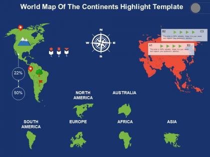
Introducing World Map Of The Continents Highlight Template slideshow. Showcase the geographical base of your industry by utilizing this PPT visual. You can depict the home as well as the host country of your business using this location PowerPoint template. Utilize this direction PPT layout to showcase the factors that affect the location including raw materials, market, transport costs, etc. Present the various paths or ways and select the right one according to the need of the hour this business unit PPT graphic. Take the assistance of this location PPT infographic to present the location of your business centers, manufacturing units, and branches. Showcase the economic viability of each of the prime factors and undertake various expansion missions using this geographical base PowerPoint template. You can also represent the importance of certain factors such as political conditions, economic situations, etc. by utilizing this business map PPT visual. Download this business map PPT visual to prove your mettle across the globe.
People who downloaded this PowerPoint presentation also viewed the following :
World map of the continents highlight template with all 5 slides:
Ensure it becomes bright and clear again with our World Map Of The Continents Highlight Template. It helps dispel the clouds.
FAQs for World map of the
Key features include accurate geographical boundaries, customizable colors and regions, editable text fields, high-resolution graphics, and compatibility with major presentation software. These elements streamline global data visualization by enabling clear regional comparisons, supporting brand consistency, and facilitating audience engagement, with many organizations finding that well-designed templates significantly enhance their international business presentations and strategic communications.
A world map template enhances visual appeal by providing professional formatting, consistent color schemes, clear geographic boundaries, intuitive data visualization frameworks, and scalable design elements. These templates streamline complex geographical information through strategic visual hierarchy, interactive features, and customizable styling options, ultimately delivering more engaging presentations and reports that help organizations communicate global insights, market data, and regional trends with greater clarity and impact.
Educational world map templates include political boundary maps, physical geography maps, climate zone maps, population density maps, and historical timeline maps. These templates enhance learning by providing clear visual references, enabling interactive discussions about global concepts, and helping students understand geographical relationships, with many educators finding that color-coded and labeled versions significantly improve student engagement and comprehension.
Customizable world map templates enhance audience engagement by enabling interactive storytelling, visual data representation, regional focus capabilities, and dynamic content personalization that captures attention more effectively than static presentations. Through customizable features like clickable regions, color-coded data visualization, and targeted geographic highlighting, organizations create immersive experiences that encourage exploration and participation, ultimately delivering stronger message retention and meaningful audience connections.
Businesses can leverage world map templates to showcase global reach, visualize international market expansion, highlight regional performance data, and demonstrate worldwide client distribution across presentations and marketing materials. These visual tools enhance investor presentations, sales pitches, and strategic planning documents by providing clear geographical context, ultimately helping companies communicate their international presence and growth opportunities more effectively to stakeholders.
Adobe Illustrator, PowerPoint, Canva, GIMP, and Inkscape offer comprehensive world map template editing capabilities. These programs enable organizations to customize geographic visualizations by adjusting colors, adding data overlays, and incorporating branding elements, with many businesses finding that PowerPoint and Canva deliver accessible solutions while Illustrator provides professional-grade precision for strategic presentations.
Cultural considerations significantly impact world map template design through projection choices, color symbolism, regional emphasis, and text orientation preferences. Different cultures favor specific map projections that position their regions centrally, while color meanings vary across societies, with designers increasingly creating culturally adaptive templates that respect diverse perspectives and enhance global communication effectiveness.
Common mistakes include using outdated map projections, selecting inappropriate color schemes that hinder readability, overcrowding maps with excessive data points, choosing templates with poor resolution, and failing to consider cultural sensitivities in regional representations. These oversights can undermine presentation effectiveness by creating confusion, reducing audience engagement, and potentially alienating stakeholders, with many organizations finding that careful template selection and thoughtful customization significantly enhance message clarity and professional credibility.
World map templates can be adapted for specific industries through customized data layers, color coding, route visualization, regional highlighting, and interactive features tailored to sector needs. Tourism companies use these templates to showcase destinations, travel routes, and seasonal patterns, while logistics firms track supply chains, shipping routes, and distribution networks, ultimately delivering targeted insights that enhance strategic decision-making and operational efficiency.
Color theory guides world map template selection by influencing visual hierarchy, data comprehension, emotional response, cultural interpretation, and accessibility considerations. Strategic color choices enhance geographical boundaries, highlight demographic patterns, and ensure cross-cultural sensitivity, with many organizations finding that thoughtful palettes significantly improve audience engagement and data retention across diverse global presentations.
Interactive world map templates enhance user experience by enabling real-time data visualization, clickable regional navigation, dynamic content updates, and audience engagement through hover effects and zoom functionality. These features transform static presentations into immersive experiences, with many organizations finding that interactive maps increase audience retention, facilitate better data comprehension, and ultimately deliver more compelling storytelling in global business presentations.
Environmental considerations when depicting maps include data accuracy regarding climate zones, natural resources, pollution levels, biodiversity hotspots, and conservation areas. These elements require careful verification and regular updates, as environmental data changes rapidly, with many organizations finding that incorporating real-time environmental monitoring enhances decision-making for sustainability initiatives and regulatory compliance.
Different projection styles create varying distortions in area, distance, direction, and shape, with Mercator projections enlarging polar regions while Robinson projections offer balanced compromise. These variations significantly impact strategic business decisions, especially for global logistics companies, international retailers, and multinational corporations planning market expansion, ultimately affecting resource allocation, shipping routes, and geographical risk assessment accuracy.
World map templates can be repurposed for interactive dashboards, customer journey mapping, supply chain visualization, market expansion planning, and global team collaboration boards. These creative applications enable organizations to track international operations, visualize data geographically, and enhance strategic planning across industries like logistics, retail, and consulting, ultimately delivering clearer insights and more engaging stakeholder communications.
Incorporating data visualization tools with world map templates transforms complex global information into compelling narratives by enabling interactive elements, real-time data overlays, and dynamic filtering capabilities. These enhanced presentations allow audiences to explore geographic patterns, regional comparisons, and trend analysis intuitively, with organizations finding that visual storytelling significantly improves audience engagement and decision-making outcomes.
-
Unique design & color.
-
Helpful product design for delivering presentation.