


World map with specific experts locations powerpoint slides




Try Before you Buy Download Free Sample Product
 Impress Your
 Audience
 100%
100% Editable
 Save Hours
 of Time


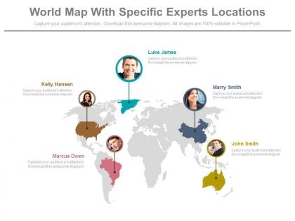
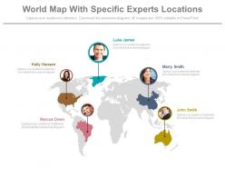
Often the multinational giants design presentations which require them to incorporate a slide marking the individual locations of their base spread worldwide. In such cases, our world map with specific experts locations PowerPoint slides. The highly customized worldwide location marker PPT presentation slide design allows you to add the images of your choice and personalize the show completely. Add it as part of multiple slides based on corporate company profile PPT template or human resource presentation visuals. The worldwide map PPT infographic is uniquely designed keeping in frame the highly competitive scenario where aesthetics are the distinguishing factor amongst many options. Mark yourself high on a scale of performance when you have such professionally equipped and well-crafted PPT PowerPoint presentation slide visual at your disposal. You simply need to click on the downlink link provided on the following page and save the file in your desired format. Personalize and customize the presentation as per your need and go ahead with your presentation show.Cultivate your clients with our World Map With Specific Experts Locations Powerpoint Slides. Enduring bonds will germinate.
People who downloaded this PowerPoint presentation also viewed the following :
World map with specific experts locations powerpoint slides with all 5 slides:
Every message is important. Our World Map With Specific Experts Locations Powerpoint Slides aim to help you present your message through the highest end design.

FAQs for World map with specific experts
Key elements include accurate country boundaries, clear labeling of continents and major nations, consistent color coding for data visualization, legends explaining symbols or categories, and scalable vector graphics for clarity. These components work together by ensuring geographical accuracy, enhancing audience comprehension, and enabling effective data storytelling, with many organizations finding that well-designed map slides significantly improve stakeholder engagement and decision-making outcomes.
Interactive world map slides enhance audience engagement by allowing real-time exploration of global data, enabling clickable regions for detailed insights, and facilitating dynamic storytelling through visual navigation. These interactive elements transform passive viewing into active participation, with many presenters finding that audiences retain information better when they can explore geographic relationships, compare regional metrics, and discover location-specific details at their own pace, ultimately delivering more memorable and impactful presentations.
Best practices for world map PowerPoint slides include using high-contrast color schemes, limiting your palette to 3-4 colors maximum, ensuring accessibility with colorblind-friendly combinations, maintaining consistent visual hierarchy, and incorporating clear legends or callouts. These design principles enhance audience comprehension by eliminating visual confusion, highlighting key geographic data effectively, and creating professional presentations that work across different viewing environments, ultimately delivering clearer insights and more impactful business communications.
World map templates effectively showcase data trends by enabling geographic visualization of metrics, comparative analysis across regions, color-coded data representation, and interactive storytelling elements. Through strategic use of heat maps, demographic overlays, and regional clustering, organizations can transform complex datasets into compelling visual narratives, ultimately delivering clearer insights and enhanced audience engagement for global business strategies.
PowerPoint offers shape tools, SmartArt graphics, icons from the Insert tab, drawing tools for custom boundaries, and formatting options for colors and effects to create custom world maps. These features enable users to design interactive presentations by combining geographical shapes with data visualization elements, text overlays, and animation effects, ultimately delivering engaging visual storytelling for global business strategies and market analysis.
Industries that benefit most from world map slides include logistics and supply chain, international business and trade, consulting firms, technology companies with global operations, and financial services. These sectors leverage geographic visualizations to showcase market expansion strategies, distribution networks, and regional performance data, ultimately enhancing stakeholder understanding while demonstrating operational scale and strategic positioning.
Clean, professional designs with subtle color schemes resonate most effectively in world map presentations, including minimalist templates, corporate themes, and data-focused layouts that enhance geographical clarity without overwhelming the content. These design approaches streamline visual communication by maintaining focus on location data, supporting clear regional distinctions, and enabling seamless integration of business metrics, with many organizations finding that understated aesthetics ultimately deliver stronger audience engagement and comprehension.
Animations and transitions enhance world map slides through strategic zoom-ins on specific regions, sequential reveal of data points, and smooth country-to-country navigation flows. These dynamic elements enable presenters to guide audience attention systematically, highlight geographic relationships more effectively, and create compelling storytelling experiences, with many organizations finding that animated regional comparisons and data progression significantly improve stakeholder engagement and comprehension.
Common mistakes include using outdated maps, overwhelming slides with excessive data points, choosing poor color schemes that reduce readability, neglecting to provide clear legends, and failing to maintain consistent scaling across regions. These presentation pitfalls can confuse audiences and undermine strategic messaging, with many organizations finding that simplified, well-designed map slides enhance stakeholder engagement and deliver clearer geographical insights for global business decisions.
Presenters can tailor world map slides by adjusting regional focus, using culturally appropriate color schemes, incorporating local data overlays, and ensuring accurate geographic representations for their target markets. Through strategic customization of legends, time zones, and regional highlights, organizations enhance audience engagement, improve comprehension across diverse markets, and demonstrate cultural sensitivity, ultimately delivering more impactful presentations and stronger international business relationships.
Demographic data, economic indicators, sales performance metrics, market penetration rates, and operational presence are most impactful when represented on world maps in presentations. These data types enable organizations to visualize global patterns, identify expansion opportunities, and communicate strategic insights effectively, with many finding that geographic visualization of performance metrics, customer distribution, and competitive positioning ultimately delivers clearer stakeholder understanding and enhanced decision-making capabilities.
Cultural differences significantly influence world map slide interpretation through varying geographical perspectives, color symbolizations, regional emphasis preferences, and historical contextual frameworks. Organizations presenting to global audiences find that incorporating culturally-sensitive design choices, offering multiple regional perspectives, and avoiding potentially problematic color associations enhances cross-cultural communication effectiveness, ultimately delivering more inclusive presentations and stronger international stakeholder engagement.
Using a template offers immediate access to professionally designed layouts, accurate geographical proportions, consistent formatting, and time-saving efficiency compared to creating from scratch. Templates provide pre-built design elements, color schemes, and data visualization options, enabling organizations to focus on strategic content delivery rather than technical design work, ultimately streamlining presentation development while maintaining professional standards.
Presenters can ensure accessibility by incorporating high contrast colors, clear readable fonts, alternative text descriptions for screen readers, and audio explanations of geographic data points. These design considerations enable audiences with visual impairments, color blindness, or other accessibility needs to fully engage with international presentations, while organizations increasingly find that inclusive design practices enhance comprehension and retention for all participants, ultimately delivering broader audience engagement.
Technologies that enhance world map PowerPoint slides include interactive mapping APIs, real-time data visualization tools, GPS integration platforms, cloud-based analytics services, and geographic information systems (GIS). These integrations streamline presentations by enabling dynamic data overlays, automated location updates, and seamless connectivity with CRM systems, ultimately delivering more engaging stakeholder experiences and strategic insights for global operations.
-
Informative presentations that are easily editable.
-
Out of the box and creative design.