

0314 design of thank you note





Try Before you Buy Download Free Sample Product
 Impress Your
 Audience
 100%
100% Editable
 Save Hours
 of Time


0314 Design of Thank You Note can be used to thank people for joining you on wedding, any special day, dinner, spending time with you, attending an event, visiting your place or to make time from their busy schedule. Besides thanking for all stated above the PowerPoint presentation acts as a platform to be used by people or clients to thank for all present and is easy to customize. The PPT graphic is ready to use on big moments, business meetings, wedding, party or graduation. The PowerPoint slide ensures you convey a helpful, encouraging, grateful, timely, supportive, pleased, gracious and kind message to anyone before you start or end talking to anyone. Thank you presentation looks very simple yet is very powerful and helps grow, build and sustain relationships. The PPT layout helps express a personal touch to gratitude for kindness, donations or favor. The presentation design helps ensure you pay courtesy and go out of the way to give time to specific actions you appreciate.Reduce difficulties with our 0314 Design Of Thank You Note. Make it simpler for your team.
People who downloaded this PowerPoint presentation also viewed the following :
Content of this Powerpoint Presentation
Description:
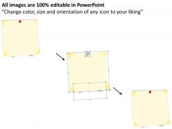
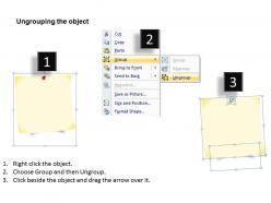
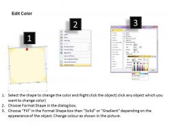
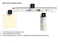
The image shows a PowerPoint slide designed to resemble a thank you note. The note is in the form of a yellow sticky note with a red pushpin at the top, giving it the appearance of being pinned to a surface. On the sticky note, the words "Thank You" are written in a casual script font that mimics handwriting, which adds a personal touch to the message.
At the bottom right corner of the sticky note, there's a placeholder text that says "Your logo," indicating that this template is designed for customization and that one can place their own company's logo there
Use Cases:
"Thank you" slides with a personal touch, like the sticky note design, are versatile for closing presentations across a variety of industries.
1. Education
Use: Concluding lectures or educational seminars.
Presenter: Educators, Speakers.
Audience: Students, Colleagues.
2. Corporate
Use: Ending business meetings or corporate presentations.
Presenter: Executives, Managers.
Audience: Employees, Business Partners.
3. Healthcare
Use: Closing medical conferences or training sessions.
Presenter: Medical Professionals, Researchers.
Audience: Medical Staff, Conference Attendees.
4. Non-Profit
Use: Finishing volunteer training or donor events.
Presenter: NGO Representatives.
Audience: Volunteers, Donors.
5. Real Estate
Use: Concluding property showcases or investor briefings.
Presenter: Real Estate Agents, Developers.
Audience: Clients, Investors.
6. Technology
Use: Wrapping up product demos or technical workshops.
Presenter: Product Managers, Tech Specialists.
Audience: Clients, Tech Enthusiasts.
7. Event Planning
Use: Ending event debriefs or planning meetings.
Presenter: Event Coordinators.
Audience: Clients, Event Staff.
0314 design of thank you note with all 5 slides:
Light up the sky with our 0314 Design Of Thank You Note. Enthrall your audience with your bright ideas.

FAQs for 0314 design of
Okay so for thank you notes, white space is your best friend - don't cram everything together! Pick maybe two fonts max, one for the header and one for the actual message. I'd go with a color scheme that matches whatever the occasion is. Oh and honestly? Less is more with design elements. Like a simple border or small icon is perfect, but I've seen people go crazy with graphics and it just looks messy. The whole point is making your actual message pop, not showing off every design trick you know. Keep it clean and let the words do the talking.
Honestly, the colors you pick really do matter for thank you notes! Warm tones like soft pink, cream, or gold make people feel all cozy and appreciated. Blues and greens come across as calming and genuine. I'd avoid bright red though - it's way too intense for gratitude (maybe deep burgundy could work?). Bright colors in general might steal attention from what you're actually saying. For personal stuff, pastels are perfect. Professional notes? Go with something more sophisticated and deeper. You want colors that back up the genuine thanks you're expressing, not fight against it.
Honestly, handwritten cards are still the best - nobody expects them anymore so they hit different. Photo cards work really well too, especially after big events like weddings where you can throw in a good shot from the day. If you're going digital, Canva's pretty solid for making something that doesn't look basic. Oh and definitely mention specifically what you're thanking them for instead of just "thanks for everything" - that stuff feels so copy-paste. People can tell when you actually put thought into it versus when you didn't.
Honestly, your font choice matters way more than people think! It sets the whole vibe before they even read what you wrote. Comic Sans will kill any heartfelt message - learned that one the hard way. Match your font to who you're writing to. Script fonts are perfect for wedding thank yous, clean fonts work for business stuff, and handwritten styles feel super personal. Pick your tone first, then find a font that backs it up. Don't let bad typography mess up your actual message.
Honestly, less is more with thank you notes. Go simple - clean font, lots of white space, maybe soft blues or warm grays instead of anything bright. Quality paper makes a huge difference too, people notice when it feels nice. I'm a big fan of handwritten touches, even just your signature or a little doodle. The words should be the star, not fancy graphics competing for attention. Overly designed ones always feel like they're trying way too hard, if that makes sense? Stick with muted colors and restraint - that's where the sincerity comes through.
Oh totally - culture makes a huge difference with thank you notes! Asian cultures usually want formal language and softer colors, while Western ones are way more chill about being casual and bright. Japan's big on handwritten stuff (honestly kind of sweet), but other places don't care if it's digital. Religious symbols can be tricky too - some colors or images might offend without you realizing. The formality thing varies like crazy between different cultures. I'd ask someone from that background if you can, or just play it safe and go more formal than you think you need to.
Honestly, imagery is like your visual hook - it makes people actually remember your thank you note instead of tossing it. Pick something that matches the vibe, like pretty florals for wedding thanks or your logo for work stuff. I've seen some amazing hand-drawn doodles that totally crush expensive stock photos, no joke. Just don't go overboard - too much clutter kills your message, but too little feels super impersonal. Find one solid visual element that screams "you" and build around that. Balance is everything here.
Honestly, less is more with branding on thank you notes. Throw in your brand colors as little accents or borders, maybe a tiny logo somewhere. Don't go overboard though - like 2-3 elements tops or it'll look super salesy. Your fonts should match what you normally use, and definitely keep the same tone you always have. If you're usually chill, don't suddenly sound like a corporate robot, you know? The whole point is showing genuine appreciation while still being recognizably you. I'd probably make a few different versions and see which one doesn't make you cringe when you read it back.
Honestly, white space is a game changer for thank you notes. When you cram everything together, it just looks messy and people won't even bother reading it. But if you leave plenty of empty space around your text - like 40-50% of the card - suddenly your message feels way more thoughtful. The reader's eye goes straight to what you're saying instead of getting distracted by clutter. I learned this the hard way after making some pretty awful cramped cards last year lol. Trust me, go minimal and your thank you will actually feel sincere instead of rushed.
Honestly, just go with Canva - it's super easy and you'll have something decent in 10 minutes. They've got tons of thank you note templates already. If you're more of a design person, Illustrator or InDesign are obviously better but probably way more than you need right now. Oh, and Figma actually works pretty well for print stuff these days which is kinda weird since it started as web design software. PowerPoint can even work if you're desperate lol. But yeah, I'd definitely start with Canva and see how that goes first.
Match your design to whatever vibe the event had. Weddings call for elegant fonts and softer colors, but birthday parties? Go wild with bright, fun graphics. Corporate stuff needs to stay clean and professional - seriously, nobody wants Comic Sans on their business thank you card. Look at the event's color scheme and theme when picking your typography and layout. Garden party means botanical elements work great. Beach wedding could use some subtle nautical touches, though don't go overboard. I always keep a few samples from the original event materials nearby while I'm designing. Makes everything way easier.
Honestly, everyone's going crazy for personalized stuff right now - custom illustrations, handwritten fonts, that whole vibe. Eco-friendly materials are huge too. Minimalist designs are everywhere, lots of white space with watercolor touches. Don't even get me started on the eucalyptus obsession, it's literally on everything! Digital notes have totally blown up, especially the interactive ones with animations or QR codes that link to photos. Vintage designs are having a moment alongside really bold typography. Definitely offer both physical and digital options - people want choices that fit their budget and style.
Start with your digital design as the foundation, then add handwritten signatures or notes on the printed piece. QR codes are everywhere now (honestly kinda overdone but they work) - link yours to a video or photo gallery. Try printing digital templates on textured paper for contrast. Oh, and here's something cool I saw recently: use digital fonts for most text, then hand-letter a few key words over it. The trick is picking one element as your main focus. Don't let them fight each other. Make the digital or physical part dominant, then use the other to accent it.
Don't cram everything onto one card - too much text looks messy and clashing colors hurt people's eyes. Generic templates are the worst honestly, they scream "I didn't try." Stick to maybe 2-3 colors tops and pick fonts that are actually readable. White space is your friend! Cards look way better when they're not cramped. Oh and this might be obvious but spell-check before you print - I've definitely learned that one the hard way. Start simple and clean, then add little touches. You can always do more later but it's hard to undo a busy design.
Honestly, those little personal details are what make thank you notes actually matter. Like, if you just grab any random card and scrawl "thanks!" it feels so blah. But throw in their favorite color or reference that weird thing that happened when you hung out? Suddenly it's about them, not just you checking a box. I always try to pick something that screams their personality - maybe a funky design for your artsy friend or something clean and minimal for the organized type. Even just handwriting their name instead of printing makes a difference. It's wild how one small touch can transform the whole thing from generic obligation to something they'll actually want to keep.
-
Excellent products for quick understanding.
-
Use of different colors is good. It's simple and attractive.