


0414 business butterfly bar chart powerpoint graph




Try Before you Buy Download Free Sample Product
 Impress Your
 Audience
 100%
100% Editable
 Save Hours
 of Time


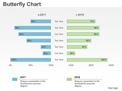
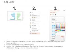
0414 business butterfly bar chart PowerPoint graph is an analytical tool to monitor different value propositions. This tornado chart PPT graphic is a special type of bar chart, where the data categories are vertically grouped instead of the standard horizontal pattern. The categories are arranged such that the biggest bar appears at the top of the chart, followed by second and so on. The tornado presentation diagrams are often used for sensitivity analysis. By forming a given variables chart, a business analyst can analyze how changes in one variable affect the outcome. Our tornado chart PPT template is perfect for displaying sensitivity analysis results without making the slide too cluttery. Tornado chart PowerPoint template as a common statistical tool is helpful to depict the sensitivity of the result. Our tornado chart PPT model can be used to display the effect on each input variable at a time while keeping all the other input variables at their nominal values. Conduct judicial inquiries with our 0414 Business Butterfly Bar Chart Powerpoint Graph. Investigate the issue in a ethical fashion.
People who downloaded this PowerPoint presentation also viewed the following :
0414 business butterfly bar chart powerpoint graph with all 5 slides:
Address every individual demand with our 0414 Business Butterfly Bar Chart Powerpoint Graph. It facilitates happy endings.
FAQs for 0414 business butterfly bar
Butterfly bar charts deliver enhanced comparative analysis, space efficiency, visual symmetry, clear data relationships, and simplified audience comprehension across multiple categories. These charts streamline complex comparisons by displaying opposing datasets side-by-side, enabling organizations to showcase before-after scenarios, demographic splits, or performance contrasts, ultimately delivering more impactful presentations and strategic insights.
A butterfly bar chart effectively compares two datasets by positioning horizontal bars extending in opposite directions from a central axis, creating mirror-image visualizations that highlight differences and similarities. This format enables immediate visual comparison of metrics like male versus female demographics, before versus after performance, or regional sales variations, with organizations finding that the symmetrical design streamlines data interpretation and enhances stakeholder presentations.
Butterfly bar charts excel when comparing two related groups across identical categories, such as male versus female demographics, before versus after scenarios, or performance comparisons between departments or regions. These charts streamline complex comparative analysis by displaying mirror datasets side-by-side, with organizations in market research, HR analytics, and financial services finding that this format delivers clearer insights than traditional side-by-side comparisons, ultimately enhancing decision-making speed and accuracy.
Industries with comparative data needs benefit most from butterfly bar charts, including financial services, healthcare, retail, manufacturing, and government sectors. Banks use them for loan portfolio comparisons, hospitals track patient demographics, and retailers analyze sales performance across regions, while manufacturers compare production metrics, ultimately delivering clearer insights for strategic decision-making.
Strategic design elements enhance butterfly bar charts through balanced color schemes, clear axis labels, consistent scaling, and intuitive data groupings that guide the eye naturally. By implementing proper spacing, contrasting colors for comparative data sets, and streamlined typography, organizations can transform complex comparative analysis into compelling visual narratives, ultimately delivering clearer insights and faster decision-making across departments.
Butterfly bar chart visualization should follow clear axis labeling, consistent color coding for each dataset, balanced scale ranges, and intuitive left-right category positioning. These charts enhance comparative analysis by maintaining proportional spacing, using contrasting colors for immediate differentiation, and ensuring readable font sizes, with many analysts finding that proper alignment and symmetric scaling ultimately deliver clearer insights for decision-making processes.
Butterfly bar charts can accommodate multiple datasets by using grouped bars, different colors for each dataset, or stacked segments within each bar wing. Financial institutions often layer demographic, behavioral, and transactional data simultaneously, while retail organizations compare seasonal performance across product categories, ultimately enabling comprehensive multi-dimensional analysis and strategic insights.
Color choices significantly impact butterfly bar chart effectiveness by enhancing readability, facilitating quick comparisons, and ensuring accessibility for diverse audiences. Strategic color selection enables viewers to distinguish between categories immediately, reduces cognitive load during analysis, and supports brand consistency, with many organizations finding that contrasting yet harmonious palettes ultimately deliver clearer insights and more impactful presentations.
Recommended tools include Tableau, Power BI, Excel, R with ggplot2, Python with matplotlib, and specialized platforms like D3.js for web applications. These software solutions streamline comparative data visualization by offering built-in templates, customizable formatting options, and interactive features, with many organizations finding that business intelligence platforms like Tableau and Power BI deliver the most user-friendly approaches for creating professional butterfly charts that enhance stakeholder presentations.
Narrative storytelling enhances butterfly bar charts by framing comparative data within compelling business contexts, using the chart's mirrored structure to illustrate contrasting scenarios, market segments, or performance outcomes. Through strategic narrative arcs, presenters can guide audiences through data revelations, highlighting key insights about demographic differences, competitive positioning, or trend analysis, ultimately transforming static comparisons into engaging, memorable stories that drive strategic decision-making.
Common mistakes include using inconsistent scales between sides, overcrowding with too many categories, choosing poor color schemes that confuse comparisons, misaligning categories, and failing to clearly label which side represents what data. These design flaws significantly reduce chart effectiveness by creating visual confusion, hampering accurate analysis, and misleading stakeholders, with many organizations finding that thoughtful design choices ultimately enhance data comprehension and decision-making accuracy.
Audience data literacy significantly influences butterfly bar chart complexity and interpretation requirements, with higher literacy levels enabling sophisticated comparative analyses across multiple metrics and categories. Organizations increasingly tailor these visualizations by simplifying layouts for general audiences while providing detailed breakdowns for analytical teams, ultimately ensuring effective communication and decision-making across diverse stakeholder groups.
Best practices for labeling butterfly bar chart axes include clear category labels on the vertical axis, descriptive titles for both horizontal axes, and consistent scale intervals. Data point labels should be positioned outside bars to avoid overlap, use contrasting colors for readability, and include relevant units or percentages, with many organizations finding that strategic placement and font sizing ultimately enhance data comprehension and decision-making accuracy.
Digital butterfly bar charts can introduce interactivity through hover effects revealing detailed demographics, clickable segments filtering specific data subsets, animated transitions showing temporal changes, and drill-down capabilities exploring nested categories. These interactive features enable users to customize their analysis, compare multiple variables simultaneously, and uncover deeper insights from demographic data, ultimately delivering more engaging presentations and strategic decision-making capabilities for stakeholders.
Misinterpreting butterfly bar charts can lead to incorrect trend comparisons, overlooked magnitude differences between categories, and flawed strategic decisions based on visual assumptions rather than actual data values. These misinterpretations often result in poor resource allocation, missed market opportunities, and ineffective policy implementations, with many organizations finding that thorough data literacy training significantly enhances decision-making accuracy and competitive advantage.
-
Commendable slides with attractive designs. Extremely pleased with the fact that they are easy to modify. Great work!
-
It saves your time and decrease your efforts in half.