


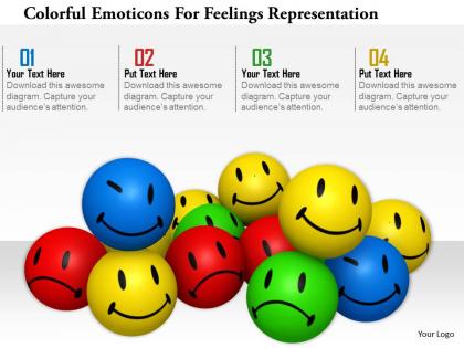
1114 colorful emotions for feelings representation image graphics for powerpoint




Try Before you Buy Download Free Sample Product
 Impress Your
 Audience
 100%
100% Editable
 Save Hours
 of Time


Our 1114 Colorful Emotions For Feelings Representation Image Graphics For Powerpoint will get your audience in harmony. They will sing from the same hymn sheet.
People who downloaded this PowerPoint presentation also viewed the following :
1114 colorful emotions for feelings representation image graphics for powerpoint with all 3 slides:
Take their breath away with our 1114 Colorful Emotions For Feelings Representation Image Graphics For Powerpoint. Dazzle them with your brilliance.
FAQs for 1114 colorful emotions for feelings representation image
Red, blue, yellow, green, and purple are most commonly linked to anger/passion, calmness/sadness, happiness, tranquility/envy, and luxury respectively. These associations stem from evolutionary psychology, cultural conditioning, and physiological responses, with industries like healthcare, retail, and hospitality increasingly leveraging color psychology to enhance customer experiences, improve patient outcomes, and ultimately drive engagement and business results.
Color in presentations enhances audience engagement by triggering emotional responses, improving visual hierarchy, and increasing memory retention through psychological associations. Strategic color choices help differentiate key information, guide attention to critical points, and create memorable visual anchors, with many organizations finding that well-designed color schemes improve audience comprehension and recall rates significantly.
Several psychological theories explain color-emotion connections, including opponent-process theory, learned associations, and evolutionary psychology principles. These frameworks suggest that colors trigger emotional responses through biological mechanisms, cultural conditioning, and survival instincts, with marketing professionals and interior designers increasingly leveraging these insights to influence consumer behavior, enhance workplace productivity, and create more emotionally engaging environments.
Colors can evoke different emotions across cultures, with red symbolizing luck in China but danger in Western contexts, while white represents purity in Western cultures but mourning in some Asian societies. These cultural variations significantly impact global marketing strategies, brand positioning, and cross-cultural communication efforts, with many multinational organizations finding that localized color choices enhance customer engagement and cultural sensitivity.
Presenters can strategically use color by aligning hues with emotional intent, establishing visual hierarchy through contrast, and maintaining brand consistency throughout their slides. Red conveys urgency and passion, blue builds trust and professionalism, while green suggests growth and stability, with many corporate presenters finding that strategic color choices enhance audience retention and message clarity by up to 80%.
Color theory guides branding and marketing communications by leveraging psychological associations, emotional triggers, cultural meanings, and visual hierarchy principles to influence consumer behavior. Through strategic color combinations, brands like Coca-Cola's energetic red and IBM's trustworthy blue create memorable identities, enhance brand recognition, and drive purchasing decisions, ultimately delivering competitive advantage in crowded marketplaces.
Color palettes can be tailored by matching hues to intended emotional responses, with warm colors like reds and oranges energizing audiences, cool blues and greens promoting trust and calm, and neutral tones ensuring professional credibility. Through strategic color selection, presenters enhance message retention, audience engagement, and brand alignment, with many organizations finding that mood-appropriate palettes significantly improve presentation effectiveness and stakeholder buy-in.
Potential pitfalls include cultural color misinterpretations, accessibility issues for colorblind audiences, overwhelming visual complexity, and brand inconsistency that can confuse messaging. These challenges can be avoided by researching audience cultural contexts, incorporating high contrast ratios and alternative visual cues, limiting color palettes to three primary colors, and establishing consistent brand guidelines, ultimately ensuring presentations deliver clear communication and enhanced audience engagement across diverse business environments.
Color choices significantly influence professional credibility through psychological associations, with neutral tones like navy, gray, and white conveying trustworthiness, while bright colors can suggest creativity but may undermine authority in conservative sectors. Financial services and legal firms increasingly favor subdued palettes to enhance perceived reliability, while tech companies strategically use vibrant accents to balance innovation with competence, ultimately delivering stronger client confidence.
Best practices for combining colors in charts and graphs to reflect emotions include using warm colors like red and orange for urgency or excitement, cool blues and greens for calm or stability, and maintaining consistent color meanings across visualizations. These strategic color combinations enhance data interpretation by creating intuitive emotional connections, with many organizations finding that thoughtful color psychology significantly improves audience engagement and comprehension.
Color enhances storytelling by establishing mood through warm tones for passion, cool blues for trust, and strategic contrasts for emphasis and narrative tension. Through thoughtful color progression, presenters create emotional journeys that guide audiences from problem awareness to solution acceptance, with many finding that consistent color themes throughout slides reinforce key messages and ultimately improve audience engagement and retention.
**INPUT**: What tools are available for selecting color schemes that align with desired emotions? **OUTPUT**: Color psychology tools include Adobe Color, Coolors, Paletton, Color Hunt, and Canva's palette generator, which provide emotion-based color recommendations and psychological associations. These platforms streamline brand development by offering mood-specific palettes, accessibility testing, and harmony rules, with many designers finding that strategic color selection enhances customer engagement and brand recognition across marketing materials. [Word count: 58 words]
Digital presentations enable more dynamic color manipulation through backlighting, animations, and interactive elements, creating heightened emotional intensity and engagement. Print presentations offer more controlled, consistent color reproduction and tactile experiences, with many organizations finding that strategic combination of both mediums delivers broader audience reach and enhanced message retention across different viewing contexts.
When choosing colors for accessibility in presentations, considerations include sufficient contrast ratios, colorblind-friendly palettes, readable font combinations, consistent color meanings, and alternative visual indicators beyond color alone. These approaches enhance comprehension by ensuring visibility across different visual abilities, supporting diverse audiences, and maintaining message clarity, with many organizations finding that accessible design ultimately delivers broader engagement and more inclusive communication experiences.
Feedback on color choices enhances future presentations by revealing audience emotional responses, cultural interpretations, accessibility concerns, and brand alignment effectiveness. Through systematic evaluation of color impact, presenters can refine their palettes to strengthen audience engagement, improve message clarity, and build deeper emotional connections, with many organizations finding that data-driven color strategies significantly boost presentation outcomes and audience retention.
-
Unique research projects to present in meeting.
-
Great experience, I would definitely use your services further.