


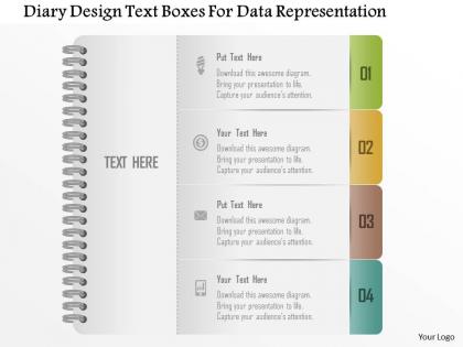
1214 diary design text boxes for data representation powerpoint template




Try Before you Buy Download Free Sample Product
 Impress Your
 Audience
 100%
100% Editable
 Save Hours
 of Time


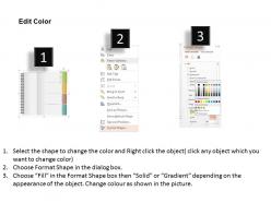
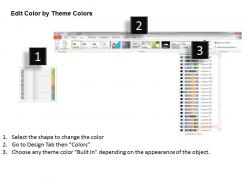
Note down all the important dates and events using our dairy design text boxes for data representation PowerPoint template design. Remembering every information is not possible and keeping this aspect in mind, we have designed this resourceful presentation visual. This PPT helps you to take a note of the business meetings, study schedule and other day to day activities that you tend to forget in your busy life. The PowerPoint graphic is accessible with innovative icons that meets the industry standards. Now this makes it look even more appealing as it enhances the overall quality of the presentation. Our proficient designing experts crafted this master slide after complete research and analysis on today’s business requirement. Giving the professional design that can meet your expectation is the motive of crafting it. All our designs are completely modifiable and editing can be done as per your liking. Download and incorporate it in your presentation now. Look for more designs that are uploaded on our website as per the industry requirement. Brands grab focus with our 1214 Diary Design Text Boxes For Data Representation Powerpoint Template. Become the cynosure of every customers eye.
People who downloaded this PowerPoint presentation also viewed the following :
1214 diary design text boxes for data representation powerpoint template with all 5 slides:
Our 1214 Diary Design Text Boxes For Data Representation Powerpoint Template give you an enormous boost. You will feel almost like a giant.
FAQs for 1214 diary design text boxes for data
Start with your time format - daily, weekly, or monthly spreads usually work best. Layout matters, but don't overthink it! I've watched so many people create gorgeous templates they never touch. Keep space for appointments, priorities, and maybe some reflection notes. Paper size is huge though - get something you'll actually want to carry around. Add habit trackers or mood stuff later if you're into that. Honestly? Begin super basic and just see what you end up writing about naturally. You can always make it fancier once you know your habits.
Honestly, the colors you pick will totally change how your diary feels when you're using it. I always go for warm tones - peaches, creams, soft golds - because they make writing feel cozy and personal. Blues and greens are super calming if you want that zen journaling vibe. Dark colors look fancy but might feel too intense for everyday stuff (though some people are into that). Bright colors energize you but can be distracting when you're trying to write a lot. Oh, and definitely test your palette on a few pages first! Nothing worse than committing to colors that annoy you after a week.
Try a multi-column setup - fits way more stuff without looking cluttered. Shrink your line spacing and go with compact fonts like Calibri or Arial Narrow. Honestly? White space is kinda overrated for diaries anyway, people just want room to actually write lol. Dotted lines work great for keeping things neat while still being flexible. Keep margins small but not so tiny that binding eats your text. Oh and definitely test it out with real handwriting first - what looks good on screen doesn't always work with a pen.
Honestly, less is more with journal illustrations. I'd go for watermark-level stuff - maybe light borders or super subtle background elements. One decorative thing per page spread, max. Muted colors work way better than bright ones too. I made this mistake once where I got carried away with these elaborate swirls and couldn't even read my own writing afterward! Leave tons of white space around your text. If you're struggling to read over your decorations, tone it down. Play around with opacity until you hit that sweet spot where it looks nice but doesn't fight your words for attention.
Typography can make or break your diary template, honestly. Nobody's gonna stick with something that hurts their eyes or feels awkward to write in. Clean fonts are your friend - save the fancy cursive stuff for wedding invites, not daily journaling. Give your lines decent spacing so thoughts don't feel cramped together. Keep font sizes consistent for dates vs writing areas. I learned this the hard way after making a template that looked gorgeous but was impossible to actually use. Test it yourself first by writing a few entries. You want something that feels like your favorite notebook, not a chore.
Oh totally! They're like completely different beasts. Digital needs search, cloud backup, and space for photos/voice memos - basically all the tech stuff that makes life easier. Print is more about the physical experience - good paper that won't bleed through, lots of writing space, layouts that actually make sense on the page. Honestly? I still prefer writing by hand sometimes, there's just something about it that feels more... real? Digital wins for convenience though - your phone's always there. Just think about what each user actually wants: digital people want quick and connected, print people want that focused, tactile vibe.
Dude, interactive stuff totally changes the game! Instead of just reading, people get to actually *do* things - click mood trackers, upload photos, rate their day. There's something weirdly addictive about clicking buttons, right? Progress bars and achievement badges work amazingly well too. They make people feel more connected to what they're writing. Oh, and tagging entries so you can search later? Game changer. Honestly, anything that creates that "just one more entry" vibe will hook users. I'd start simple with like one feature and see how it goes.
Honestly, just stick them where you'll actually see them - like the cover or beginning of each section. Don't go crazy scattering quotes everywhere (I made that mistake once and it looked like a Pinterest explosion). Pick ones that actually mean something to you right now, not just random inspirational stuff. Maybe switch them up every month or so? They get stale otherwise. Oh, and with affirmations, make them about what you're specifically working on. One good quote per section beats having them crammed all over the place. Less clutter = more impact, you know?
Honestly, seasonal updates are such a game-changer! Switch up your colors and visuals throughout the year - spring pastels with flowers, bright summer themes, autumn oranges, cozy winter blues. Apps that do this well make me actually want to open them again instead of getting bored. You could add seasonal features too, like New Year goal-setting or back-to-school planning stuff. Just don't go overboard - you want it fresh but not totally different each time. I'd probably start with just changing the color palette first and see how people react to that.
Dude, the cover is EVERYTHING when it comes to pricing your diary. People judge it instantly - no joke. Go with leather or linen and you can charge triple what you'd get for basic paper. Textured stuff, embossing, nice colors? That screams quality to customers. I've literally watched mediocre diaries fly off shelves just because the cover looked expensive. Plus your design sets the vibe - clean minimalist covers make people expect simple layouts inside, ornate ones suggest fancy detailed pages. So definitely pick materials based on what price point you're aiming for.
Focus on the stuff you'll actually use first - daily pages, monthly spreads, note sections. Get those working smoothly before you worry about making it pretty. Once the basics are solid, add your visual touches through fonts, colors, and spacing that help rather than hurt usability. Honestly, I've wasted so much time on diaries that looked amazing but were terrible to write in! Test your layout with real content for like a week before you commit. You'll spot problems fast when you're actually trying to jot down appointments or whatever. Short bursts of real use beats hours of theoretical planning.
Honestly, date formats are your biggest headache - MM/DD vs DD/MM will confuse half your users if you pick wrong. Weekly layouts matter too since some places start weeks on Monday. Don't forget major holidays like Diwali or Ramadan depending on your audience. Arabic/Hebrew markets need right-to-left layouts, which is trickier than it sounds. Colors are weird - red's lucky in China but screams danger everywhere else. I learned that one the hard way! Skip the universal approach and just make region-specific versions. Pick your top three markets first.
Honestly, user feedback is like having a GPS for your diary templates. Grab insights through surveys, quick usability tests, or just chatting with people who actually use them. They'll point out stuff you never noticed - maybe the date format sucks, writing space is cramped, or they desperately want mood tracking. Users come up with the weirdest requests sometimes, but that's gold! Set up feedback loops so you can test tweaks fast and keep improving. Oh, and find a few brutally honest users for regular check-ins throughout your process. Trust me, they'll save you from design disasters.
Honestly, start with voice memos - they're perfect for catching those random emotional moments. Photos work great too, especially if your app can grab location and weather data automatically. I've seen some really cool mood tracking that turns into actual art over time, which is pretty neat. Those 10-second video reflections are huge right now - you can compile them into monthly recap videos. Some friends of mine connect their Spotify or fitness trackers to spot patterns between workouts/music and how they're feeling. Interactive stuff like memory maps where you can click around or let friends comment is fun but honestly overwhelming at first. Just pick voice notes and photos to start, then add whatever feels right later.
Honestly, your audience shapes everything. Teens want bold colors and trendy fonts - throw in some social features too. Business people? Clean lines and muted tones that look professional. Kids need huge fonts and simple navigation. Plus bright colors - like, the more neon the better with little ones. Adults usually prefer that minimalist vibe with lots of white space. You've gotta figure out what they actually value first. How will they use it day-to-day? Once you nail that down, the design choices become way more obvious. It's really about matching their expectations, you know?
-
Out of the box and creative design.
-
Wonderful templates design to use in business meetings.