

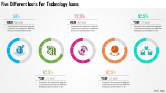
1214 five different icons for technology icons powerpoint template





Try Before you Buy Download Free Sample Product
 Impress Your
Audience
 100%
Editable
 Save Hours
of Time


Become the firm favourite with our 1214 Five Different Icons For Technology Icons Powerpoint Template. Your ideas will draw in bigger crowds.
People who downloaded this PowerPoint presentation also viewed the following :
1214 five different icons for technology icons powerpoint template with all 5 slides:
Don't waste effort with our 1214 Five Different Icons For Technology Icons Powerpoint Template. You will never act in haste.


FAQs for 1214 five different icons for technology
A tech icon? They're people who completely flipped how we use technology and changed whole industries. Jobs with the iPhone, Bezos making online shopping normal, Musk pushing electric cars mainstream. These folks saw stuff others didn't and got pretty obsessed with their vision - sometimes weirdly so, honestly. What makes them icons isn't just building cool products. It's that they actually changed how millions of people live and work every day. So yeah, when you're wondering if someone counts as a tech icon, just ask: did their work fundamentally shift society? That's the real test.
Oh totally! So back in the day, icons had to look super realistic - like actual file folders and trash cans - because nobody knew what the hell a computer was supposed to do. Made sense, right? But now everyone's basically a tech expert (or thinks they are lol), so we can get away with super simple, flat designs. Way cleaner too. Those old 3D buttons were kinda clunky when you think about it. Now it's all minimal line art that works whether you're on your phone or some huge screen. Honestly, a simple outline trash icon does the job just as well as those realistic ones from Windows 95.
Honestly, the hamburger menu changed everything - even though half of us still hate it. But it solved that whole "how do we fit navigation on a tiny screen" problem. The floppy disk save icon is hilarious because nobody's seen an actual floppy in decades, yet we all know what it means. Same with the trash can and that magnifying glass for search. Oh, and folders still look like those old manila ones from office filing cabinets! It's crazy how these visual shortcuts became so hardwired into our brains. When you're designing stuff, you can basically count on people recognizing these instantly across any platform.
Oh man, this is such a bigger deal than people realize! That floppy disk save icon? Half the world has no clue what it is. Colors are tricky too - red screams "danger" here but it's lucky in other places. Even reading left-to-right vs right-to-left messes with where users expect buttons. I learned this the hard way on a project last year. Test your stuff with different user groups early on. Seriously, just add text labels when you're unsure. What feels "obvious" to you probably isn't universal at all.
Dude, shape and color are like the secret sauce for tech icons. Your brain processes that stuff in milliseconds - it's actually crazy how fast we pick up on visual cues. Think about it: you see a triangle and instantly know it means "play," or those three little lines scream hamburger menu. Color hits different though. Blue feels trustworthy, red screams danger, green says "you're good to go." Honestly, I'm probably overthinking this, but the combo is what makes icons click for users. Just test them with real people - you'll know pretty quick if they're working.
Honestly, icons are just visual shortcuts that make everything click faster for users. They don't have to read a bunch of text - just boom, they see the magnifying glass and know it's search. Makes your whole interface feel way less cluttered too. The trick is sticking with stuff people already recognize instead of trying to be all artistic about it. Like, a hamburger menu is boring but everyone gets it instantly. I'd say look at your current buttons and see which ones are super wordy - those are prime candidates for swapping in some clean icons. Just makes everything feel more modern without being fancy.
Honestly, just stick with what people already know - envelopes for email, magnifying glasses for search, that kind of stuff. Clean, bold lines are your friend here. Fine details look terrible when the icon's tiny anyway. I learned this the hard way after spending hours on some "artistic" gear icon that literally nobody understood lol. Skip trendy elements too - they'll just confuse users and look dated in six months. Test them with real people if you can. Seriously, go with obvious over clever every single time. Your users will thank you.
Dude, AR and VR are totally changing how we think about icons. Instead of flat 2D stuff, you're making these floating 3D objects people can actually grab and spin around. Pretty crazy, right? The tricky part is they need to look good from every angle and work with different lighting. Honestly, shadows and depth matter way more than just colors now. Oh, and users aren't just looking at them anymore - they're poking and manipulating them in 3D space. Try taking some of your current icons and imagining them as actual objects you'd pick up.
Don't overcomplicate them - simple shapes work way better at small sizes. Also that floppy disk thing is so outdated but somehow we're all still stuck with it lol. Keep your line weights and corner styles consistent across everything. Test at actual 24x24px size, not zoomed in where they look perfect but tiny where they're actually garbage. Accessibility matters too - good contrast helps everyone. Skip the super literal metaphors. Sometimes abstract works better than trying to cram a whole concept into one little icon. Start with a grid system and you'll save yourself headaches later.
Honestly, user feedback is the only way to know if your icons actually make sense. That hamburger menu you think is obvious? Half your users will see a sandwich. I'm not even joking - it happens constantly. Testing shows you stuff you'd never guess: cultural misunderstandings, accessibility issues, whether older users get it. People will straight up tell you when icons are too tiny or completely missing from their workflow. Even rough sketches work for early feedback. Way better than spending weeks perfecting something that confuses everyone.
Look, consistent icons are honestly a game-changer for your users. They don't have to figure out what everything means each time - way less mental work. Your product just feels more polished too, which builds trust. I've seen apps where icons are all over the place style-wise and it screams amateur hour. Users start recognizing your specific icon style, which is solid for branding. Oh and make sure you document your icon system early so your team doesn't go rogue later. Short version: nail down your visual standards and stick to them religiously.
So basically, your brain just gets these visual shortcuts instantly. You see a trash can icon and boom - you know it means delete. Same with the magnifying glass for search or that gear thing for settings. It's honestly pretty wild how we all just understand this stuff now. Most good icons use familiar objects as metaphors - like how we still use that ancient floppy disk for "save" even though I haven't seen one in forever. The trick is sticking with what people already know unless you've got a really good reason to confuse everyone. Way faster than making people read labels for everything.
Icons are getting way more inclusive now - diverse skin tones, accessibility stuff, gender-neutral vibes. Minimalism's still huge but with these cool micro-animations and subtle 3D effects. Actually kinda wild how 3D is back, honestly didn't see that coming. Users want customizable systems too, like adjusting colors to match their setup. The biggest thing? Icons should represent actual people using tech, not just the tech itself. You should probably look at your current icons - anything screaming "generic tech bro" is gonna look ancient soon.
So accessibility stuff actually makes your icons way better overall. High contrast is huge for people with vision issues. Test everything in grayscale first - if it works there, you're golden. Don't just use color alone to show meaning either. Like, red AND a stop sign instead of just making something red, you know? Your icons need to scale down to tiny sizes and still make sense. Oh and screen readers need proper alt text to work with them. Honestly the constraints are annoying at first but they push you toward cleaner, more obvious designs. Try viewing your stuff at 16px - it's a good reality check.
Dude, Apple's the obvious winner - that simple apple icon just *is* premium tech now. Nike's swoosh works great too, though that's more athletic stuff. Twitter's bird was perfect for social media vibes. Chrome's icon is actually brilliant because it looks fast and sleek, which is exactly what you want. Oh and GitHub's octocat somehow makes coding seem fun instead of terrifying lol. The trick is making your icon actually represent what your product does while being recognizable even when it's super tiny. Like, people need to spot it instantly on their phone screen.
-
The content is very helpful from business point of view.
-
Amazing product with appealing content and design.