


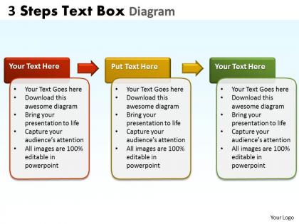
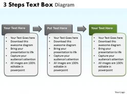
3 steps text box diagram 2




Try Before you Buy Download Free Sample Product
 Impress Your
 Audience
 100%
100% Editable
 Save Hours
 of Time


Your thoughts have already made an impression. Our 3 Steps Text Box Diagram 2 will be a bonus.
People who downloaded this PowerPoint presentation also viewed the following :
3 steps text box diagram 2 with all 8 slides:
Bedeck your ideas with our 3 Steps Text Box Diagram 2. Your audience will get glued onto them.
FAQs for 3 steps text
Key elements include clear sequential flow, consistent visual hierarchy, balanced spacing, readable typography, and logical content progression from step to step. These design principles enhance comprehension by creating intuitive pathways, maintaining visual consistency, and ensuring seamless information absorption, with many organizations finding that well-structured diagrams significantly improve audience engagement and message retention across presentations.
A 3 steps text box diagram enhances audience understanding by breaking complex processes into digestible sequential components, creating clear visual hierarchy, and eliminating cognitive overload through structured information flow. This approach enables presenters to guide audiences through logical progressions systematically, with many organizations finding that sequential visual frameworks improve retention rates, facilitate decision-making processes, and ultimately deliver more impactful presentations across departments.
Recommended software tools for creating visually appealing 3 steps text box diagrams include PowerPoint, Canva, Lucidchart, Adobe Illustrator, and Visio. These platforms streamline diagram creation by offering customizable templates, drag-and-drop functionality, and professional formatting options, with many organizations finding that PowerPoint and Canva deliver the best balance of accessibility and design quality for business presentations.
Color psychology significantly enhances 3 steps text box diagram effectiveness by guiding attention flow, reinforcing sequential logic, and improving information retention through strategic visual hierarchy. Progressive color schemes, such as light-to-dark gradients or complementary palettes, help viewers naturally follow the intended sequence while creating emotional connections to content, with many organizations finding that thoughtful color choices increase comprehension rates and audience engagement by up to 40%.
Common mistakes include overcrowding text boxes with excessive information, using inconsistent formatting across steps, creating unclear progression flow, and neglecting visual hierarchy through poor color or size choices. These design pitfalls can confuse audiences and diminish message effectiveness, with many organizations finding that simplified content, consistent styling, and clear directional indicators ultimately deliver better comprehension and stronger stakeholder engagement.
Adapting a 3 steps text box diagram involves adjusting language complexity, visual hierarchy, and content depth based on your audience's expertise and needs. For executive presentations, emphasize high-level outcomes and strategic impact, while technical teams benefit from detailed processes and implementation specifics, with educational contexts requiring step-by-step explanations that build understanding progressively.
Sequential processes, procedural workflows, stage-based transformations, decision-making frameworks, and implementation methodologies work best in 3 steps text box diagrams. These visual formats streamline complex business processes by breaking them into digestible phases, with many organizations finding that manufacturing procedures, customer onboarding sequences, and strategic planning initiatives become significantly clearer, ultimately enhancing operational efficiency and stakeholder comprehension.
Storytelling techniques can be integrated into a 3 steps text box diagram by creating a narrative arc with setup, conflict, and resolution, using character-driven scenarios, and employing emotional hooks within each step. This approach transforms static process diagrams into compelling narratives, with many organizations finding that story-based presentations increase audience retention by up to 65%, ultimately delivering stronger stakeholder buy-in and enhanced message comprehension.
Icons and visuals in 3 steps text box diagrams enhance comprehension, increase retention, and accelerate information processing by making complex processes immediately accessible. These visual elements streamline communication across diverse audiences, with many organizations finding that incorporating strategic iconography reduces training time, improves presentation effectiveness, and delivers more engaging stakeholder experiences.
To maintain clarity and simplicity in your 3 steps text box diagram, use concise language, logical sequential flow, consistent visual formatting, and strategic white space distribution. These design principles streamline information processing by eliminating cognitive overload, enhancing visual hierarchy, and creating intuitive navigation paths, with many organizations finding that simplified step-by-step presentations ultimately deliver faster comprehension and improved audience engagement.
Font choice significantly influences readability, visual hierarchy, and professional credibility in 3 steps text box diagrams, with consistent typography ensuring seamless information flow across sequential elements. Strategic font selection enhances comprehension by establishing clear distinctions between headings and body text, while maintaining brand consistency, ultimately delivering improved audience engagement and more effective knowledge transfer in business presentations.
Balance text and visuals in a 3-step text box diagram by using concise headlines with supporting bullet points, incorporating relevant icons or graphics for each step, and maintaining consistent spacing and visual hierarchy. This approach streamlines information flow while enhancing comprehension, with many organizations finding that strategic visual-text combinations deliver clearer communication and improved audience engagement across presentations.
**INPUT**: In what scenarios would a 3 steps text box diagram be more effective than a bullet-point list? **OUTPUT**: A 3 steps text box diagram proves more effective when presenting sequential processes, decision workflows, or progressive stages that require visual emphasis and logical flow. While bullet points work for simple lists, diagrams enhance comprehension in training materials, process documentation, and client presentations, with many organizations finding that visual hierarchy streamlines communication and reduces misunderstandings across teams.
Peer feedback enhances 3 steps text box diagrams by identifying unclear transitions, suggesting clearer language, and highlighting missing context that creators often overlook. Through collaborative review, teams can streamline complex processes, ensure logical flow between steps, and optimize visual hierarchy, with many organizations finding that peer-reviewed diagrams significantly improve user comprehension and implementation success rates.
Creative variations of 3 steps text box diagram include circular flow designs, vertical timeline layouts, stair-step progressions, overlapping interconnected boxes, and arrow-driven pathways. These visual approaches enhance audience engagement by transforming traditional linear presentations into dynamic storytelling formats, with many organizations finding that strategic diagram variations improve information retention and deliver clearer communication outcomes.
-
Really like the color and design of the presentation.
-
Great designs, Easily Editable.