


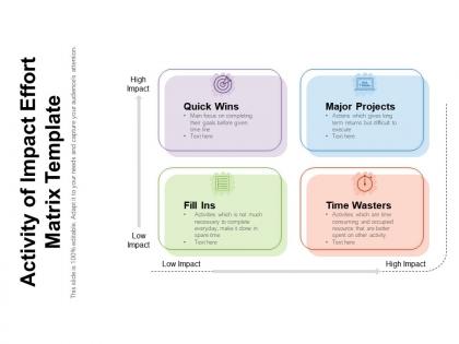
Activity of impact effort matrix template




Try Before you Buy Download Free Sample Product
 Impress Your
 Audience
 100%
100% Editable
 Save Hours
 of Time


Our Activity Of Impact Effort Matrix Template are explicit and effective. They combine clarity and concise expression.
People who downloaded this PowerPoint presentation also viewed the following :
Activity of impact effort matrix template with all 2 slides:
Give your audience a fulfilling experience. They will find our Activity Of Impact Effort Matrix Template elevating.
FAQs for Activity of impact
So basically you plot your tasks on a 2x2 grid - impact vs effort. High impact, low effort = do these first (duh). Low impact, high effort = avoid like the plague. I use this all the time at work and it actually works really well. Just list out everything you're working on, then figure out where each thing falls on the grid. The visual makes it super obvious what to prioritize. Quick wins are your best friend here - they build momentum. Been using this for like two years now and honestly wish I'd found it sooner.
So basically make a 2x2 grid - impact vs effort. Hit the high impact, low effort stuff first since those are your easy wins. After that, tackle high impact + high effort for the bigger projects. The low impact, high effort quadrant? Skip it completely - that's just busywork that'll burn everyone out. I learned this the hard way lol. Oh and definitely get your team to weigh in on where everything goes instead of deciding solo. Trust me, you don't want to be the person making all those calls yourself.
So for impact, think revenue potential, customer satisfaction gains, strategic fit, and how many people you're affecting. Effort's the usual suspects - time, budget, resources, plus technical complexity and risks. Oh, and opportunity cost! I always space on that one but it's actually massive. Here's the thing though - you've gotta stay consistent with your criteria across everything you're comparing. Pick maybe 3-4 specific metrics for each side and don't deviate. Otherwise you'll end up comparing random stuff and the whole matrix becomes pointless. I learned that the hard way on a project last year.
So you plot your projects on a grid - high impact/low effort stuff goes in the "quick wins" section. That's where you want to start since you'll get awesome results without draining your team. High impact/high effort projects? Those are your big initiatives that need proper planning. Low-impact work just gets ignored (finally, a good excuse to say no to random requests). I'd map out what you're currently working on first. You'll probably spot some obvious winners you've been sleeping on. It's basically a cheat sheet for resource allocation, but way less boring than it sounds.
Honestly, the worst mistake is scoring stuff without getting everyone's input first. You'll miss huge blind spots that way. Don't obsess over whether something's a 7 vs 8 either - I've watched teams waste entire meetings on that nonsense. Keep your criteria consistent throughout so you're actually comparing similar things. Oh, and here's what trips people up most: they build this amazing matrix then never touch it again. Your priorities from last quarter are probably way different now, so update the damn thing regularly or it becomes useless pretty fast.
So basically you plot your projects on a simple grid - high/low impact vs high/low effort. Quick wins jump out immediately (high impact, low effort stuff). Those are your goldmine. Honestly, most people overthink this but it's super straightforward once you see it laid out. What's brilliant is how it forces you to actually admit which projects are just busywork. I'd start by mapping what you're already doing - bet you'll spot some total resource drains (high effort, low impact) that you can just... stop. It's weirdly satisfying to kill those off.
Yeah totally! Impact-effort matrices work great in agile. During sprint planning, just plot your user stories on it - you'll spot the quick wins (high impact, low effort) that should definitely go in your next sprint. Those "major project" items are perfect for multi-sprint planning. We started doing this in our backlog refinement sessions and honestly? It cuts through all the usual arguing about priorities. Way more productive than everyone just shouting about their pet features. Give it a shot next planning session - bet you'll find some obvious wins sitting right there in your backlog.
Honestly, it's way simpler than other methods because you're only dealing with two things - impact vs effort. RICE and those weighted scoring frameworks? They make you crunch like 5 different numbers, which is just exhausting. The 2x2 grid thing is brilliant though. Your team can instantly see the "high impact, low effort" goldmine stuff. Instead of some ranked list that nobody remembers, you get clear buckets - do this now, plan for later, or just... don't. It's perfect when you need everyone to agree fast without spiraling into analysis paralysis mode.
Color coding is your best friend here - green for those sweet high-impact/low-effort wins, red for the time-wasters that'll drain your budget. Make sure your quadrant labels are super clear because nobody wants to argue about where stuff actually belongs. Icons help too if you've got different project types mixed in. A confusing matrix honestly just makes everyone more frustrated than before you started. The goal? Someone should walk in and instantly get what you're prioritizing without you having to explain the whole thing.
You know what's brilliant about the matrix? Everyone can actually see the trade-offs instead of just arguing in circles. Plot those initiatives together and suddenly people get why you can't do everything at once. Quick wins vs. big impact becomes super obvious when it's visual. Having stakeholders build it with you is key - they'll stop fighting the decisions if they helped make them. My team got weirdly competitive about moving those sticky notes around last time, which was actually helpful? Skip the endless debates next meeting. Just get everyone plotting items together and watch how fast you hit consensus.
Dude, tech companies are probably the biggest users - they're always trying to figure out which features to build first. Healthcare and manufacturing love these too since they help decide what'll actually move the needle. Consulting firms are obsessed with them (shocking, I know). Manufacturing uses them for operations stuff, healthcare for process improvements that could literally save lives. Really though, any industry works as long as you've got multiple projects competing for attention. If it's just one project? Don't bother with the matrix, just get started.
Don't just make your matrix once and walk away - that thing needs regular updates as stuff changes. Move tasks between quadrants when you get team feedback or learn something new about effort/impact. Honestly, I've watched entire project priorities flip after one random stakeholder call lol. Add new items as they pop up, cross off completed ones. Update it during sprint reviews or retrospectives - basically whenever big changes hit. You'll want to schedule check-ins to keep everything current and actually useful.
Dude, you've gotta get other people involved in this. What looks super impactful to you might be completely off-base from marketing's perspective. And effort? Yeah, your dev team will laugh at what you think takes "just a few hours" to build. I've watched so many teams create these matrices alone and they're basically garbage. Round up your cross-functional people for like an hour workshop - let them argue about where stuff goes. Trust me, the debates are worth it. You'll get way better estimates and people actually care about executing when they helped decide the priorities. Plus it's kinda fun watching everyone disagree at first.
Honestly, just use software instead of those static spreadsheets - they're a pain to update. Drag and drop stuff between quadrants when priorities change. Most tools automatically calculate scores and let your whole team collaborate live. The best part? They connect to whatever project management thing you're already using. I watched one team spend literally hours updating their matrix manually, then it was outdated the next day. Such a waste. Miro or FigJam work great, but honestly start with whatever collaboration tool you already have. Don't make your life harder by adding new software everyone has to learn.
Check your impact-effort matrix every 2-4 weeks or when you hit big project milestones. Things always change once you start digging in - user research surprises you, technical stuff gets way more complicated than expected, or your boss suddenly cares about something totally different. When you move things around, write down why. Otherwise your team will be confused about the reasoning later. Honestly, I'd just set a recurring calendar reminder because you'll definitely forget otherwise. We all do! The whole point is staying on top of what actually matters instead of grinding away on outdated priorities.
No Reviews