


Affinity diagram for customer experience ppt design




Try Before you Buy Download Free Sample Product
 Impress Your
 Audience
 100%
100% Editable
 Save Hours
 of Time


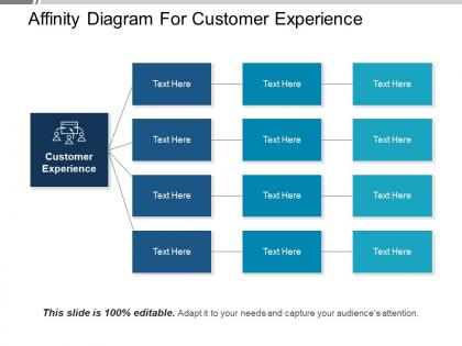
Generate information related to your company’s product, process or complex issue our affinity diagram for customer experience PPT design. Gather large amounts of data including ideas, opinions and important issues.You can collect and organize large sets of data effortlessly. Research and analyse the data with data affinity PPT design. Organize the collected data to address difficult issues using using this affinity diagram PPT slide. Make complex data, easy to understand for your audience. Use our affinity diagram PPT template when group consensus is necessary. Present brainstorming ideas to your audience to improve the customer experience, with ease. You can draw relationship and connections for better customer experience. From analysis to results create a comprehensive data with affinity analysis PPT example. Make translation of the clustered data easy and effective. Find out the co-occurrence relationships among purchases and feedbacks by your regular customers with affinity analysis. This PPT diagram is high quality and ready to use. Invest less time to create an impressive PowerPoint presentation with our affinity chart PPT template. Add to their growth with our Affinity Diagram For Customer Experience Ppt Design. They will absorb your ideas better.
People who downloaded this PowerPoint presentation also viewed the following :
Affinity diagram for customer experience ppt design with all 5 slides:
Your efforts have got you the advantage. Our Affinity Diagram For Customer Experience Ppt Design ensure it won't fritter away.
FAQs for Affinity diagram for customer
Affinity diagrams in project management enhance team collaboration, streamline idea organization, identify patterns across complex data, improve decision-making processes, and facilitate stakeholder alignment. These visual tools enable project managers to synthesize diverse inputs from team members, categorize feedback systematically, and prioritize initiatives effectively, ultimately delivering clearer project roadmaps and stronger consensus among stakeholders.
Affinity diagrams enhance team collaboration by organizing diverse ideas into logical clusters, encouraging equal participation from all members, and creating visual consensus around emerging themes. Through this structured grouping process, teams streamline decision-making, identify breakthrough insights more efficiently, and build shared understanding, with many organizations finding that collaborative clustering sessions significantly improve creative outcomes and team alignment.
Best practices for organizing affinity diagrams include grouping related ideas naturally, using clear and descriptive headers, limiting groups to 5-10 items, involving multiple team members in the sorting process, and iterating groupings until patterns emerge clearly. This collaborative approach streamlines decision-making by revealing hidden connections and priorities, with many organizations finding that structured affinity mapping accelerates project timelines and enhances strategic alignment.
Affinity diagrams help product development teams prioritize tasks by grouping related features, user feedback, and requirements into thematic clusters that reveal natural priorities and dependencies. Through this visual organization, development teams can identify high-impact feature sets, streamline resource allocation, and focus on user-centered improvements, ultimately delivering more cohesive products while reducing development time and complexity.
Affinity diagrams organize and synthesize user research data by grouping related insights, pain points, behaviors, and feedback into meaningful themes that inform design decisions. They enable UX teams to identify patterns across user interviews, surveys, and usability tests, transforming scattered observations into actionable insights that drive user-centered design improvements and strategic product enhancements.
Effectively facilitating remote affinity diagramming requires digital collaboration tools like Miro or Mural, clear time management with structured phases, and active engagement through breakout rooms for small group clustering. Remote teams benefit from pre-session preparation with shared templates, real-time voice communication during sorting phases, and designated facilitators managing technical coordination, ultimately delivering the same collaborative insights as in-person sessions while accommodating distributed workforce flexibility.
Digital affinity diagram tools include Miro, Mural, Figma, Lucidspark, and Microsoft Whiteboard, along with specialized options like Conceptboard and Stormboard. These platforms streamline collaborative analysis by enabling real-time editing, template libraries, and seamless integration with project management systems, with many organizations finding that digital solutions significantly enhance team productivity and remote collaboration capabilities.
Affinity diagrams help researchers organize and cluster customer feedback, survey responses, interview insights, and behavioral data to reveal recurring pain point patterns and themes. By grouping related customer concerns from diverse sources like focus groups, social media comments, and support tickets, teams can identify the most critical issues affecting user experience, prioritize solutions based on frequency and impact, and develop targeted strategies that address root causes rather than symptoms.
Strategies include rotating facilitation roles, using anonymous sticky notes, implementing silent brainstorming phases, creating small breakout groups, and establishing clear participation guidelines. These approaches streamline diverse input collection by minimizing hierarchy influence, encouraging quieter participants, and ensuring balanced contribution opportunities, with many organizations finding that structured inclusion ultimately delivers richer insights and stronger team consensus.
Affinity diagrams organize information through collaborative grouping of related ideas after brainstorming, while mind maps create hierarchical structures radiating from central concepts during ideation. Affinity diagrams excel in team environments for synthesizing user research, customer feedback, and project insights, whereas mind maps work better for individual planning, knowledge mapping, and exploring connections, with many organizations finding affinity diagrams more effective for collaborative decision-making.
Yes, affinity diagrams integrate seamlessly into Agile methodologies through sprint retrospectives, user story mapping, backlog refinement sessions, and cross-functional team collaboration activities. These visual tools enhance Agile workflows by streamlining idea organization, accelerating consensus-building during standups, and enabling faster prioritization of features, with many development teams finding that affinity mapping significantly improves sprint planning efficiency and stakeholder alignment.
Teams often struggle with overwhelming data volumes, grouping bias, and unclear categorization criteria when creating affinity diagrams. These challenges can be overcome by setting clear objectives upfront, using diverse team perspectives to minimize bias, establishing consistent grouping rules, and breaking large datasets into manageable segments, ultimately enabling more accurate insights and streamlined decision-making processes.
Educators can leverage affinity diagrams to organize student ideas, group related concepts, facilitate collaborative discussions, and identify learning patterns across subjects. These visual tools enhance classroom learning by encouraging active participation, helping students see connections between topics, and enabling teachers to assess understanding more effectively, ultimately creating more engaging and comprehensive educational experiences.
Color coding in affinity diagrams enhances visual organization by differentiating themes, prioritizing insights, and enabling rapid pattern recognition across complex data sets. Through strategic color application, teams streamline analysis, improve collaboration efficiency, and accelerate decision-making processes, with many organizations finding that color-coded groupings reduce interpretation time while delivering clearer strategic insights and enhanced project outcomes.
Affinity diagrams can be adapted for diverse cultural contexts by incorporating multilingual labeling, culturally relevant categorization methods, flexible grouping approaches that respect different thinking patterns, and inclusive facilitation techniques. Organizations in global consulting, international healthcare, and cross-cultural research find that these adaptations enhance participation, improve cultural sensitivity, and deliver more comprehensive insights that reflect diverse perspectives and ultimately strengthen decision-making processes.
-
Unique and attractive product design.
-
Commendable slides with attractive designs. Extremely pleased with the fact that they are easy to modify. Great work!