


Audit Dashboard Powerpoint Ppt Template Bundles




Try Before you Buy Download Free Sample Product
 Impress Your
 Audience
 100%
100% Editable
 Save Hours
 of Time


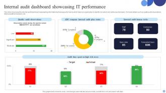
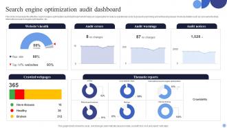
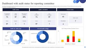
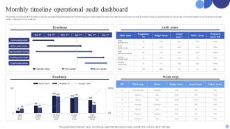
Elevate your auditing processes with our PPT on Audit Dashboard. Dive into the world of data visualization and gain valuable insights into how audit dashboard examples, including the powerful Tableau audit dashboard, can enhance your internal audit practices. This presentation offers a comprehensive view of the audit dashboard, a dynamic tool for monitoring, tracking, and reporting audit processes. Explore the key features and best practices for creating an effective audit report dashboard that streamlines your auditing workflow. Whether you are an auditor, financial professional, or business leader, our Audit Dashboard PPT equips you with the knowledge and tools needed to transform your audit management practices. Stay at the forefront of auditing innovation and elevate the accuracy and efficiency of your processes. Get your copy today.
People who downloaded this PowerPoint presentation also viewed the following :
Audit Dashboard Powerpoint Ppt Template Bundles with all 17 slides:
Use our Audit Dashboard Powerpoint Ppt Template Bundles to effectively help you save your valuable time. They are readymade to fit into any presentation structure.










FAQs for Audit Dashboard Powerpoint
Track completion rates and findings by risk level first - that's your foundation. Time-to-resolution matters too since dragged-out fixes drive everyone crazy. Management response rates and overdue items are honestly what execs fixate on, so definitely include those. Repeat findings show whether problems actually get solved or just swept under the rug. Audit cycle coverage proves you're not missing critical areas. Oh, and don't go overboard - maybe 6-8 metrics tops. More than that and people's eyes glaze over during meetings.
Honestly, visualizations are a game changer for audit data. No more drowning in spreadsheets trying to find patterns. Charts instantly show you which departments are problem areas, how long fixes actually take, and what keeps popping up every cycle. Heat maps work really well for spotting where your biggest risks cluster together. Bar charts are perfect for comparing stuff, trend lines for tracking progress over time. I'd probably start with your top 3 metrics first - don't try to visualize everything at once or you'll go crazy. Way easier to digest than raw numbers.
Your audit dashboard is pretty much useless without real-time data. Think about it - you're making decisions based on old info while problems are happening right now. I learned this the hard way when we missed a compliance issue that had been sitting there for three days. Stakeholders expect current data, especially during active audits. You'll want automated refreshes every few hours minimum, but honestly? Push for real-time integration wherever you can swing it. Otherwise you're just playing catch-up and explaining to leadership why you're always behind.
So basically, audit dashboards let you see what's happening with your team right now instead of waiting around for meetings or digging through endless spreadsheets. You can catch problems early - like bottlenecks or team members getting swamped. Honestly, the visual stuff makes it way easier to figure out which audits are about to blow up and need attention first. Your stakeholders will actually thank you because you're giving them real updates instead of the usual "everything's fine" nonsense. I'd start with whatever metrics keep you up at night and build from there.
Put your biggest risks right up top with color coding or icons - users gotta see the scary stuff first. Clean layout is key, don't jam everything together (I've seen too many dashboards that look like someone threw data at a wall). Add filters for dates, departments, risk levels so people can actually find what they need. Clickable charts are clutch for drilling into details. Oh, and definitely test with real users before launch. They'll spot weird quirks you totally missed while staring at it for weeks.
Most audit platforms let you drag and drop widgets around to show what actually matters to your team. Focus on the metrics you check daily instead of cramming everything in - honestly, cluttered dashboards are worse than useless. Set up custom filters for your compliance requirements and timeframes. Role-based views are clutch since your security team probably doesn't need the same view as executives. You can usually hook it up to your existing tools and set automated alerts too. I'd start by asking your team what they're constantly digging for, then build around those pain points.
Honestly, you've got two main choices here: Tableau or Power BI. Both handle multiple data sources well and auditors don't hate using them, which is half the battle right there. Power BI's probably your best bet if you're already using Office 365 - way cheaper and integrates seamlessly. Tableau's got more customization but the price difference is pretty steep. You could try Qlik Sense or even soup up Excel with Power Query, but trust me, you'll outgrow those fast once your audit data gets complex. I'd go Power BI first.
Set up data validation at multiple points - your source systems, ETL processes, and dashboard. Automated quality checks are a lifesaver for catching weird anomalies and missing values before they mess up your reports. Pull from authoritative sources only (sounds obvious but you'd be surprised how often people don't). Document your data lineage so you actually know where everything comes from. Spot-check dashboard numbers against source reports regularly - I usually do this weekly but depends on your setup. Create a feedback loop with your audit team too, so they can flag discrepancies quickly when they pop up.
Honestly, data quality is your biggest headache - everything's scattered across different systems and nothing matches up. Getting leadership to actually care is tough too since they won't see results right away. Oh, and picking the right tools without breaking the bank? Good luck with that lol. Training your team takes forever, plus someone has to maintain all this stuff once it's running. Don't try to build some crazy complex dashboard from day one though. Pick one metric that actually matters and start there. Way less stressful.
Dude, audit dashboards are actually pretty clutch - they give your whole team real-time visibility into what everyone's doing. No more of those annoying "where are we on the revenue testing?" email threads. You can track progress across different audit areas and catch bottlenecks early. Honestly, it's way better than trying to manage everything through spreadsheets and random check-ins. The notifications are huge too - people get pinged automatically when reviews are ready or when they need to weigh in on findings. Everyone stays on the same page with priorities and deadlines, which is half the battle.
So connecting your audit dashboard to other BI tools is honestly brilliant - you can see how compliance issues actually impact sales or customer satisfaction instead of just guessing. Everything's in one place, which saves you from that annoying tab-switching nightmare. Patterns jump out way faster when you're looking at audit data alongside financial metrics and operational stuff. Makes executive reports so much cleaner too. I'd start by figuring out which data connections would give you the biggest "aha moments" - that's where the real value is.
For historical data, you want to show trends instead of just dumping static numbers on people. Line charts work really well for tracking audit findings or completion rates quarter by quarter. Heat maps are perfect too - they'll instantly highlight your problem areas. One thing I learned the hard way: match your time periods to actual audit cycles, don't just default to monthly because it seems logical. And definitely add filters so people can dig into specific departments or risk categories. Makes the whole thing way more useful when someone needs to get into the weeds.
Honestly, start with your messiest audit first - like compliance or financial stuff where you've got multiple teams all over the place. Dashboards are game-changers when you're tracking 50+ items across departments. Leadership loves them too since they can see real-time status without bugging you every five minutes. IT security reviews are another big win. I'd focus on audits with tight deadlines or anything that happens regularly. Oh, and they're especially worth it when you need to show completion rates quickly. Trust me, once you see how much time it saves, you'll wonder how you survived without one.
Definitely start with stakeholder interviews to figure out what metrics they actually care about. Most people have *really* strong feelings about dashboards once you get them going - honestly it's kind of funny how passionate they get! Send surveys or do quick feedback sessions about their current reporting headaches. Build wireframes first, then iterate based on what they tell you. Don't wait until you've built some complex thing to show them. Test with real users throughout the whole process. The trick is getting them involved in designing it, not just dumping a finished dashboard on them and crossing your fingers it works.
Don't cram everything onto one screen - you'll just confuse people. Generic KPIs are useless if they don't match what you're actually auditing for. I've seen so many teams just grab standard reports and slap "dashboard" on them. Focus on stuff that matters: risk scores, completion rates, exception trends. Test it with real auditors first! What IT thinks is brilliant might be total garbage to the people using it daily. Oh, and start small - you can always add more later once you see what actually works.
-
I was confident and well prepared for my presentation for the first time ever. With SlideTeam’s templates, I could deliver one of my best presentations. Will be coming back for more!
-
Informative and engaging! I really like the design and quality of the slides.