


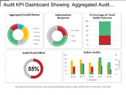
Audit kpi dashboard showing aggregated audit status and audit work effort




Try Before you Buy Download Free Sample Product
 Impress Your
 Audience
 100%
100% Editable
 Save Hours
 of Time


Discourage disputes with our Audit Kpi Dashboard Showing Aggregated Audit Status And Audit Work Effort. Encourage them to exist in harmony.
People who downloaded this PowerPoint presentation also viewed the following :
Audit kpi dashboard showing aggregated audit status and audit work effort with all 6 slides:
Folks feel driven to heed your ideas due to our Audit Kpi Dashboard Showing Aggregated Audit Status And Audit Work Effort. It empowers you to command attention.
FAQs for Audit kpi dashboard showing aggregated audit status and
So for your audit dashboard, I'd focus on the big three: efficiency, quality, and risk stuff. Track audit cycle time and budget variance - that operational side is crucial. Quality metrics like repeat findings rate and client satisfaction scores are solid picks. Don't forget the risk angle though - high/medium/low finding ratios plus any overdue remediation items. Honestly depends what your stakeholders actually want to see, but those cover most bases. Oh, and start with maybe 5-7 metrics tops. Nobody wants to stare at a crowded dashboard that gives them a headache. You can always add more later once people get comfortable with the basics.
Honestly, these dashboards are game-changers for spotting compliance issues fast. Everything's in one place instead of scattered across random spreadsheets. You can actually see patterns – like when accounting is always behind on their monthly stuff (why is it always accounting?). The visual setup makes problem areas jump out immediately. Best part? When your boss suddenly needs compliance numbers, you're not frantically digging through old emails. Set up alerts for the critical stuff so nothing sneaks by. Way better than playing catch-up after problems blow up.
Honestly, visualizing your audit data is a game changer. Raw spreadsheets are just painful to look at - nobody wants to dig through rows of numbers to find patterns. Heat maps work great for showing risk levels across different departments, and trend lines are perfect for tracking completion rates. Bar charts help with comparisons, gauges show how you're hitting targets. I always tell people to pick their top 5 KPIs first, then choose visuals that tell the story clearly. Good dashboards make problems jump out immediately. It's way easier than trying to spot issues buried in data tables.
Start by figuring out what compliance stuff actually matters for your industry - like SOX if you're public, GDPR if you handle tons of data. Most dashboard tools make it pretty straightforward to customize widgets for your specific risk indicators (setup's annoying at first though). Focus on what regulators actually look at during audits. Healthcare companies need HIPAA compliance rates, financial services track operational risk ratios. Honestly, generic audit metrics are pretty useless. You want templates built around your sector's real standards - that's what'll save you headaches down the road. Way more effective than trying to force generic stuff to work.
Honestly, I'd go with Power BI for audit dashboards. Most audit teams are already stuck in Microsoft hell anyway, so it'll play nice with Excel. Tableau makes prettier charts but the learning curve is brutal - like, unnecessarily complicated for what you need. If money's tight, Google Data Studio actually doesn't suck for basic stuff. Oh, and map out your KPIs first before you pick anything. Sounds obvious but I've seen people get excited about fancy tools then realize their data sources don't even connect properly. What a mess that becomes.
Most audit dashboards should refresh weekly, though daily works if you're tracking active audits. Weekly hits the sweet spot for compliance metrics and performance trends. Some teams go crazy with hourly updates - total waste of time honestly. Match your frequency to how fast stakeholders actually need to respond to stuff. I'd start weekly and see what people say. You can always bump it up if your team's constantly asking for fresher data. Daily makes sense when you're deep in an audit and need to watch progress closely.
Honestly, the biggest pain is trying not to track absolutely everything - total KPI overload. You'll want metrics for every little thing, but then nobody can see what actually matters. Executives love their high-level risk stuff, but your audit team needs different data to do their job better. Some audit outcomes are just impossible to measure properly, which is annoying. Oh, and good luck getting clean data when you're pulling from like 5 different systems that hate each other. My advice? Pick maybe 5-7 metrics that actually connect to your main goals. Add more later if people use them.
Track whether your auditors are actually logging in daily or just going through the motions. Check if audit cycles are wrapping up faster and findings get resolved quicker. Honestly, the best gauge? Just ask your team straight up if it's making their jobs easier. Data accuracy matters too - are stakeholders making smarter calls based on what they're seeing? If usage is low or audit outcomes haven't budged, time to rework the whole thing or do better training. Sometimes dashboards look great but don't actually move the needle, you know?
Honestly, forget about counting total findings - that just tells you how big the audit was. Focus on remediation velocity instead (how fast you close stuff out). Repeat finding rates are huge too. Same problems keep showing up? That's your real red flag right there. Management response time matters more than people think. Also track your control testing pass rates and how well stakeholders actually engage with you. When people don't cooperate or the same issues keep recycling, that's when audits go sideways. Build your dashboard around these predictive things, not last quarter's numbers.
Honestly, real-time data integration is a game changer for audit dashboards. You'll catch control failures and compliance issues as they're happening instead of finding out weeks later. No more waiting around for monthly updates that are already outdated. Your dashboard goes from just reporting what went wrong to actually helping prevent problems - which is way more useful if you ask me. Stakeholders finally get data they can trust for making decisions. Set up some automated alerts for the critical stuff so you don't have to babysit it constantly. Makes the whole thing predictive instead of always playing catch-up.
Honestly, if you don't figure out what your stakeholders actually want first, you're gonna waste so much time. Board members care about totally different stuff than your audit team does - like high-level risk vs. detailed finding status. I learned this the hard way on my last project lol. Interview the key people about their pain points and what decisions they're making. Then build your KPIs and layout around that. The audit committee might want one view while regulators need something completely different. It's basically impossible to design a useful dashboard without knowing who's using it and why.
Pull your last 18 months of audit data - that's your goldmine for setting realistic dashboard targets. I'd focus on cycle times, finding frequencies, and resolution rates first. Honestly, nothing kills team morale faster than those pie-in-the-sky KPIs that nobody can hit. Look for trends over 2-3 years to catch seasonal patterns and figure out what your team can actually handle. This way you'll know if current performance is just normal ups and downs or if something's actually broken. Start with your top 5 metrics that really matter, not the vanity ones.
Keep it simple - red for critical stuff, yellow for medium, green for low priority. Put the worst things right at the top where execs will actually see them. Don't dump every single metric on there or it becomes useless noise (honestly, some dashboards are just painful to look at). Trend lines are clutch - shows if you're making progress or things are getting worse. Each number should tie back to something they can actually fix. The whole point is they glance at it and know exactly what's on fire. Less is definitely more here.
So basically, the dashboard gives everyone the same numbers to work with instead of each department doing their own thing. Finance, operations, compliance - they're all looking at the same risk levels and audit findings. No more playing telephone with results, you know? The visual stuff actually makes sense to people who aren't audit nerds like us. I'd definitely set up regular check-ins with your key people so you can catch issues early. Honestly, it's just way easier when everyone's reading from the same playbook. Plus you'll spot those cross-department problems before they blow up.
Honestly, most audit dashboard failures happen because people cram way too many metrics in there. Like, I've seen ones with 40+ KPIs that just become visual noise. Nobody checks them because who has time for that? Another big issue - IT builds these fancy things without asking auditors what they actually need. Total waste. Those static monthly reports that pretend to be dashboards? Don't even get me started. Pick your top 5 metrics that truly move the needle on audit results. Get your team involved early so they'll actually use the thing. Simple beats complicated every time.
-
Great quality slides in rapid time.
-
Really like the color and design of the presentation.