

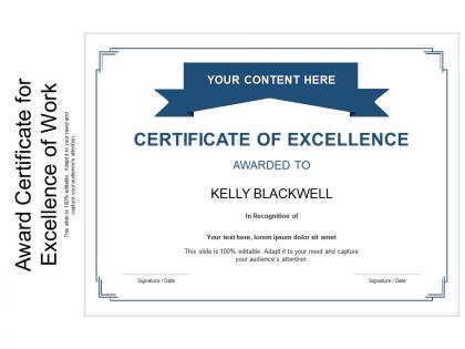
Award certificate for excellence of work




Try Before you Buy Download Free Sample Product
 Impress Your
 Audience
 100%
100% Editable
 Save Hours
 of Time


Our Award Certificate For Excellence Of Work are topically designed to provide an attractive backdrop to any subject. Use them to look like a presentation pro.
People who downloaded this PowerPoint presentation also viewed the following :
Award certificate for excellence of work with all 2 slides:
Use our Award Certificate For Excellence Of Work to effectively help you save your valuable time. They are readymade to fit into any presentation structure.
FAQs for Award certificate for
Definitely put their name front and center - that's what they're gonna frame, right? Include the award title and why they earned it. The organization's name and logo need to be visible too, plus the date and a real-looking signature. Nobody wants a certificate that screams "made on Microsoft Word." Add any specifics like what time period this covers or what they actually accomplished. Design-wise, keep it clean but not boring. Oh, and leave some breathing room around the text - cramped certificates look cheap and are honestly hard to read anyway.
Oh man, typography totally makes or breaks how legit your certificate looks. I'd go with something classic like Times New Roman or Trajan - they just scream "official." Comic Sans is obviously a hard no (saw someone use it once and it was painful). Make sure the recipient's name really pops too. Here's the thing though - font weight and spacing matter way more than people think. Bold serif fonts give you that traditional, prestigious vibe. Thin or cutesy fonts? They'll make even the most important award look like something from a school carnival. Good contrast and readable sizing are clutch for making people actually feel honored when they get it.
Honestly, minimalist is the way to go right now - clean lines, tons of white space, maybe just one pop of color. Those old-school ornate certificates with all the gold foil? They're kinda cringe now, not gonna lie. Modern sans-serif fonts look way better, plus geometric borders or subtle watermarks add nice touches without being extra. Digital ones are super popular too since people love posting their wins on LinkedIn. My advice? Keep the recipient's name huge and bold - that's what matters most. Simple but classy beats overdone every time.
Color psychology is huge for awards! Gold and deep blue instantly say "prestigious" and trustworthy. Red brings that energy and importance vibe. Green works great for achievement stuff. I still cringe thinking about when we used bright pink for engineering awards - what were we thinking? You've gotta match your industry though. Tech startups can get away with funky purples or orange, but traditional fields? Stick with navy, gold, or burgundy. The key is matching your message with what people expect to see. Don't overthink it, but definitely don't ignore it either.
Go with 8.5x11" or 11x14" - way easier to frame and cheaper to print. Landscape usually looks better since you get more room for names and it feels more traditional, but honestly portrait works fine if your design needs it. Make sure your text is readable from like arm's length away, so 12pt minimum for body text. Oh and definitely design at 300 DPI right from the start - trust me on this one, it saves headaches later whether you print at home or go professional. The resolution thing always bites people if they don't think about it early.
Honestly, digital certificates are so much better for engagement. Recipients can share them instantly on social media or LinkedIn - no more awful photos of crumpled paper certificates! They look way more professional too. The interactive stuff like verification links makes them feel legit and modern. Plus you'll never lose them since they're stored online forever. One thing I'd definitely do is set up automatic sharing when you send them out. Makes it super easy for people to show them off right away. Way better than the old paper system if you ask me.
Honestly, templates are a lifesaver for this stuff. They save you hours of work and make everything look way more professional than anything I could design myself. You just swap out the names and dates while keeping everything consistent across your certificates. Different departments or award types? No problem - just tweak the same template. I mean, unless you're secretly a graphic designer (which most of us definitely aren't), these give you that polished look without the headache. Pick one that fits your vibe and you'll have impressive certificates done in minutes.
Honestly, personalized certificates are so much better than those boring templates everyone uses. Throw in their actual achievements, maybe reference that killer project they nailed last month. I've literally watched people frame the custom ones while tossing generic certificates straight into drawers – pretty telling, right? A handwritten note from the boss hits different too. You could match their team colors or even add a photo from when they crushed that deadline. Little stuff like mentioning their anniversary with the company shows you actually see them as a person, not just another employee.
Okay so certificate writing - use their full name and be super specific about what they actually did. Date and organization name are obvious musts. Don't get all flowery with the language, honestly nobody wants to read a paragraph hanging on their office wall. "Presented to" sounds way better than weird passive stuff. Spell check everything twice because having to reprint these is annoying as hell. Oh and include whoever's giving it with their proper title. The whole point is that someone reading it in like five years should immediately get what the person accomplished. Keep it formal but not stuffy, you know?
Do certificates toward the end - people still have energy but aren't completely checked out yet. Call each person up individually because honestly, everyone's there for the photo moment anyway. Get someone to handle pics with decent lighting. When you hand it over, mention what they actually did, not just "congrats Sarah." Don't rush the handshake part, but keep things moving so the line doesn't drag forever. Oh and grab someone else to hold the mic - you need both hands free for the actual handoff. Makes everything way smoother.
Your logo and graphics are literally what make people take the certificate seriously. Like, you instantly know a Harvard diploma vs some sketchy online thing, right? Pull your brand colors and fonts first, then build everything around those. I've seen gorgeous certificates that look nothing like the company's other stuff - super confusing. Don't let fancy graphics overshadow the person's name and what they actually achieved. Stick to your existing brand guidelines so everything feels cohesive. The visuals should back up the recipient's accomplishment, not steal the show.
Honestly, good paper makes all the difference - people can tell cheap cardstock from across the room. Stick with clean fonts (2-3 max) and don't go crazy with colors. White space is your friend here. Make the recipient's name pop as the main focus, keep your logo sharp. I learned this the hard way but always print a test first! What looks amazing on your laptop screen can look terrible on paper. Oh and templates are totally fine - Canva's got decent ones if you're not artsy. The whole thing should feel cohesive with your brand colors. Simple beats fancy every time.
Just don't oversell what the award actually means - that's where you'll run into trouble. Avoid making it sound official or government-backed if it's not. Short sentences work best here. Keep the language simple and truthful, especially if people might put it on their resume or something. Oh, and check you're not using any company logos without asking first - that trademark stuff can bite you. Most certificates are pretty harmless legally though. I mean, as long as you're not claiming it's from Harvard when it's really just from your book club, you should be fine. When in doubt, boring and factual wins.
Honestly, testimonials are game-changers for award certificates. They give you that third-party validation that actually means something. Like, sure you can say you won an award, but when a client writes "This completely transformed how we work" - that hits different, you know? Way better than generic stuff like "great job." The trick is getting specific quotes with real details. Oh, and definitely ask permission first (learned that one the hard way). Include their name and title too. Makes it look legit instead of like you just made something up.
Honestly, just go with Canva for this one. Their certificate templates are actually pretty decent and you can bang one out super fast. If you're already comfortable with design stuff, Adobe InDesign gives you way more control over everything. PowerPoint works too if you want something simple - I know it sounds basic but it gets the job done. Google Docs has templates now which is kinda random but whatever. Microsoft Publisher's another option. But seriously, start with Canva. You'll have something that looks professional in maybe 20 minutes, and you can tweak the colors and text however you want.
No Reviews