


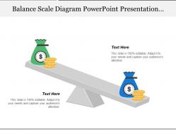
Balance scale diagram powerpoint presentation templates 1





Try Before you Buy Download Free Sample Product
 Impress Your
 Audience
 100%
100% Editable
 Save Hours
 of Time


Our Balance Scale Diagram Powerpoint Presentation Templates 1 don't allow distractions to intrude. It ensures intensity of focus.
People who downloaded this PowerPoint presentation also viewed the following :
Balance scale diagram powerpoint presentation templates 1 with all 5 slides:
Create the atmosphere for a friendly exchange with our Balance Scale Diagram Powerpoint Presentation Templates 1. It will give birth to camaraderie.
FAQs for Balance scale diagram powerpoint
**INPUT**: What are the key components of an effective balance scale diagram template? **OUTPUT**: Effective balance scale diagram templates include a central fulcrum, balanced arms or platforms, clear labeling areas, comparative elements, and visual weight indicators. These components streamline decision-making processes by enabling clear comparisons, facilitating stakeholder discussions, and presenting complex trade-offs visually, with many organizations finding that balanced presentations ultimately enhance strategic planning and improve buy-in. **Word count: 56 words**
Balance scale diagrams enhance presentation clarity by visually representing competing options, trade-offs, pros and cons, and weighted factors in an immediately comprehensible format. These templates enable presenters to streamline complex decision frameworks, facilitate stakeholder alignment through clear visual comparisons, and accelerate consensus-building processes, with many organizations finding that visual balance representations significantly reduce meeting times while improving decision quality.
Industries such as finance, healthcare, legal services, consulting, and project management benefit significantly from balance scale diagram templates. These sectors frequently present risk assessments, cost-benefit analyses, compliance comparisons, and strategic trade-offs, with many organizations finding that visual balance representations enhance stakeholder understanding and accelerate decision-making processes.
**INPUT**: Are there any specific design elements that should be prioritized in a balance scale diagram template? **OUTPUT**: Essential design elements include clear visual hierarchy, proportional scaling, consistent color coding, readable typography, and intuitive labeling systems. These elements enhance comprehension by ensuring stakeholders quickly grasp comparative relationships, weight distributions, and decision factors, with many organizations finding that well-designed templates streamline presentations and accelerate strategic discussions.
Color schemes in balance scale diagrams significantly influence audience perception by establishing visual hierarchy, emotional context, and comprehension speed through strategic use of contrasting hues, complementary palettes, and symbolic associations. These design choices enhance message clarity by guiding attention to key comparisons, reinforcing brand identity, and creating intuitive understanding, with many organizations finding that thoughtful color application improves audience engagement and decision-making processes.
Common mistakes when creating balance scale diagrams include overcrowding elements, using inconsistent sizing to represent weight/importance, poor color choices that confuse rather than clarify, unclear labeling, and failing to maintain visual balance. These design flaws often result in audiences misunderstanding comparisons, with many presenters finding that simplified layouts, consistent proportional sizing, and strategic color coding ultimately deliver clearer messaging and stronger audience engagement.
Balance scale diagrams can be customized through color coding, industry-specific icons, tailored labels, adjustable comparison elements, and audience-appropriate terminology. These customization options enable organizations to align presentations with brand guidelines, sector requirements, and stakeholder preferences, with many businesses finding that personalized diagrams enhance message clarity, improve audience engagement, and ultimately deliver more impactful decision-making support.
Professional balance scale diagrams can be created using PowerPoint, Visio, Lucidchart, Canva, and specialized presentation platforms like SlideTeam. These tools streamline diagram creation by offering pre-built templates, customizable elements, and professional formatting options, with many organizations finding that dedicated presentation software delivers the most polished results for business communications.
Instructors can incorporate balance scale diagrams by using them to teach mathematical concepts like equations and inequalities, illustrate cause-and-effect relationships in science, demonstrate economic principles like supply and demand, and visualize decision-making processes across subjects. These visual tools enhance student comprehension by transforming abstract concepts into tangible comparisons, with many educators finding that balance scales significantly improve retention rates and engagement in mathematics, science, and critical thinking lessons.
Balance scale diagrams effectively illustrate trade-offs in budget allocation decisions, risk versus reward investment scenarios, work-life balance discussions, cost-benefit analyses, and resource prioritization challenges. These visual tools streamline complex decision-making processes across healthcare, finance, and corporate strategy, with many organizations finding that balance scales enhance stakeholder understanding while delivering clearer strategic insights and faster consensus-building.
Balance scale diagrams adapt to each field's specific needs, with marketing using them for brand positioning and competitive analysis, finance for risk-reward assessments and portfolio balance, and engineering for load distribution and system equilibrium calculations. These versatile templates enable professionals to visualize trade-offs, compare alternatives, and communicate complex decisions effectively, with many organizations finding that sector-specific customizations enhance stakeholder understanding and strategic decision-making processes.
Balance scale diagrams can be innovatively combined with flowcharts showing decision processes, timeline graphics illustrating before-and-after scenarios, pie charts displaying resource allocation, and interactive dashboards presenting real-time comparisons. These strategic combinations enhance audience engagement by creating multi-dimensional narratives, with many organizations finding that layered visual approaches streamline complex presentations while delivering clearer insights and more compelling business cases.
Animations and interactive elements enhance balance scale diagrams by enabling dynamic weight adjustments, step-by-step scenario comparisons, and real-time visual feedback that illustrate cause-and-effect relationships. These interactive features allow presenters to demonstrate shifting priorities, evolving market conditions, and strategic trade-offs in real-time, ultimately delivering more engaging stakeholder experiences and clearer decision-making frameworks.
Annotations and labels enhance balance scale diagrams by providing context, clarifying relationships between elements, explaining weighted factors, and defining measurement criteria. These textual additions transform visual metaphors into comprehensive communication tools, enabling audiences to quickly grasp complex comparisons, trade-offs, and decision frameworks, ultimately delivering clearer presentations and more persuasive business arguments.
Balance scale diagrams facilitate structured team discussions by visually organizing arguments, encouraging balanced analysis, and creating shared reference points for decision-making. These templates enable teams to systematically evaluate competing priorities, with many organizations finding that the visual format reduces bias, promotes inclusive participation, and accelerates consensus-building, ultimately delivering clearer strategic decisions.
-
Best Representation of topics, really appreciable.
-
Much better than the original! Thanks for the quick turnaround.