


Bar graph showcasing increase revenue growth sample of ppt




Try Before you Buy Download Free Sample Product
 Impress Your
 Audience
 100%
100% Editable
 Save Hours
 of Time


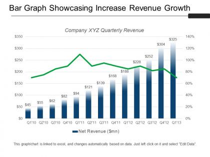
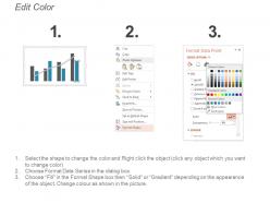
Download bar graph showcasing increase revenue growth sample of PPT to create a long term plan for business growth. With the help of this revenue growth PPT template, you can accurately measure and analyze the impact of revenues on monthly and annual growth or on customer lifetime value. This strategy to increase sales revenue presentation slide has been created by our professional team members and allow you to showcase how sales and revenue are both interlinked to optimize profits. The way to boost sales presentation slide can be used to visualize various points by which you can leverage sales such as to learn more about competitors, create innovation and unique products, build a customer service approach, focus on marketing efforts and provide credible products. Our histogram template with vertical standing lines can be used to showcase data of your achievements , sales targets and the data figures of achieved revenues. Check out this strategy to improve sales template and for more, you can visit our website. Identify acts of generosity with our Bar Graph Showcasing Increase Revenue Growth Sample Of Ppt. Highlight excellent examples to follow.
People who downloaded this PowerPoint presentation also viewed the following :
Bar graph showcasing increase revenue growth sample of ppt with all 5 slides:
Increase the degree of elation felt with our Bar Graph Showcasing Increase Revenue Growth Sample Of Ppt. It helps add a bit of jazz.
FAQs for Bar graph showcasing increase revenue growth
For your bar chart, definitely include the actual revenue numbers for each period plus the percentage growth rates. Year-over-year and quarter-over-quarter comparisons work great. Oh, and break it down by product lines or segments if that helps tell your story better. Honestly, bar graphs are perfect because trends just jump out at you immediately. Keep your time intervals consistent - that's huge. Also throw data labels right on top of each bar so people don't have to guess what they're looking at. Those basics will give you a really solid chart that actually shows where your revenue's headed.
Dude, colors can totally mess with how people read your charts! Like, bright green screams "amazing news!" while deep red feels like disaster mode. Same exact 5% growth can look either impressive or meh depending on your palette. Warm colors (orange, yellow) make things feel energetic and positive. Blues and grays? More neutral, sometimes even boring. I've literally watched people react completely differently to identical data just because of color choices - it's wild how much psychology plays into it. Just pick colors that actually match what your numbers are saying.
Okay so definitely put the dollar amounts right on the bars - like $2.5M format, not mixing it with $2,500,000 because that looks messy. Then add the growth percentages nearby, maybe as little annotations or whatever works. Honestly the worst charts are ones where you're squinting trying to figure out the numbers! Make your time periods super obvious on the bottom. Oh and if there's negative growth, totally use red - it just makes sense visually. You don't want people doing math in their heads when they could be focusing on your actual point.
Organize your bar graph chronologically - that's the key. Look for those recurring peaks and dips hitting at the same times yearly. Holiday shopping seasons will jump out at you, along with the predictable slow months. Honestly, the visual approach beats staring at endless spreadsheet rows any day. Color-coding different years helps the patterns pop more. Monthly data can get pretty noisy though, so don't be afraid to group by quarters instead. You'll spot those seasonal trends way faster once everything's lined up properly on your chart.
Dude, definitely go with grouped bar charts for revenue comparisons. They're perfect for seeing side-by-side numbers across different time periods. Stacked bars? Eh, they work if you need to show revenue breakdowns, but honestly they get confusing when people try to compare the totals. With grouped bars, anyone can instantly spot which quarters killed it and which ones... didn't. Oh, and skip all that 3D nonsense - it just makes everything look warped. Start simple with grouped charts, then maybe add complexity later if you really need those component details too.
So context is everything with revenue graphs, trust me. That 5% growth? During a recession it's amazing, but in a boom market you're probably falling behind competitors. I always add little notes explaining what was happening – like "oh hey, remember when supply chains went crazy in Q3?" Economic stuff, seasonal changes, industry drama – all of it matters way more than just staring at the bars. Don't let people think that revenue dip was your fault when the whole market tanked, you know?
So here's the thing - revenue numbers by themselves don't tell you much. Are those bars going up because you're crushing it, or just because it's a good month for everyone? Add some benchmark lines to your charts - industry averages, competitor data, whatever makes sense for your situation. Horizontal lines work best so people can see at a glance if you're ahead or behind. Your own past performance is honestly sometimes the most useful comparison. Trust me, stakeholders love this stuff because it actually gives context to the story. Makes boring revenue charts way more interesting too.
Interactive bar graphs are way better than regular slides - people can actually click around and explore the revenue data themselves. Add hover effects for exact numbers and clickable segments so they can drill into specific quarters. Real-time animations work great too as you're presenting. Honestly, everyone's scrolling on their phones half the time anyway, so getting them to actually participate keeps them engaged. When people discover insights on their own, they remember it better. Tableau's probably your best bet, though PowerBI works if you don't want to code anything.
Tableau and Power BI are your best bet for anything fancy - they make financial dashboards look incredible. But honestly? Excel still rocks if your team's already using it for everything else. Google Sheets or Canva work fine too when you just need something clean and simple. The main thing is watching your scale so you don't make 2% growth look like you doubled revenue or whatever. I'd probably start with whatever you already know how to use, then switch later if you need more features. No point learning new software unless you actually need it.
Call out any weird data stuff right on your chart - don't hide it. Add footnotes like "Q2 restated" or whatever applies to your situation. Trust me, someone will notice that random spike in Q3 anyway, so beat them to it. If you estimated missing numbers, just say so. Keep your time periods consistent and make sure you're measuring revenue the same way across all quarters. Being upfront about data decisions actually makes you look more credible. Way better than getting called out mid-presentation when Karen from accounting spots something fishy.
Oh dude, you should totally try combining bar and line graphs for revenue stuff. The bars show your actual numbers while the line tracks trends or percentage changes. It's like getting two stories at once - people see the concrete data they want, but they also catch growth patterns they'd miss with just bars. Super helpful for spotting when things are speeding up or slowing down. Honestly, I was skeptical at first, but it works. Your stakeholders will get both the "what happened" and "how fast is this moving" without you having to explain it. Game changer for quarterly presentations.
Honestly, bar graphs are perfect for spotting revenue patterns - just look for seasonal bumps or consistent dips that keep showing up. Start by calculating your year-over-year growth percentages from each bar. That'll show your average growth rate. You'll need at least 2-3 years of decent data though, otherwise you're just guessing. Once you see the pattern, project it forward but tweak for any market shifts you expect. Pro tip: use lighter colored bars for your forecasts next to the historical ones. Makes it super easy for people to see what's real vs projected. Works every time.
Honestly? The worst thing you can do is mess with your y-axis - I've seen people make a tiny 5% bump look like they tripled sales just by starting the scale at like 95 instead of zero. Super tempting when you're nervous about a presentation, but don't do it. Also watch out for cherry-picking your dates or making bars different widths to hide stuff. Mixing up your data sources is another classic mistake. Just keep your scales consistent and start revenue charts at zero. People will notice these tricks eventually and then you look sketchy.
Honestly, it all comes down to who's gonna be staring at your charts. Executives want clean, simple visuals with the key growth numbers front and center - no clutter. Sales teams are different though, they actually love diving into the colorful breakdowns by product and region. Technical folks? They're all about seeing your data sources and methodology spelled out clearly. For investors and board members, stick with conservative colors and focus on those year-over-year comparisons they care about. I learned this the hard way after bombing a presentation once. Just match your design complexity to your audience and you'll be golden.
Honestly, the best bar charts tell a story instead of just showing data. Start with your biggest growth period to grab attention right away. Then use colors that build momentum - maybe muted grays shifting to bright blues as revenue climbs. Those little annotation boxes are gold though - drop in quick notes like "launched premium tier" or "holiday boost" right on the chart. I'm always way more engaged when someone reveals the quarters one by one rather than dumping everything at once. Makes you actually feel the growth happening, you know?
-
Informative presentations that are easily editable.
-
The Designed Graphic are very professional and classic.