


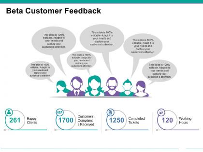
Beta customer feedback example of ppt




Try Before you Buy Download Free Sample Product
 Impress Your
 Audience
 100%
100% Editable
 Save Hours
 of Time


Bring the focus back to the facts at hand with our Beta Customer Feedback Example Of Ppt. Identify attempts at diverting attention.
People who downloaded this PowerPoint presentation also viewed the following :
Beta customer feedback example of ppt with all 5 slides:
Our Beta Customer Feedback Example Of Ppt don't allow averages to decide. They are geared for the exceptional.
FAQs for Beta customer feedback
Dude, those smart layouts are seriously a lifesaver - I'm talking hours saved every week. The color suggestions actually work too, not like other tools that want you using hot pink for budget reports lol. Master slide templates keep me from going insane trying to match fonts across 50 slides. Oh, and charts format with one click now instead of that Excel nightmare we all know. Start with the smart layouts first if you're new to it - biggest time saver by far. My OCD brain loves how consistent everything stays without effort.
Honestly, it's pretty straightforward - takes maybe 10-15 minutes to figure out the basics. You just drag stuff around and click on text to edit it. All the formatting buttons are where you'd think they'd be. Advanced stuff can be trickier though. Like, I spent forever hunting for the color palette settings (why they buried that I'll never know). People usually only get stuck when they jump straight into crazy complex layouts. Better to start with a simple template first, then mess around from there. Most of our beta users get it without needing much help.
So our beta users gave us some pretty useful stuff to work with. Visual hierarchy is the big one - people can't scan through our layout quickly enough to find what they're looking for. Mobile nav feels janky too, which honestly doesn't surprise me. And yeah, everyone's asking for dark mode because of course they are. Most of this is fixable though. I'd go after the hierarchy problems first since that's what's actually breaking the user experience. Then we can sort out the mobile stuff before launch.
So our beta users are pretty stoked about the templates - they're saying it's way more intuitive than PowerPoint's mess of an interface. Google Slides got roasted too, which honestly made me laugh. The drag-and-drop stuff is getting tons of love, and people aren't struggling with the learning curve at all. Short sentences win sometimes. Canva still beats us on color options (annoying but fair), but we're definitely winning on ease of use overall. You should peek at that feedback thread when you get a chance - there's some really actionable stuff in there that we could probably knock out pretty quick.
Your beta users seem pretty stoked about covering the main stuff - onboarding, sales outreach, project updates. That's good news. But they're definitely wanting more meat on the bone for technical docs and customer support scenarios. Industry-specific templates came up a lot too, especially healthcare and finance (those industries are always picky about their templates, honestly). I'd probably add like 10-15 new ones in those gaps. The foundation you've got is working, so it's more about filling holes than starting over.
Honestly, the templates work pretty well for basic stuff. Most beta users can swap colors, change fonts, and throw their logo on without drama. Color picker's solid and font choices hit the main ones - though I really wish they'd add more Google Fonts already. Complex brand guidelines are where things get messy. Customers with super strict spacing rules or specific design elements? Yeah, they're gonna struggle. People keep asking for more control over margins and maybe some preset themes. I'd just ask your current users what's actually bugging them most about branding, then fix those first.
Ugh yes, those templates can be such a pain sometimes. The formatting gets all wonky when you copy stuff between sections - drives me crazy when I'm rushing to move things around. Also the image placeholders? Total mess on mobile preview, they never resize right. Auto-save freaks out too if you type too fast, which honestly feels like poor design. But real talk, even with these annoying quirks I still use them constantly because they're huge time savers. You should definitely put together some kind of quick fix guide for the formatting stuff since that's what trips people up most.
Your templates need real company examples, seriously. I'm just guessing at best practices without seeing how others actually use them. Video walkthroughs would help too since I hate reading through walls of text - I learn way better visually. Oh, and troubleshooting guides for common problems? I keep hitting the same issues over and over. It's annoying having to figure everything out from scratch each time. You don't need to go crazy - just start with one solid example per template and see how it goes.
So the beta feedback came back pretty mixed, tbh. Aesthetics scored around 6-7 out of 10 - not awful but could be way better. Main issues? Color schemes feel dated and fonts are too "corporate-stuffy" (customers' words lol). Clean layouts are working though, which is good news. Honestly, it sounds like the functionality is solid but everything just needs to look more modern. People want something that actually feels engaging, you know? I'd definitely push for a design refresh next quarter - seems like that's where you'll get the biggest impact.
Honestly, the beta feedback on templates is pretty solid - people are obsessed with them for stuff like onboarding and support tickets. Super quick to set up, which everyone loves. Short, repeatable processes? They're perfect. But here's the thing - they kinda suck when teams need heavy customization or work in weird niche industries. I keep thinking we should frame them more as starting points, not the final answer. Oh, and definitely focus on building industry-specific ones next time. The generic approach only goes so far, you know?
So the beta users kept asking for way more control over colors and fonts - that feedback was everywhere. They also really want drag-and-drop for moving template sections around since the current setup is too rigid. The preview thing is apparently super clunky right now too. Honestly, the biggest game-changer would be adding conditional logic so templates actually adapt to different user data. Oh, and most people mentioned wanting to save their custom templates to reuse later. I'd tackle the drag-and-drop and color stuff first - seems like those are easier fixes that'll make people way less frustrated.
It's pretty solid overall, but could be better. PDF and PNG downloads work well - quality's good, speeds are fine. But honestly? The lack of editable formats like PSD or AI files is super annoying. Sometimes I just need to tweak one little thing and can't without redoing everything from the ground up, which is such a pain. More native design formats would be amazing, especially for premium stuff. That alone would totally change how we use it for our projects.
Honestly, you'll want real-time chat when you're editing templates. Nothing worse than being stuck mid-project and having to wait hours for an email response. Screen sharing is a lifesaver too - way easier to show someone what's bugged out than trying to describe it over text. I always get annoyed when I have to pause everything just to write some detailed support ticket, you know? Quick calls work best, especially if they can watch while you recreate whatever's going wrong. Oh, and make sure whoever helps you actually gets the template system. Trust me, you don't want to waste time teaching support the basics first.
Honestly, I'd use your templates for maybe 60-70% of my presentations. Client stuff and quarterly reviews especially - those polished templates would be perfect. Way too much of my time gets wasted messing around with slide layouts instead of actually working on content, which is honestly kind of embarrassing. Quick team meetings? Probably not worth it. But anything going to leadership or clients would definitely benefit. Oh, and track which template styles your beta users download most - that's gonna tell you what people actually want versus what just looks pretty.
Your beta users keep hammering on speed and personalization - those two things came up everywhere. Response times under 30 seconds would crush the competition, honestly. But the personalization thing? That's where you'll really win. People are tired of cookie-cutter responses that ignore their actual business needs. Most companies still treat customers like ticket numbers, which is crazy for 2024. I'd go back through those feedback threads and grab the exact words customers used - that's your best blueprint right there.
-
Designs have enough space to add content.
-
Excellent products for quick understanding.