


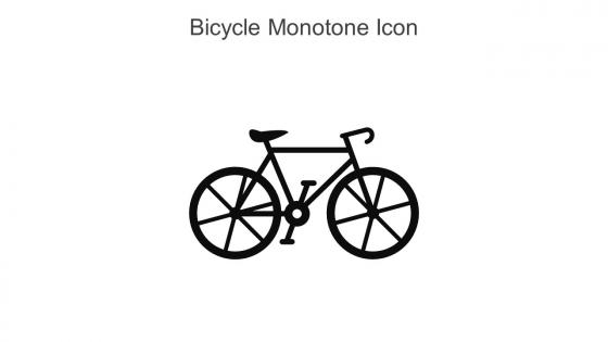
Bicycle Monotone Icon In Powerpoint Pptx Png And Editable Eps Format




Try Before you Buy Download Free Sample Product
 Impress Your
 Audience
 100%
100% Editable
 Save Hours
 of Time


This Bicycle monotone icon in powerpoint pptx png and editable eps format is a 100 percent editable icon. The downloaded file will have this icon in EPS, PNG and Powerpoint pptx format and is perfect for your next project. It has a simple yet stylish design.
People who downloaded this PowerPoint presentation also viewed the following :
Bicycle Monotone Icon In Powerpoint Pptx Png And Editable Eps Format with all 6 slides:
Use our Bicycle Monotone Icon In Powerpoint Pptx Png And Editable Eps Format to effectively help you save your valuable time. They are readymade to fit into any presentation structure.





FAQs for Bicycle Monotone Icon In Powerpoint Pptx Png And
A bicycle monotone icon offers clean visual communication in presentations, representing concepts like sustainability, transportation, health, eco-friendly initiatives, and urban mobility without color distractions. These minimalist icons enhance professional presentations by maintaining design consistency, improving readability across different backgrounds, and enabling audiences to focus on core messages, with many organizations finding that monotone visuals streamline complex information delivery.
A bicycle monotone icon enhances sustainability messaging by providing clear visual recognition, reinforcing eco-friendly transportation themes, and creating memorable associations with carbon reduction efforts. Through minimalist design, the icon seamlessly integrates across slides while supporting corporate sustainability narratives, with many organizations finding that simple, recognizable symbols significantly strengthen environmental messaging and audience engagement.
When creating a bicycle monotone icon, consider simplicity, scalability, recognizability, contrast, and consistency with your brand aesthetic. These principles work together by eliminating unnecessary details, ensuring visibility across sizes, maintaining clear geometric shapes, and using strategic negative space, with many designers finding that focusing on the distinctive wheel-frame silhouette ultimately delivers maximum impact and universal recognition.
Bicycle monotone icons are most effectively utilized in sustainability presentations, transportation planning decks, health and wellness materials, urban development proposals, and environmental impact reports. These versatile icons enhance presentations by providing clear visual communication across diverse sectors, with many organizations finding that the minimalist design maintains professional aesthetics while conveying movement, eco-consciousness, and active lifestyle messaging seamlessly.
Color choice significantly influences a bicycle monotone icon's perception by affecting brand recognition, emotional response, visual hierarchy, and accessibility considerations. Through strategic color selection, designers enhance user engagement, improve readability across different backgrounds, and align with brand identity guidelines, while darker tones often convey professionalism and lighter shades suggest approachability, ultimately delivering stronger visual communication.
**Adobe Illustrator, Figma, Canva Pro, Sketch, and Inkscape** are top choices for creating custom bicycle monotone icons for presentations, offering vector-based design capabilities and scalable graphics. These tools enable designers to craft clean, professional icons through precise line work, customizable stroke weights, and monochromatic color schemes, with many presentation creators finding that vector-based icons maintain clarity across different slide formats and screen resolutions.
A bicycle monotone icon integrates into branding strategies through logo design, packaging elements, digital marketing materials, merchandise applications, and social media graphics. This versatile symbol enhances brand recognition by conveying eco-friendliness, health consciousness, and sustainability values, with companies in fitness, environmental services, and urban mobility finding that consistent icon usage across touchpoints delivers stronger brand identity and customer connection.
Monotone icons, particularly bicycle icons, create psychological calm and focus by reducing visual distractions, enhancing cognitive processing, and establishing consistent brand identity throughout presentations. The bicycle symbol specifically evokes movement, progress, and environmental consciousness, while the monotone treatment ensures audience attention remains on content rather than decorative elements, ultimately delivering clearer communication and stronger message retention.
Current icon design trends in transportation emphasize minimalism, accessibility, and universal recognition, with flat design, simplified geometric shapes, and high contrast ratios dominating the landscape. These approaches streamline user interfaces by reducing visual clutter, enhancing readability across devices, and ensuring instant recognition, with many transportation apps and platforms finding that monotone icons significantly improve navigation efficiency and user experience.
Bicycle monotone icons symbolize growth through forward motion, journey progression, and momentum building, making them ideal for milestone tracking, process flows, and development timelines. These versatile icons enhance business presentations by representing continuous improvement, sustainable progress, and team collaboration, with many organizations finding that bicycle imagery effectively communicates balanced advancement and steady achievement toward strategic goals.
Common mistakes include using inconsistent icon styles, choosing overly complex designs, poor sizing that creates visual hierarchy issues, and selecting icons that don't clearly represent their intended concepts. These errors often result from mixing different icon families or prioritizing aesthetics over clarity, with many presenters finding that simple, uniform icon sets enhance audience comprehension while maintaining professional visual consistency throughout their presentations.
Cultural perceptions significantly influence bicycle monotone icon interpretation, with Western cultures often associating bicycles with recreation, fitness, and environmental consciousness, while other regions emphasize transportation necessity and economic accessibility. These cultural frameworks shape how viewers decode the icon's meaning in presentations, with many designers finding that context-sensitive application delivers clearer communication and broader audience engagement across diverse markets.
Visual hierarchy guides viewer attention through strategic placement, sizing, contrast, and spacing of your bicycle monotone icon relative to other slide elements. When used effectively, the icon can serve as a focal point, supporting visual, or navigational element, with many presenters finding that proper hierarchy enhances message clarity and audience engagement.
Effective presentations using bicycle monotone icons include sustainability reports showcasing eco-friendly transportation, urban planning proposals illustrating bike lane integration, health campaigns promoting active lifestyles, delivery service presentations highlighting last-mile solutions, and corporate wellness programs encouraging employee fitness initiatives. These icons streamline visual communication by providing clear, recognizable symbols that enhance audience comprehension while maintaining professional aesthetics, ultimately delivering stronger message retention and engagement across diverse business contexts.
Corporate presentations typically use bicycle icons to symbolize sustainability initiatives, green transportation policies, employee wellness programs, and eco-friendly business practices. Educational contexts favor bicycle icons for health curriculum, environmental science lessons, transportation studies, and community safety programs, with many schools finding that visual symbols enhance student engagement and comprehension across diverse learning styles.
-
The designs by SlideTeam are honestly the best I have seen so far. Will be definitely coming back for more.
-
I discovered some really original and instructive business slides here. I found that they suited me well.