

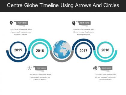
Centre globe timeline using arrows and circles




Try Before you Buy Download Free Sample Product
 Impress Your
 Audience
 100%
100% Editable
 Save Hours
 of Time


Our Centre Globe Timeline Using Arrows And Circles facilitate your functioning. They help you avoid any extra fuss.
People who downloaded this PowerPoint presentation also viewed the following :
Centre globe timeline using arrows and circles with all 5 slides:
Include every angle in your assessment with our Centre Globe Timeline Using Arrows And Circles. Adopt an expansive approach.
FAQs for Centre globe timeline using
Key principles for effective timeline visualization include chronological accuracy, visual hierarchy, appropriate scale selection, clear labeling, and consistent formatting throughout the design. These principles work together by establishing logical flow, emphasizing critical milestones, and maintaining visual clarity, with many organizations finding that well-designed timelines enhance stakeholder understanding and streamline project communication processes.
Different types of timeline visualizations significantly impact engagement through visual hierarchy, interactivity, and cognitive load management, with linear timelines enhancing chronological understanding while interactive and branching formats increasing user participation. Organizations in education, marketing, and project management find that combining visual elements like animations, color coding, and multimedia integration delivers higher retention rates and deeper comprehension, ultimately enabling more effective communication and strategic storytelling across diverse audiences.
**INPUT**: What software or tools are recommended for creating dynamic and interactive timeline visualizations? **OUTPUT**: Recommended tools include Tableau, Power BI, D3.js, TimelineJS, and Visio, each offering unique interactive capabilities for dynamic presentations. These platforms streamline data storytelling by enabling real-time updates, collaborative editing, and multi-format exports, with many organizations finding that interactive timelines enhance stakeholder engagement and project transparency significantly.
Timeline visualizations adapt across industries by incorporating sector-specific milestones, regulatory requirements, and operational workflows that reflect each field's unique processes. In healthcare, timelines track patient treatment progressions, clinical trial phases, and regulatory approvals, while educational institutions use them for curriculum development, student progression tracking, and accreditation cycles, ultimately enabling organizations to streamline compliance monitoring and enhance strategic planning across diverse operational contexts.
Common mistakes in timeline visualizations include inconsistent time scales, overcrowded data points, poor color choices, missing context labels, and inadequate spacing between events. These errors undermine clarity by confusing audiences, obscuring key milestones, and reducing comprehension rates, with many organizations finding that clean, well-structured timelines significantly enhance stakeholder understanding and project communication effectiveness.
Color and typography enhance timeline effectiveness by creating visual hierarchy, improving readability, guiding attention flow, and enabling categorical differentiation across events or periods. Strategic color coding helps audiences quickly identify patterns, phases, or priorities, while consistent typography establishes clear information architecture, ultimately delivering more intuitive navigation and faster comprehension for stakeholders reviewing project milestones or historical progressions.
Timelines aid storytelling by creating chronological structure, establishing clear narrative flow, highlighting key milestones, and connecting cause-and-effect relationships between events. Through visual progression, presenters can guide audiences through complex developments, whether showcasing product evolution, project phases, or company growth, ultimately delivering more engaging and memorable presentations that enhance audience comprehension and retention.
Interactivity transforms timeline visualizations by enabling users to zoom, filter, hover for details, and navigate through different time periods or data layers. These interactive features enhance user engagement and comprehension, with many organizations finding that clickable timelines, dynamic filtering, and real-time updates significantly improve decision-making processes and data exploration experiences.
Data accuracy in timeline visualizations is ensured through systematic data validation, cross-referencing multiple sources, implementing version control systems, and establishing clear data governance protocols. Organizations across sectors like healthcare and finance find that combining automated verification tools with manual review processes, standardized date formats, and regular audits ultimately delivers reliable visual narratives while minimizing costly misinterpretations.
Latest trends in timeline visualization design include interactive storytelling elements, mobile-responsive layouts, data-driven animations, vertical scrolling formats, and integrated multimedia content. These approaches enhance user engagement by combining dynamic visual elements with intuitive navigation, while many organizations find that modern timeline designs significantly improve information retention and deliver more compelling presentations across digital platforms.
Project timelines illustrate management workflows through milestone mapping, dependency visualization, resource allocation tracking, and progress monitoring across project phases. These visual frameworks enable teams to identify bottlenecks, coordinate deliverables, and maintain stakeholder alignment, with many organizations finding that clear timeline presentations reduce project delays while enhancing team coordination and client communication.
**INPUT**: What are the best practices for annotating timeline visualizations without cluttering the design? **OUTPUT**: Best practices include using selective labeling for key milestones, hierarchical text sizing, strategic white space management, hover interactions for detailed information, and color-coded annotation systems. These approaches streamline information delivery by prioritizing critical events, maintaining visual clarity, and enabling progressive disclosure, with many organizations finding that layered annotation strategies enhance audience comprehension while preserving design elegance. [Word count: 58 words]
Timeline visualizations enhance historical analysis by organizing chronological data, highlighting patterns and relationships, identifying cause-and-effect sequences, and revealing temporal gaps or overlaps in research. These tools streamline complex historical narratives, enable researchers to present compelling evidence-based arguments, and help audiences grasp intricate connections between events, ultimately delivering clearer insights and more persuasive presentations.
Creative timeline visualizations include interactive scrolling experiences like The New York Times' "Snow Fall," circular timelines for cyclical processes, animated data storytelling, and immersive multimedia journeys combining video, audio, and graphics. These innovative approaches enhance audience engagement by transforming linear information into compelling visual narratives, with organizations across media, education, and corporate sectors finding that interactive elements, strategic animations, and multi-sensory design significantly increase viewer retention and comprehension.
User feedback improves timeline visualization design by identifying usability pain points, highlighting confusing navigation elements, and revealing which data hierarchies resonate most effectively with end users. Through iterative testing and stakeholder input, organizations can refine visual clarity, enhance interactive features, and optimize information density, ultimately delivering more intuitive interfaces that accelerate decision-making processes.
-
Awesome use of colors and designs in product templates.
-
Best Representation of topics, really appreciable.