


Circular progress bar powerpoint ppt template bundles




Try Before you Buy Download Free Sample Product
 Impress Your
 Audience
 100%
100% Editable
 Save Hours
 of Time


Our Circular Progress Bar Powerpoint Ppt Template Bundles are topically designed to provide an attractive backdrop to any subject. Use them to look like a presentation pro.
People who downloaded this PowerPoint presentation also viewed the following :
Circular progress bar powerpoint ppt template bundles with all 20 slides:
Use our Circular Progress Bar Powerpoint Ppt Template Bundles to effectively help you save your valuable time. They are readymade to fit into any presentation structure.
-
Circular progress bar powerpoint ppt template bundles
-
Circular progress bar powerpoint ppt template bundles
-
Circular progress bar powerpoint ppt template bundles
-
Circular progress bar powerpoint ppt template bundles
-
Circular progress bar powerpoint ppt template bundles
-
Circular progress bar powerpoint ppt template bundles
-
Circular progress bar powerpoint ppt template bundles
-
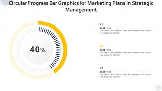
Circular progress bar powerpoint ppt template bundles
-
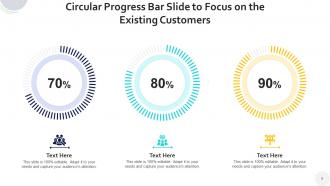
Circular progress bar powerpoint ppt template bundles
-
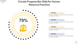
Circular progress bar powerpoint ppt template bundles
-
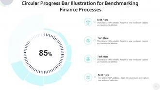
Circular progress bar powerpoint ppt template bundles
-

Circular progress bar powerpoint ppt template bundles
-

Circular progress bar powerpoint ppt template bundles
-

Circular progress bar powerpoint ppt template bundles
-

Circular progress bar powerpoint ppt template bundles
-

Circular progress bar powerpoint ppt template bundles
-

Circular progress bar powerpoint ppt template bundles
-

Circular progress bar powerpoint ppt template bundles
-

Circular progress bar powerpoint ppt template bundles
-

Circular progress bar powerpoint ppt template bundles
FAQs for Circular progress bar powerpoint
Key features include customizable percentage displays, animated progression effects, color-coded segments, data integration capabilities, and responsive scaling across different slide layouts. These elements enhance presentation impact by enabling real-time progress visualization, supporting multiple data sets simultaneously, and maintaining visual consistency, with many organizations finding that well-designed circular templates significantly improve audience engagement and data comprehension.
Circular progress bars enhance presentation effectiveness by providing instant visual clarity on project status, goal completion, and performance metrics, making complex data immediately comprehensible to audiences. These dynamic visual elements streamline information delivery while maintaining audience engagement, with many presenters finding that circular indicators deliver faster comprehension and stronger retention than traditional charts, ultimately creating more impactful business communications.
Effective circular progress bar design requires clear visual hierarchy, consistent color schemes, appropriate sizing for visibility, and readable typography that complements your presentation's overall aesthetic. These elements work together by ensuring accessibility across different screen sizes, maintaining brand consistency, and enabling quick data comprehension, with many presenters finding that strategic color coding and proportional scaling ultimately enhance audience engagement and information retention.
Circular progress bars prove particularly beneficial in project management, healthcare analytics, financial services, and manufacturing sectors where visual progress tracking enhances stakeholder communication and decision-making processes. These industries leverage circular progress indicators for budget utilization, treatment milestones, operational efficiency metrics, and compliance tracking, with many organizations finding that circular formats deliver cleaner visual hierarchy and improved audience engagement compared to traditional linear progress displays.
Customizing circular progress bars involves modifying colors, fonts, sizes, percentage displays, and background elements to align with corporate visual identity standards. These templates enable brands to maintain consistency across presentations by incorporating company color palettes, typography choices, and design aesthetics, ultimately delivering professional, cohesive visual communications that reinforce brand recognition and credibility.
Best practices for animating circular progress bars in PowerPoint include using smooth entrance effects, setting appropriate timing intervals, applying consistent easing transitions, and synchronizing animations with narrative flow. These techniques enhance audience engagement by creating visually compelling data storytelling, with many presenters finding that properly timed circular animations improve information retention and maintain viewer attention throughout complex business presentations.
Circular progress bars offer more intuitive percentage visualization and space efficiency compared to linear bars, though they can be harder to compare across multiple metrics simultaneously. While linear bars excel at showing sequential progress and precise comparisons, circular designs enhance visual appeal and work exceptionally well for dashboards, KPI presentations, and executive summaries, ultimately delivering stronger audience engagement in business presentations.
Yes, circular progress bars can effectively represent multiple data points by displaying comparative metrics, departmental performance, project completion rates, and goal achievements simultaneously on one slide. When strategically arranged with clear labeling and consistent color coding, these visual elements enable audiences to quickly assess progress across different areas, with many organizations finding that this approach streamlines quarterly reviews and enhances stakeholder understanding of complex performance data.
Microsoft Office Suite applications like Excel and Word integrate seamlessly with PowerPoint's circular progress bar templates, enabling dynamic data linking and consistent presentation formatting. Popular design tools including Canva, Adobe Creative Suite, and specialized analytics platforms like Tableau also enhance these templates by providing real-time data connections, ultimately delivering more interactive and visually compelling business presentations.
To ensure accessibility with circular progress bars, include alternative text descriptions, use high contrast colors, provide numerical values alongside visual indicators, and incorporate multiple data representation methods. These approaches enable audiences with visual impairments or color blindness to understand progress metrics effectively, while redundant formatting ensures comprehensive information delivery across diverse accessibility needs, ultimately creating inclusive presentations that engage all stakeholders.
Common mistakes include overcrowding slides with multiple progress bars, using inconsistent color schemes, making text too small to read, choosing overly complex animations, and failing to provide clear context for the data being displayed. These design pitfalls can confuse audiences and dilute your message, with many presenters finding that simple, well-labeled circular progress bars with consistent formatting ultimately deliver greater visual impact and audience comprehension.
**INPUT**: How can you effectively teach your audience to interpret circular progress bars during a presentation? **OUTPUT**: Effectively teaching circular progress bar interpretation involves clearly explaining the visual elements, starting with basic concepts like percentage completion and color coding, then demonstrating real-world applications through interactive examples. By walking through specific scenarios like project milestones, sales targets, or budget allocation while highlighting key interpretation techniques, presenters enable audiences to quickly grasp data relationships and make informed decisions, ultimately enhancing comprehension and engagement.
SlideTeam offers comprehensive circular progress bar template bundles including animated sequences, multi-step processes, KPI dashboards, milestone trackers, and comparison charts. These bundles streamline presentation creation by providing consistent design elements, customizable metrics, and professional formatting, with many organizations finding that standardized progress visualization enhances stakeholder communication and project transparency.
Color choices in circular progress bars significantly impact audience perception by influencing emotional response, comprehension speed, and data interpretation accuracy. Strategic color selection enhances visual hierarchy, creates intuitive understanding through cultural associations like green for completion or red for urgency, and improves accessibility for diverse audiences, ultimately delivering clearer communication and stronger engagement in business presentations.
Pre-designed templates offer significant time savings, professional design consistency, immediate usability, and cost-effective resource allocation compared to custom development. These templates enable organizations to streamline project reporting, enhance presentation quality, and maintain visual branding standards, with many businesses finding that ready-made solutions deliver faster deployment and consistent results.
-
Designs have enough space to add content.