


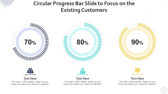
Circular progress bar slide to focus on the existing customers infographic template




Try Before you Buy Download Free Sample Product
 Impress Your
 Audience
 100%
100% Editable
 Save Hours
 of Time


Professionals belonging to any sector can use this set titled Circular Progress Bar Slide To Focus On The Existing Customers Infographic Template. From managers, executives to lower level employees, every individual can use this tool to present insightful details and implications in a well structured format. Various charts and graphs are added to this infographic design that makes it a resourceful set. Not only will this add to the informative qualities of this template, but it also makes it an instant attention grabber. Apart from this, it offers at a glance view of the topics, thus simplifying complex concepts. This helps in retaining the information presented for a long time. The biggest quality of this template is its visual elements, all added to elevate the aesthetic appeal of the presentation. Therefore download this template and present a customized version of it without any trouble.
People who downloaded this PowerPoint presentation also viewed the following :
Circular progress bar slide to focus on the existing customers infographic template with all 10 slides:
Use our Circular Progress Bar Slide To Focus On The Existing Customers Infographic Template to effectively help you save your valuable time. They are readymade to fit into any presentation structure.








FAQs for Circular progress bar slide to focus on the existing
You'll want clear percentage labels and a distinct progress arc for each section. Keep your colors consistent but don't go crazy - I used to throw every bright color at these things but honestly, restraint looks way better. Add a title explaining what you're tracking, maybe throw in some icons to make it easier to scan. Here's the thing though - don't cram more than 6 data points in there or it gets messy fast. Start your most important metric at the top since that's where people look first. Oh, and make sure you've got concise text for each data point so it's actually readable.
Dude, circular progress bars are honestly a game-changer for presentations. They show completion rates and percentages way better than boring old tables. People get the info instantly just by looking at them. Perfect for stuff like project progress, survey results, or hitting goals vs where you actually ended up. Plus they look clean and modern - way more satisfying than regular bar charts, if that makes sense? Oh and they take up less space too, so you can cram more data on one slide without it looking like a mess. Your audience will actually pay attention instead of zoning out.
Ok so first thing - make sure there's enough contrast so people can actually see it. Pick colors that match your brand but also make sense (green = good, red = bad, you know). The circle size matters too, and don't make the stroke too thin or it'll disappear on mobile. Your center text is super important - clean font, big enough to read fast. Honestly? I've seen so many people get caught up in fancy animations when their basic design is trash. Keep colors simple and test it small before you commit to anything.
So circular progress bars are perfect for single tasks - file uploads, loading stuff, maybe showing skill levels. They save tons of space on mobile and honestly just look way cleaner than regular bars. I'd use them when you're dealing with percentages or anything that feels naturally circular. Linear ones work better if you have multiple steps to show, but circles give you that satisfying "almost done" vibe. Oh, and they're great for dashboards when you want something that pops visually. Next time you're mocking something up, throw one in and you'll see what I mean.
Dude, colors make a huge difference with progress bars! Green's perfect for completion rates - people just associate it with "good job, keep going." Red screams urgency, so save it for deadlines or critical stuff. Blue feels trustworthy (banks love it for a reason) so use it for financial data or reliability metrics. Orange and yellow? Great for highlighting milestones you want people to notice. I swear, half the boring dashboards I see could be fixed just by picking colors that actually match the vibe they're going for. Don't just grab whatever - think about how you want people to *feel* when they see that bar.
Honestly, Figma's probably your best starting point - it's free and you can use it right in your browser without downloading anything. Adobe Illustrator is the gold standard though, especially if you want those really crisp circular elements and fancy gradients. Canva works if you just need something quick and dirty. PowerPoint might sound weird but you can actually hack together decent progress bars using donut charts (learned that one the hard way once). Figma's great for beginners, then maybe level up to Illustrator later when you need more control.
First thing I'd do is swap in your brand colors - that makes the biggest visual impact. Then mess around with the ring thickness until it looks right. Most templates let you replace that boring percentage in the center with your logo or whatever, which is honestly way cooler. Don't forget about fonts either, switching to your brand typeface ties everything together. You can also play with shadows and gradients if you're feeling fancy. Oh, and the animation speed is usually adjustable too. Start with colors first, then work through the other stuff until it feels like yours.
Don't cram too much stuff into one circle - it becomes unreadable garbage. Colors that look too similar? Your audience will squint and give up. I've sat through way too many presentations where labels overlap each other like a hot mess. Skip animations unless they actually help tell your story (spoiler: they usually don't). You need a legend or title that explains what you're measuring - seems obvious but people forget this constantly. Oh, and test everything on the screen you'll actually use. Trust me on this one - what looks perfect on your laptop might be tiny and blurry when projected.
Keep it clean but not boring - go minimal with one accent color that actually pops. Make your percentage super readable (bigger font, good contrast) while keeping other stuff subtle. I used to go crazy with gradients everywhere... don't do that lol. Your progress bar should match the overall size, and white space helps a ton. Definitely test on mobile though - looks amazing on desktop then becomes tiny and useless on phones. Start with making it work, then add just enough visual flair so it's engaging without being overwhelming.
You want to use circular progress bars for stuff that shows completion - like project progress, sales targets, or survey responses. Basically anything where you're tracking "X out of Y." They're perfect for comparing multiple percentages side by side too, like team performance metrics. Way more visually interesting than boring old bar charts, honestly. Just don't use them for random data comparisons - they really shine when there's actual progress happening. Oh, and keep the design simple so people aren't squinting at tiny numbers. Start with your most important metric first.
Dude, animated progress bars are so much better than static ones. People literally can't look away when something's filling up - it's weirdly satisfying to watch. You'll want to animate from 0% to whatever your target is instead of just showing the final number. Builds way more suspense that way. If you've got multiple bars, stagger them so they don't all start at once - creates this cool ripple effect. Oh, and don't make them super slow or people get bored. Like 2-3 seconds tops. Trust me, that filling motion makes boring data feel way more exciting.
Your percentage complete, current value vs target, and timeframe - those three need to jump out right away. Also add a clear title because people literally forget this all the time and viewers just stare confused. Growth rates or other comparisons can go in smaller text around the edges. The whole point is someone should glance at it for like 3 seconds and immediately get what you're measuring plus how you're doing. Honestly, just show it to someone at work first - they'll tell you if it's confusing way faster than you'll figure it out yourself.
Oh that's actually a cool idea! Circular progress bars work great for showing timeline completion. So like, picture each circle as a different project phase - maybe "Research" sits at 75% filled, "Development" at 30%, whatever. Way better than those soul-crushing Gantt charts honestly. Just make sure you label each one clearly with the milestone name plus percentage. Group similar stuff together and stick with consistent colors for different work streams. I've seen people mess this up by making it too cluttered, but when done right it's super visual and engaging.
Honestly, less is more with labels - stick to 2-3 words tops. Put your text outside the circle if you can, saves so much space. I'm terrible at this myself and always try to shove way too much info in there lol. Make those percentages pop though, that's what people actually look for. Contrasting colors are your friend - dark text on light backgrounds and vice versa. If you've got multiple bars going, throw in a legend. Oh and test how it looks when shrunk down because someone's definitely gonna resize it for slides later.
Hover effects are probably the easiest starting point - just show detailed percentages when people mouse over. For drilling down deeper, make segments clickable so users can explore specific data points. Animated fills look pretty slick when they trigger on scroll too. Figma prototypes work well for this stuff, or PowerPoint if you're going that route. Basic CSS isn't too hard either if you don't mind getting your hands dirty. Oh, and toggle buttons are great for switching between different time periods or datasets. Honestly, I'd just start with simple hover states and see what your audience actually wants to dig into before going overboard.
-
Designs have enough space to add content.
-
Informative design.
-
Wonderful templates design to use in business meetings.
-
Topic best represented with attractive design.