Coffee Shop Business Dashboard Sales Restaurant Cafe Business Idea Ppt Portrait
Try Before you Buy Download Free Sample Product
Audience
Editable
of Time
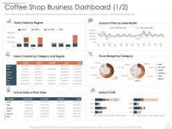
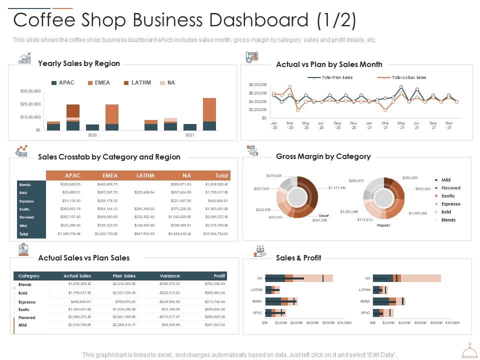
This slide shows the coffee shop business dashboard which includes sales month, gross margin by category, sales and profit details, etc.
People who downloaded this PowerPoint presentation also viewed the following :
Coffee Shop Business Dashboard Sales Restaurant Cafe Business Idea Ppt Portrait with all 2 slides:
Use our Coffee Shop Business Dashboard Sales Restaurant Cafe Business Idea Ppt Portrait to effectively help you save your valuable time. They are readymade to fit into any presentation structure.
FAQs for Coffee Shop Business Dashboard Sales Restaurant Cafe Business
Start with the obvious stuff - daily revenue, how much each customer spends, and total customer count. Inventory turnover matters a ton, especially pastries (learned that one the hard way lol). Track your labor costs vs sales too. Peak hours will show you staffing patterns, and if you can figure out customer retention, that's gold. Wait times are pretty crucial since nobody likes standing around for overpriced coffee. Oh, and waste percentage - you'd be shocked how much gets tossed. Honestly just pick a few to start with and add more once you see what's actually useful.
Dude, having real-time sales data is a game changer. Instead of playing the guessing game, you'll actually know which drinks are crushing it and which pastries are just... well, becoming expensive paperweights. When you spot an unexpected rush, boom - call in extra help. Running low on that popular muffin? Reorder before you're stuck telling customers "sorry, we're out." I love how you start noticing weird patterns too, like how everyone suddenly wants iced coffee the second it hits 75 degrees. Honestly, just peek at your dashboard every couple hours and watch how much less food you end up tossing.
Your customers are basically telling you what to put on your dashboard. Long wait times getting complaints? Track queue length and service speed up top. People love those seasonal drinks but you're only watching total sales? Break that revenue down by product - way more useful. I've honestly seen so many dashboards that look fancy but track random stuff nobody actually cares about. Check your surveys and reviews for the real pain points. Then build your dashboard around fixing those specific problems instead of just pretty charts that don't help anyone.
Hook your POS up to the dashboard and it'll update stock automatically when stuff sells. Super helpful for setting alerts when you're running low on beans or milk - trust me, you don't want to be out of oat milk at 8am. I'd set those thresholds based on when deliveries actually come, not just random numbers. Your team needs to scan everything when restocking though, or the whole system gets wonky. Oh, and tracking usage patterns helps predict reorders. Honestly saved my butt so many times when I actually remembered to check it.
Make your key numbers pop first - sales, hourly orders, inventory alerts. Color code everything so green means good, red means "crap we're out of oat milk." Simple charts beat cluttered spreadsheets every time. Navigation should be brain-dead easy - honestly, if your staff needs training just to find basic info, you've already lost. Real-time data matters way more than historical reports for daily operations. The 10-second rule applies here: can someone glance at your dashboard and immediately know what's happening? If not, strip it down and try again.
Track stuff like orders per hour, transaction times, and customer ratings - most POS systems grab this data automatically anyway. Build simple dashboards for each person showing sales volume and upselling rates. Maybe add waste metrics too if you're tracking ingredients (though honestly that might be overkill at first). The key is framing these as coaching tools, not ways to catch people messing up. Nobody wants to feel like they're being watched constantly. Start with just 2-3 metrics so you don't drown everyone in numbers. Keep it simple and actually useful.
Google Data Studio or Tableau are solid if you want something powerful - they'll pull from your POS, inventory, all that stuff. But honestly? I've watched way too many people go overboard with features they never touch. Google Sheets can actually work great for tracking daily sales and labor costs if you set it up right. Way cheaper too. My advice is start with the basics - just track what you'll actually look at every day. You can always upgrade later once you figure out what matters most for your shop.
Oh, a dashboard for your coffee shop? Yeah, it'll show you seasonal patterns super clearly - like when pumpkin spice explodes in fall or everyone suddenly wants iced everything in summer. Way better than trying to figure it out from daily receipts (honestly, who has time for that?). Most let you compare this year to last year too, which is actually pretty helpful. You can plan your inventory and staffing ahead of time instead of panicking when suddenly everyone wants hot chocolate. The charts make it obvious when products are about to tank or take off seasonally.
So the dashboard lets you slice customer data by age, gender, location, purchase frequency - all the usual stuff. I'd definitely start with age groups since coffee tastes are so different between generations (like, boomers vs Gen Z ordering habits are wild). Demographics show spending patterns which helps with targeting promos. Peak hours crossed with popular items reveals some interesting trends too. Oh, and if you're testing new marketing campaigns, run those weekly demographic reports to catch any shifts in your customer base early.
Honestly, the easiest way is just comparing your numbers before and after campaigns. Check if sales actually jumped, how many new customers you got, and whether people used those promo codes you pushed. Your dashboard probably shows foot traffic too - that's clutch for seeing if your Instagram ads got butts in seats. I'd also watch average transaction values because sometimes you get more customers but they're spending way less, which kinda defeats the point. Set up those date comparisons so you can pull week-over-week stats and show your boss it wasn't just money down the drain.
Focus on what actually matters day-to-day: sales numbers, your best sellers, when you're slammed, how your team's doing. Make those pop with clear, big visuals right up front. All that granular stuff like ingredient costs? Hide it in tabs or dropdowns for when managers need to dig deeper. Honestly, I've watched so many places create these monster dashboards that nobody uses because they're too cluttered. Your staff should be able to glance at yesterday's numbers without squinting at tiny charts. Oh, and definitely start with whatever your team looks at first thing each morning - that's your north star.
Honestly, you need profit margins on there because revenue numbers can be totally misleading. That popular latte might be bleeding money if your ingredient costs are crazy high - happens all the time. Margins show you what's actually working vs what just looks busy. When they start dropping, you can figure out if it's waste, portions getting too big, or your supplier jacking up prices. Way better than just staring at sales totals that don't tell the real story. Smart pricing decisions become obvious too.
Honestly, dashboards are pretty clutch for figuring out your customers. You'll see who's coming back, what they're buying, how often they show up. Then you can actually reward the right people instead of just throwing discounts around randomly. I saw this one coffee place that noticed their black coffee drinkers never got pastries, so they started offering free ones - smart move. You can also catch when regulars go MIA and hit them with "we miss you" promos. Set up some automated stuff based on how much they spend or visit. Way better than guessing what'll keep people coming back.
Honestly, your dashboard layout will make or break whether people actually use the thing. I've seen so many that are just... terrible. Like someone designed it without ever working behind a counter, you know? Put your big metrics front and center - revenue, current orders, inventory alerts that actually matter. Don't cram everything onto one screen though. Keep the secondary stuff accessible but not cluttered up top. Oh, and definitely test it with your baristas first before you roll it out. They'll spot problems you'd never think of.
Dude, your dashboard is literally sitting there with all the answers. Pull up those sales numbers and see what's actually moving vs what just takes up space. Sometimes the basic drinks crush those complicated seasonal things profit-wise, which is kinda counterintuitive but whatever. Check your top 10 sellers against the bottom 5 - compare what ingredients cost versus what you're making. That'll show you what to push harder or maybe ditch entirely. Also look at peak times and seasonal stuff for pricing tweaks. Start there and you'll spot patterns pretty quick.
-
Top Quality presentations that are easily editable.
-
Thanks for all your great templates they have saved me lots of time and accelerate my presentations. Great product, keep them up!
-
Really like the color and design of the presentation.