


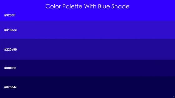
Color Palette With Five Shade Blue Dark Blue Ultramarine Paua Stratos




Try Before you Buy Download Free Sample Product
 Impress Your
 Audience
 100%
100% Editable
 Save Hours
 of Time


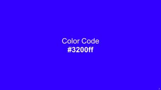
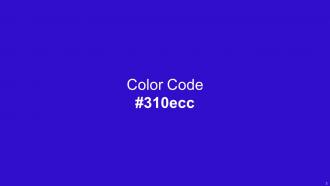
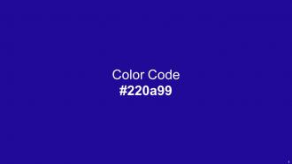
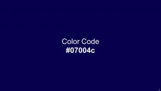
Heres a visually-pleasing color palette with Five Color Shades With Hex Code 3200ff, 310ecc, 220a99, 0f0066, 07004c. These colors are intuitively picked to ignite the spark of brilliance in your designs and creativity.
People who downloaded this PowerPoint presentation also viewed the following :
Color Palette With Five Shade Blue Dark Blue Ultramarine Paua Stratos with all 14 slides:
Use our Color Palette With Five Shade Blue Dark Blue Ultramarine Paua Stratos to effectively help you save your valuable time. They are readymade to fit into any presentation structure.







FAQs for Color Palette With Five Shade Blue Dark Blue
Oh yeah, colors totally mess with people's heads during presentations! Red gets everyone pumped but can feel kinda aggressive. Blue's the safe choice - builds trust and keeps things calm (literally why every tech company on earth uses it). Green screams "growth" and feels balanced. Yellow will grab attention but honestly gets annoying fast if you use too much. Purple's good for creative stuff or if you want that luxury vibe. Orange hits that sweet spot between friendly and confident. Black and gray look super professional but might be too serious depending on who you're presenting to. I'd stick with 2-3 colors max that actually match your message, and definitely test them first - sometimes what sounds good in your head looks terrible on actual slides.
Honestly, your color palette is like visual shorthand for your brand. People see those colors and boom - they think of you immediately. Starbucks green is perfect proof of this. You can spot their cup from across a coffee shop without even seeing the logo. Pick maybe 3-5 colors tops and use them everywhere - website, business cards, social posts, whatever. The trick is staying consistent though, so write down the actual hex codes (sounds nerdy but trust me on this). When everything matches, you look way more professional and people remember you faster. It's kind of wild how much difference it makes.
Oh man, I've been down this rabbit hole so many times! Coolors.co is honestly my favorite - just hit spacebar and it generates new palettes instantly. Adobe Color works great too if you want more control. I always use WebAIM's contrast checker afterward because I've definitely picked colors that looked amazing but made text completely unreadable lol. Canva has a palette tool built in that's super easy. Keep it to 3-4 colors max though, otherwise things get messy fast. Test everything against both light and dark backgrounds before you finalize anything!
Dude, color psychology gets crazy when you factor in different cultures. Like, red screams "good luck!" in China but feels aggressive here in the West. White's pure and clean to us, but it's literally mourning colors in parts of Asia - who knew? Your audience will have gut reactions to your color choices before they even read anything. I learned this the hard way on a project once. If you're designing for different cultures, definitely research what colors mean to them first. Maybe even test it out with actual people from those backgrounds.
Yeah so with complementary colors, don't split them 50-50 or your slides will look like a basketball team uniform lol. Go more like 70-30 instead - pick one as your main color for backgrounds and big elements, then use the other for highlights or buttons. Orange and blue are gorgeous together but you gotta let one dominate. The contrast creates that visual hierarchy thing that actually helps people read your stuff. Oh and here's a weird trick - squint at your slide when you're done. If important text vanishes, your contrast needs work.
So basically, high contrast makes your text way easier to read. Dark text on light backgrounds (or the flip) means people's eyes don't have to strain. I swear, nothing bugs me more than gray text on white - like, why make everyone squint? Your audience will actually focus on what you're saying instead of trying to decipher blurry letters. Plus it just looks more professional. Quick test: if you're leaning forward to read your own screen, the contrast's too weak and needs fixing.
Don't just use color for important stuff - like 8% of guys and 0.5% of women can't see certain colors properly. Red-green is the worst combo since they look basically the same to those people. I totally messed this up on a project once, whoops! Patterns or little icons work way better alongside colors. There's tools like Stark that'll show you how your design actually looks to colorblind users - super helpful. Contrast matters too obviously. Just run it through accessibility checkers before you call it done, saves you headaches later.
Colors totally make or break engagement - I'm not even joking about this. Warm ones like red and orange get people hyped and create urgency. Blues and greens? Way more trustworthy and chill. I tried using mostly gray once and it was such a disaster, nobody stuck around. You've gotta match your palette to what you're actually saying. Like if it's financial stuff, go with professional blues instead of crazy neon colors. Honestly, even tiny changes can boost engagement by a lot. Test a few different options if you can swing it.
Think of color as your presentation's tour guide - it shows people exactly where to look. Bright, contrasting colors grab attention, so use them on your most important stuff like key points or buttons. I made this mistake once where everything was super colorful and nobody knew what mattered! Neutral backgrounds work way better with just pops of color. You're basically directing traffic through your slides. Pick one bold accent color for your critical info and keep everything else pretty subdued. Trust me, less is definitely more here.
Yeah, so RGB and CMYK are totally different beasts. Your screen shows RGB (emitted light) but printers use CMYK (reflected light) - which honestly sucks because your gorgeous blues will look muddy as hell when printed. I learned this the hard way on my first project. Convert to CMYK early so you can see what happens to your colors. For digital stuff, RGB is fine but test it on different screens since they all display differently. Oh, and definitely print some test swatches first! Way cheaper than reprinting everything.
Honestly, everyone's doing minimalist stuff right now - like 2-3 colors tops with tons of white space. Monochromatic is everywhere too, especially blues and greens (which I actually love). Earth tones are big because we're all obsessed with nature vibes after being cooped up forever. Also people are way into muted colors instead of those super bright ones that hurt your eyes during back-to-back video calls. My take? Choose one solid brand color, throw in a gray, and keep your accent subtle. Way cleaner look.
So I actually do this all the time! Match your colors to whatever season it is. Fall? Go with those warm oranges and deep reds - they look amazing. Winter presentations work best with cool blues and whites. Spring calls for soft pastels and fresh greens, while summer's all about bright corals and sunny yellows. Honestly, people notice this stuff more than you'd think. Just don't go crazy - stick to 2-3 colors max and make sure there's enough contrast so people can actually read your text. It's such an easy way to make your slides feel more polished without much effort.
Ugh, the worst thing you can do is go crazy with colors - like 3-5 max or it looks like a rainbow exploded. Test contrast ratios too because accessibility matters. Don't pick something just because it's pretty on your screen - I learned this the hard way when my "gorgeous" palette looked awful on my client's cheap laptop. Colors need to actually fit your brand vibe, not just your personal taste. Your audience isn't you, ya know? Also always have a neutral backup color ready. Trust me, you'll need it when things inevitably get weird. Test early with real people!
Honestly, limiting your colors is like magic for design. You're forced to be pickier, which makes everything look way more put-together. I always think of those people who only wear black and beige - somehow they look effortlessly chic while the rest of us are out here in rainbow chaos. When you stick to maybe 2-4 colors max, each one actually matters more. Decision-making becomes so much easier too since you're not staring at a million options. Pick one main color first, then just add 1-2 others that vibe well with it. Trust me, your designs will instantly feel more intentional.
Definitely start with Adobe Color and Coolors.co - both are free and super easy to figure out. Adobe's got solid tutorials on complementary colors and how contrast works for readability. Coolors is honestly kind of addictive once you get going, but it's perfect when you need palettes fast. If you want to go deeper, "Interaction of Color" by Josef Albers is the classic book, or there's tons of good stuff on YouTube (The Futur has decent videos). Oh, and test your colors on different screens first - learned that one the hard way! Practice with actual presentations though, that's where you'll really get it.
-
It's always a delight to see new templates from you! I am extremely pleased with the fact that they are easy to modify and fit any presentation layout in seconds!
-
Excellent design and quick turnaround.