


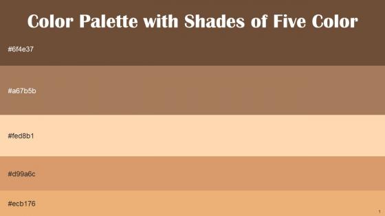
Color Palette With Five Shade Shingle Fawn Barley Corn Light Apricot Whiskey Tacao




Try Before you Buy Download Free Sample Product
 Impress Your
 Audience
 100%
100% Editable
 Save Hours
 of Time


Heres a visually-pleasing color palette with Five Color Shades With Hex Code 6f4e37, a67b5b, fed8b1, d99a6c, ecb176. These colors are intuitively picked to ignite the spark of brilliance in your designs and creativity.
People who downloaded this PowerPoint presentation also viewed the following :
Color Palette With Five Shade Shingle Fawn Barley Corn Light Apricot Whiskey Tacao with all 14 slides:
Use our Color Palette With Five Shade Shingle Fawn Barley Corn Light Apricot Whiskey Tacao to effectively help you save your valuable time. They are readymade to fit into any presentation structure.







FAQs for Color Palette With Five Shade Shingle Fawn Barley Corn Light
A color palette is a curated collection of colors that work harmoniously together, creating visual consistency and reinforcing brand identity throughout presentations. It's essential because strategic color choices enhance readability, guide audience attention, and convey professionalism, with many organizations finding that cohesive palettes improve message retention and audience engagement while strengthening brand recognition.
Color palettes significantly influence audience perception by enhancing comprehension, establishing emotional tone, and reinforcing brand credibility through strategic visual hierarchy. Well-designed palettes streamline information processing, guide attention to key points, and create memorable experiences, with many organizations finding that consistent color strategies improve audience engagement and message retention by up to 80%.
When choosing a color palette for presentation templates, consider brand alignment, audience demographics, content type, visual hierarchy needs, and accessibility requirements. These factors work together to enhance readability and professional impact, with many organizations finding that strategic color choices significantly improve audience engagement, message retention, and overall presentation effectiveness across diverse business contexts.
Cultural differences significantly impact color palette choices through varying symbolic meanings, religious associations, and aesthetic preferences across regions. While red signifies prosperity in China but danger in Western contexts, and white represents purity in some cultures versus mourning in others, understanding these nuances enables presenters to create culturally sensitive designs that resonate with diverse audiences, ultimately enhancing communication effectiveness and avoiding unintended misinterpretations.
Key color theory principles for effective palette selection include complementary colors, analogous harmonies, triadic schemes, color temperature balance, and contrast ratios. These principles enable designers to create visual hierarchy, evoke specific emotions, and enhance readability across presentations, with many organizations finding that strategic color application improves audience engagement and brand consistency.
Popular presentation templates often feature sophisticated color combinations like navy and gold for corporate authority, teal and coral for modern creativity, or deep purple with silver accents for premium branding. These strategic palettes enhance visual hierarchy, improve audience retention, and strengthen brand consistency across sectors like financial services, healthcare, and technology, ultimately delivering more impactful presentations.
Contrasting colors enhance readability by creating clear distinctions between text and backgrounds, headers and body content, and key elements and supporting information. This strategic color separation guides viewer attention through content hierarchically, reduces eye strain during extended reading, and ensures accessibility across different viewing conditions, ultimately delivering more engaging presentations that communicate messages effectively and maintain audience focus throughout.
Tools for creating customized color palettes include Adobe Color, Coolors.co, Canva's palette generator, Paletton, and ColorHunt, along with built-in features in PowerPoint and Google Slides. These resources streamline design workflows by offering color harmony algorithms, brand integration capabilities, and accessibility compliance checks, with many organizations finding that strategic palette selection enhances audience engagement and reinforces professional credibility across presentations.
Balancing creativity and professionalism requires strategic color choices that enhance visual interest while maintaining credibility, such as combining neutral bases with strategic accent colors, incorporating brand-aligned hues, and using sophisticated color relationships. Many organizations find that pairing classic blues or grays with thoughtful pops of color delivers engaging presentations that resonate with diverse audiences while preserving executive-level credibility.
Common color palette mistakes include using too many colors, selecting colors with poor contrast, ignoring brand guidelines, choosing overly bright or distracting hues, and failing to consider accessibility needs. These missteps can overwhelm audiences, reduce readability, and diminish professional credibility, with many organizations finding that strategic color choices enhance message clarity and audience engagement while strengthening brand consistency.
Color accessibility ensures presentations reach diverse audiences by incorporating sufficient contrast ratios, colorblind-friendly combinations, and alternative visual cues beyond color alone. Through accessible design principles, organizations enhance communication effectiveness, meet compliance standards, and create inclusive experiences, with many finding that accessible palettes actually improve overall visual clarity and professional credibility across all audience segments.
Brand colors serve as the foundational anchor for presentation color palettes, establishing visual consistency, reinforcing corporate identity, and creating immediate recognition among audiences. These primary brand elements guide the selection of complementary accent colors, neutral backgrounds, and highlighting schemes, with many organizations finding that strategic color integration enhances message credibility while strengthening brand recall across all communication touchpoints.
Effective color palettes highlight key information through strategic contrast, consistent emphasis colors, and visual hierarchy techniques, with vibrant accent colors drawing attention to critical data points while neutral backgrounds maintain readability. Many successful presentations use the 60-30-10 rule, applying dominant colors to backgrounds, secondary colors to supporting elements, and bold accent colors to key findings, ultimately enhancing audience comprehension and message retention.
Data-driven presentations benefit from high-contrast combinations like navy and white, deep blue with light gray, or charcoal with soft yellow accents that ensure readability across different viewing conditions. These strategic color choices enhance comprehension by reducing eye strain, creating clear visual hierarchy between data points, and maintaining professional credibility, with many organizations finding that consistent, accessible palettes ultimately improve audience engagement and decision-making outcomes.
Seasonal color trends influence presentation templates by incorporating nature-inspired palettes that resonate with audience expectations, enhance brand relevance, and create timely visual connections. These strategic color choices enable organizations to maintain fresh, contemporary designs while leveraging psychological associations with seasons, ultimately delivering more engaging presentations and stronger audience connection across different business cycles.
-
The templates you provide are great! They have saved me tons of time and made my presentations come alive. Thank you for this awesome product. Keep up the good work!
-
SlideTeam provides PPTs on every single topic. Their templates suit my job very well. I am very grateful!