


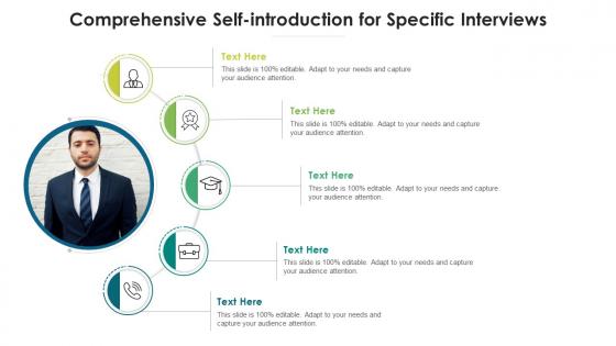
Comprehensive self introduction for specific interviews infographic template




Try Before you Buy Download Free Sample Product
 Impress Your
 Audience
 100%
100% Editable
 Save Hours
 of Time


This is a Comprehensive Self Introduction For Specific Interviews Infographic Template that can be used by professionals belonging to any domain. It is a powerful illustrative tool that can be deployed to showcase consumer behavior, sales reports, progress reports, IT research results, and many more. In short, this PPT layout works for every industry, irrespective of its operations. The combination of compelling information and visual content added in this template makes it a very resourceful layout to grab. Utilize it to present information and insightful details about your business or the finished product that can be visualized from the onset. This PPT design features high quality elements like graphics, icons, etc. that can be used to further enhance the illustrative properties of a presentation. It can also be reproduced as PNG, JPG and PDF, for the users convenience.
People who downloaded this PowerPoint presentation also viewed the following :
Comprehensive self introduction for specific interviews infographic template with all 2 slides:
Use our Comprehensive Self Introduction For Specific Interviews Infographic Template to effectively help you save your valuable time. They are readymade to fit into any presentation structure.
FAQs for Comprehensive self introduction for specific
Definitely start with your name, title, and a decent headshot - that's the must-have stuff. Then add your key skills, maybe a quick summary of what you do now, and how people can reach you. I always toss in something personal too, like a hobby or random fact. Makes you way more memorable than just another boring business card, you know? Oh, and don't cram everything together - clean design with white space is clutch so people can actually read it fast. Your unique selling point should be in there somewhere too. Really depends what you're using it for though - networking events vs job interviews might need different vibes.
Colors can seriously make or break how people see your infographic. Blue screams trustworthy and professional, orange says you're creative and energetic. Match your palette to whatever vibe you're going for and the industry too - like, hot pink probably isn't ideal for finance jobs lol. Stick to 2-3 colors that work with your brand and what your audience expects. Oh, and definitely check they look good together! Also make sure colorblind people can still read everything. Honestly, being strategic about color choices is way more important than most people realize.
Okay so for fonts, go with something clean like Montserrat or Open Sans for your main text. Poppins works well for headings too. I swear, half the infographics I see use fonts that are impossible to read - don't be that person! Two font families max or it'll look like a ransom note. Body text should be at least 12pt because nobody wants to squint at your resume. Oh, and here's a trick I learned the hard way: zoom out to 50% and see if you can still read everything. If not, bump up that font size. Trust me on this one.
Honestly, these infographics are perfect for showing off both your professional side and who you actually are. Pick colors and fonts that match your field - tech people usually go minimalist, teachers might use warmer tones. I love when people throw in random personal stuff like "obsessed with houseplants" next to their MBA. Mix your real achievements with hobbies and weird facts about yourself. The goal? Someone should look at it and think "yeah, I'd grab coffee with them." Just don't let one side take over completely - nobody wants a resume disguised as an infographic, you know?
Hey! So for your self-intro infographic, there's tons of ways to make it interesting. Timeline format works great for showing your career path. Or do a "day in the life" thing that shows your skills through your routine. Honestly, I'm kinda obsessed with the video game stats approach - like skill bars and achievement badges, super fun. You could also try puzzle pieces where each piece is a different part of you. Map format showing places that shaped you is cool too, or even make it look like a recipe card with your professional "ingredients." Just pick whatever doesn't make you cringe, you know?
Honestly, visuals and icons are game-changers for infographics - way better than boring text blocks. People scan stuff super fast these days, so a lightbulb for skills or location pin for your city just clicks instantly. Icons create this natural flow that guides readers through your story without them even realizing it. The style should match your field too - creative people can go wild with colors, but finance folks probably want something cleaner. Oh, and consistency is key! Don't mix cartoon icons with professional ones. It'll look messy and kinda unprofessional.
Make your name huge so people actually know whose resume they're looking at. White space is your friend - cramming everything together just looks messy. I'd stick with maybe 2-3 colors tops and one clean font that's easy to read. Break things into clear sections like experience, skills, all that good stuff. Throw in some icons to make it less wall-of-text-y, but honestly don't get too crazy with effects. I've seen people go overboard and it's just distracting. The whole point is standing out for the right reasons, you know?
Skip the boring "Education, Experience, Skills" layout. Go with something like "Where I Started → Turning Points → Where I Am Now" instead. Include little stories in each section - maybe that one project that totally shifted how you think, or what got you hooked on your field in the first place. A timeline or journey map works great visually too. People are way more likely to remember your stories than a bunch of bullet points (trust me on this). The whole thing should feel like they're actually getting to know you, not just scrolling through your resume with fancy graphics slapped on it.
Definitely start with Canva - I swear by it for this stuff. The templates are actually good and you won't get frustrated trying to figure out basic tools. Adobe Illustrator gives you way more control but honestly? Unless you're already familiar with it, you'll spend forever just learning the interface. Figma's pretty great too, sits right in the middle complexity-wise. Oh, and don't sleep on PowerPoint if that's what you know best - I've seen some surprisingly decent infographics made there. You can always mock something up in Canva first, then move it to fancier software once you've got the concept down.
So basically, infographics are way more visual than regular resumes - you get charts, colorful layouts, cool icons instead of boring text blocks. They're perfect for showing personality through design. You can make timelines for your career, use graphs for achievements, add personal stuff that'd be weird on a normal resume. Honestly they're kinda fun to create once you start messing around with it. Great for creative jobs or just standing out. Oh and definitely still bring your regular resume too - some people are traditionalists, you know? Works best when you use both together.
Go vertical for sure – works way better on phones and social media. I'd do 1080x1350px for Instagram or 800x2000px if you need more space. LinkedIn carousels are killing it right now, so that's 1080x1080px per slide. Skip horizontal unless you're doing like a presentation or something. Most people will see this on mobile first anyway. Oh, and export as PNG so your text stays crisp – PDF if you might print it later. Honestly, I've been seeing carousels everywhere lately and they actually get decent engagement.
Oh man, this is like THE most important thing! Who's gonna see your portfolio totally changes everything - your tone, which projects you show off, even the fonts you pick. Targeting employers? You'll want different stuff than if you're just chatting with other creatives at a meetup. Corporate types definitely aren't here for Comic Sans (learned that one the hard way lol). Think about how technical you can get too - some people love industry speak, others will be completely lost. Just write down who your actual audience is first. Trust me, it'll save you so much time later when you're not second-guessing every design choice.
Honestly, make your top achievements impossible to ignore - bigger fonts, colored boxes, whatever works. Numbers are your best friend here because "boosted sales 40%" just sounds way more impressive than some vague "improved performance" nonsense. Don't just dump all your skills in one massive list (seriously, it's brutal to read). Group them by category instead. Progress bars work great for tech skills since people can scan them super fast. Keep everything short - like, Instagram caption short. Oh, and here's a weird trick that actually works: show it to someone for 10 seconds, then ask what stuck. You'll be surprised what doesn't land.
Okay so biggest thing - don't jam a million words on there. People's attention spans are like 3 seconds these days. Skip the cheesy stock photos too (you know the ones with the fake smiling business person). Stick to 2-3 colors or it'll look like a rainbow threw up on your resume. Make your font big enough to read on phones since that's where everyone looks at stuff now. Proofread the hell out of it - typos make you look sloppy. I'd start with your best accomplishments first and build from there.
Honestly, I'd say every 6-12 months or whenever something big changes - new job, finished a certification, wrapped up a huge project, that sort of thing. Your infographic gets stale fast otherwise! I actually set a quarterly reminder to just glance at mine because I'm terrible at remembering this stuff. Don't wait for everything to be perfect either. Sometimes just swapping out your photo or tweaking how you describe what you do can freshen things up. Promotions are obvious update moments, but even shifting your career focus deserves a refresh. Think of it like your LinkedIn - nobody wants to see outdated info.
-
Innovative and attractive designs.
-
Qualitative and comprehensive slides.
-
Use of icon with content is very relateable, informative and appealing.