


Contract negotiation table powerpoint slide images




Try Before you Buy Download Free Sample Product
 Impress Your
 Audience
 100%
100% Editable
 Save Hours
 of Time


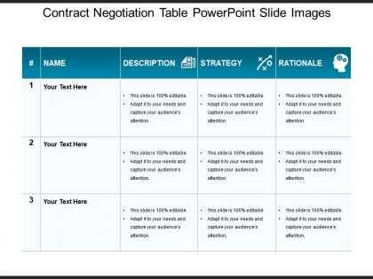
Put on this contract negotiation table PowerPoint slide images PPT slide for discussing the points of a potential partnership arrangement by two or more parties. The objective of designing the strategic negotiation graph PPT is to facilitate the presenter to demonstrate the team about the agreement to be which is to be executed between the interested parties that is beneficial to all the interested parties. The usage of the negotiated agreement design PowerPoint shape makes the discussions of the partners comfortable and concrete as the flexible features of the template allows the user to go back and forth to re-discuss and reconsider the points by the parties until all the requisite points have been cleared and agreed upon. As we all know that the end goal of the contract is to make an arrangement that is both fair and equitable to each party, in light of the same, the slideshow has been designed professionally to facilitate the user all the services at his / her doorstep. So don’t lose the opportunity, choose this PPT slide and feels the difference from the ordinarily designed templates. Ensure consistency from beginning to end with our Contract Negotiation Table Powerpoint Slide Images. Be able to handle intermediate conditions.
People who downloaded this PowerPoint presentation also viewed the following :
Contract negotiation table powerpoint slide images with all 5 slides:
Enhance chances of employment with our Contract Negotiation Table Powerpoint Slide Images. Create a higher degree of competence.
FAQs for Contract negotiation table
Keep it stupid simple - flowcharts for your negotiation steps, comparison tables, basic timelines. Don't get fancy with animations, nobody cares and it's distracting as hell. Use the same fonts and colors throughout or you'll look like an amateur. Bullet points over paragraphs every single time. People need to focus on the actual contract terms, not puzzle out your slides. Oh, and definitely bring a PDF backup because conference room tech always craps out at the worst moment. Trust me on that one.
Honestly, infographics are a game-changer for legal stuff. Dense contract language becomes way more digestible when you turn it into visuals. Flowcharts work perfectly for decision trees, timelines show key dates, and simple icons beat walls of text every time. Your stakeholders will actually understand payment schedules and risk stuff without their eyes glazing over. I mean, who wants to read paragraph after paragraph of legal jargon? Create one-page summaries for your gnarliest clauses. Negotiations move so much smoother when everyone gets what's happening instead of pretending they understood that 500-word liability section.
Honestly, Gantt charts are your best bet here - they map out phases and deadlines super clearly. Progress bars work too, especially for tracking each contract section. I'm obsessed with kanban boards though (probably too much lol) because you can instantly see what's in review versus what's done. For updates to stakeholders, timeline views with color coding are clutch - red, yellow, green keeps it simple. But here's the thing: pick whatever your team will actually use. I've seen so many beautiful charts that nobody bothers updating, and then you're stuck explaining why everything looks three weeks behind when it's not.
Skip the boring conference table shots - they tell you nothing. Focus on body language instead. Catch someone leaning in when they're engaged, or arms crossed when they're getting defensive. Those micro-expressions are gold. Genuine smiles vs fake ones, people pointing at documents together, that moment of relief when everyone finally agrees. Honestly, handshakes are so overdone. Shoot from angles that show the actual human drama happening. The push and pull between people is way more interesting than whatever's on paper.
Oh man, colors totally matter for contract stuff! Blues and grays make you look trustworthy and stable. Red though? That's tricky - creates urgency but can stress people out. I once had a client literally call my red slides "aggressive" which was... awkward. For most contract talks, stick with cooler neutrals. You want them thinking about terms, not getting worked up over your slide colors. Green's solid for financial sections since, well, money. Honestly though? Blue-and-white with one accent color is your safest play. Clean and professional without being boring.
Icons are perfect for this! Handshakes work for collaboration, scales show fairness tactics, chess pieces for strategic moves. A lightbulb's good for creative problem-solving. Arrows going different ways = compromise strategies. Keep it simple though - people barely glance at this stuff. Targets show goal-focused approaches, puzzle pieces for integrative bargaining. Oh, and arrows are honestly overused but they work. Just pick obvious ones so your team won't be sitting there confused about what strategy you're suggesting. Nobody wants to decode symbols when they're prepping for negotiations.
For showing negotiation outcomes, I'd go with split-screen comparisons - like side-by-side contract terms or financial numbers. Flowcharts work too, especially ones that branch out based on different decisions. Green/red indicators are honestly pretty solid for win-lose stuff, even though they seem basic. Real contract excerpts or actual dollar amounts pack way more punch than vague concepts. Oh, and start with your most realistic scenarios first - you can always add the weird edge cases later. The whole point is making the differences super obvious right away.
Okay so visual storytelling works because you're creating a story that helps them actually *see* your point. Skip the boring contract language - use diagrams or timelines instead. Show them how a partnership could grow over time, or map out the risks and benefits. Way more interesting than dense paragraphs, honestly. People connect with visuals emotionally, plus complex stuff becomes way easier to understand. Oh and here's something that actually works - try making a simple timeline of your deal structure next time. I bet they'll react totally differently to it.
Get professional headshots that actually look like they belong together - same lighting, same vibe. Nothing worse than having your team look like a mismatched yearbook committee (learned that one the hard way). Make sure everyone looks polished but not stiff. Oh, and definitely get permission first - sounds obvious but you'd be surprised. Include their titles underneath so people know who's who. Keep the layout simple so it doesn't compete with your actual contract details. One last thing - have backup slides ready in case someone bails before the meeting.
Dude, throw some visuals into your contract talks - org charts, flowcharts, that kind of stuff. People hear "project management" and think completely different things, right? A quick diagram kills that confusion before it starts. Honestly, buried text clauses are the worst because everyone just skims them anyway. Your stakeholders can actually see their role when it's visual. Workflows show handoff points super clearly too. Try making a one-page responsibility summary before your next review. Trust me, you'll dodge so many annoying back-and-forth emails.
Dude, visual metaphors are game-changers for negotiation stuff. Like when someone explains it as a "chess game" - suddenly you get the whole strategic mindset thing. Or "building bridges" for working together, "poker face" for keeping cards close. Your brain just clicks with pictures way better than boring text lists (which is probably why I zone out in most training sessions lol). Once you've seen these concepts visually, you'll actually spot them happening in real negotiations. Try sketching out your approach before your next big meeting - sounds weird but it works.
Yeah, brand images totally help with trust in contract negotiations. People see familiar logos and instantly think "legit business" - it's basically like showing up in a nice suit. Stakeholders feel way more confident dealing with established brands because it screams stability and accountability. But here's the thing - don't go overboard with it. Nobody wants contracts that look like NASCAR sponsorship deals, you know? Stick to subtle stuff like letterheads or signature blocks. Keep it clean and professional. The visual familiarity alone does most of the heavy lifting for credibility.
Okay so first thing - make an overview slide that shows all your main sections, like a roadmap. Break down the complicated legal stuff into smaller pieces, one concept per slide. Visuals are your friend here! Flowcharts, timelines, whatever keeps people from falling asleep during another contract presentation (been there). Order it logically: who's involved, what the scope covers, payment terms, then all the risk and liability bits. Keep your formatting consistent with clear headers so nobody gets lost. Oh and here's something that actually works - add "questions pause" slides after each big section. People stay way more engaged when they can ask stuff as you go.
Honestly, Canva's probably your easiest bet for this stuff - super user-friendly and has tons of templates. Adobe Creative Suite works too if you're feeling fancy, but PowerPoint is actually underrated for quick charts and flowcharts. I use it all the time because why overcomplicate things? Timeline graphics and comparison tables are clutch for breaking down complex contract terms. Just keep everything clean and readable - nobody wants to squint at messy visuals during negotiations. Oh, and definitely start with templates then tweak them. Saves you hours of formatting headaches.
Visual case studies are seriously your best friend in negotiations. People zone out when you're just talking, but show them a chart or before/after comparison? Game changer. I always bring 2-3 slides that match whatever situation I'm dealing with - way more convincing than just saying "this totally works, I promise." Charts and timelines make everything click instantly. You can point directly at the data when someone pushes back on your terms. Honestly, I've watched people completely flip their stance once they see the visual proof. Just make sure your examples actually relate to what you're negotiating, otherwise it's kinda pointless.
-
Excellent template with unique design.
-
The Designed Graphic are very professional and classic.