


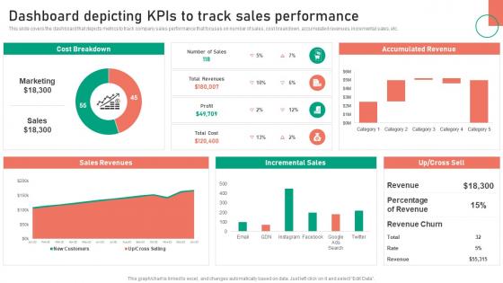
Dashboard Depicting KPIs To Track Sales Performance Change Management Approaches




Try Before you Buy Download Free Sample Product
 Impress Your
 Audience
 100%
100% Editable
 Save Hours
 of Time


This slide covers the dashboard that depicts metrics to track company sales performance that focuses on number of sales, cost breakdown, accumulated revenues, incremental sales, etc.
People who downloaded this PowerPoint presentation also viewed the following :
Dashboard Depicting KPIs To Track Sales Performance Change Management Approaches with all 7 slides:
Use our Dashboard Depicting KPIs To Track Sales Performance Change Management Approaches to effectively help you save your valuable time. They are readymade to fit into any presentation structure.





FAQs for Dashboard Depicting KPIs To Track Sales Performance
Key sales performance dashboard metrics include revenue growth, conversion rates, average deal size, sales cycle length, pipeline velocity, and quota attainment by individual and team. These metrics enable sales managers to identify bottlenecks, optimize resource allocation, and forecast accurately, with many organizations finding that real-time visibility into these indicators drives faster decision-making and ultimately delivers improved team performance and competitive advantage.
Visualization techniques enhance sales data interpretation by transforming complex datasets into intuitive charts, graphs, heat maps, and trend lines that reveal patterns instantly. These visual representations enable sales teams to identify top-performing products, regional variations, and seasonal trends more effectively, while facilitating faster decision-making and strategic planning that ultimately drives revenue growth.
Real-time data enables sales teams to identify opportunities, address bottlenecks, and adjust strategies instantly rather than waiting for monthly reports. Through live dashboards tracking pipeline movement, customer interactions, and market trends, organizations can accelerate deal closures, optimize resource allocation, and respond to competitive threats immediately, ultimately delivering faster revenue growth and enhanced sales effectiveness.
Sales performance dashboards can be customized through role-specific metrics, personalized KPI selections, adjustable reporting timeframes, team-based filters, and customizable visualization formats. Different teams benefit from tailored approaches, with inside sales teams focusing on call metrics and conversion rates, while field sales teams emphasize territory performance and client relationships, ultimately delivering targeted insights that enhance decision-making across diverse sales functions.
Best practices for integrating CRM data into sales performance dashboards include establishing automated data connections, standardizing data formats, implementing real-time synchronization, creating user-specific access controls, and maintaining data quality protocols. These integration strategies streamline reporting by eliminating manual data entry, ensuring consistent metrics across teams, and delivering actionable insights, with many sales organizations finding that seamless CRM integration enhances forecasting accuracy and accelerates decision-making processes.
Historical data analysis enables sales teams to identify patterns, trends, and seasonal fluctuations that inform strategic decision-making, resource allocation, and territory planning. Through predictive analytics and performance tracking, organizations can optimize pricing strategies, forecast demand more accurately, and allocate sales resources strategically, ultimately delivering improved conversion rates and competitive advantage.
**INPUT**: What tools or software are recommended for creating effective sales performance dashboards? **OUTPUT**: Recommended tools for sales performance dashboards include Tableau, Power BI, Salesforce Analytics, HubSpot, and Google Data Studio, each offering different visualization capabilities and integration options. These platforms streamline performance tracking by connecting multiple data sources, automating report generation, and delivering real-time insights, with many sales organizations finding that interactive dashboards ultimately enhance decision-making speed and revenue forecasting accuracy. [Word count: 58]
Sales performance dashboards support goal setting by providing real-time visibility into key metrics like revenue targets, conversion rates, and pipeline health, enabling managers to establish data-driven objectives. Through automated tracking and visual progress indicators, sales teams can monitor quarterly targets, identify performance gaps, and adjust strategies proactively, ultimately delivering improved forecasting accuracy and consistent goal achievement across organizations.
**INPUT**: What are the challenges in maintaining the accuracy of data on sales performance dashboards? **OUTPUT**: Data accuracy challenges include inconsistent data entry, delayed system updates, integration issues between multiple platforms, human error in manual processes, and outdated information sources. These obstacles can significantly impact decision-making quality, with many organizations finding that implementing automated data validation, real-time synchronization protocols, and standardized reporting procedures ultimately delivers more reliable insights and enhanced sales forecasting accuracy. [Word count: 58]
User feedback significantly influences sales dashboard design by identifying critical metrics, preferred visualization formats, workflow integration needs, and usability pain points that impact daily performance tracking. Through iterative feedback collection, organizations can prioritize relevant KPIs, streamline navigation paths, and customize reporting features, with many sales teams finding that user-centered design ultimately delivers higher adoption rates and more actionable insights.
Sales performance dashboards focus on analyzing completed results, measuring metrics like revenue achieved, quota attainment, conversion rates, win/loss ratios, and individual rep performance against targets. Sales pipeline dashboards emphasize forecasting and opportunity management, tracking deals in progress, stage progression, pipeline velocity, and potential future revenue, with many organizations finding that combining both approaches delivers comprehensive visibility into current achievements and future prospects.
Sales dashboards enhance team motivation and accountability by providing real-time visibility into individual and team performance metrics, enabling transparent goal tracking, and facilitating data-driven coaching conversations. Through interactive leaderboards, progress indicators, and achievement recognition features, sales teams can monitor their pipeline health, conversion rates, and quota attainment, ultimately fostering healthy competition while delivering improved performance outcomes.
Mobile-friendly dashboards enable sales teams to access real-time performance data, customer insights, pipeline updates, and competitive intelligence from anywhere, enhancing responsiveness and decision-making speed. With remote work increasingly common, organizations find that mobile accessibility streamlines client interactions, accelerates deal closures, and delivers significant competitive advantages through instant data availability.
Balancing leading and lagging indicators requires combining predictive metrics like pipeline velocity, activity levels, and conversion rates with outcome measures such as revenue, closed deals, and quota attainment. Effective dashboards present these metrics side-by-side with clear visual hierarchies, enabling sales teams to monitor current performance while identifying early warning signals, ultimately delivering both strategic insight and tactical guidance for consistent revenue growth.
Effective sales data visualizations include bar charts for comparative performance, line graphs for trend analysis, pie charts for market share breakdowns, heat maps for territory performance, and funnel charts for pipeline progression. These visual elements enable sales teams to quickly identify top performers, seasonal patterns, and revenue opportunities, with many organizations finding that interactive dashboards combining multiple chart types significantly enhance decision-making speed and strategic planning accuracy.
-
Nothing beats the well-formatted and professionally designed templates offered. Kudos to SlideTeam for their amazing collection of PPT slides.
-
Great designs, really helpful.