


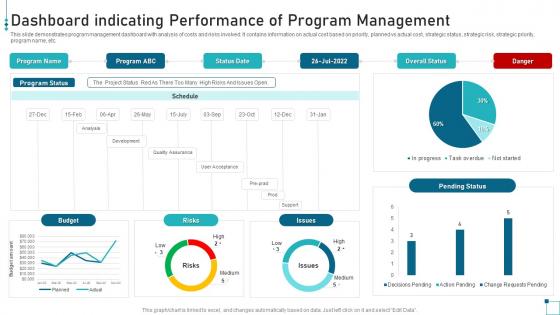
Dashboard Indicating Performance Of Program Management




Try Before you Buy Download Free Sample Product
 Impress Your
 Audience
 100%
100% Editable
 Save Hours
 of Time


This slide demonstrates program management dashboard with analysis of costs and risks involved. It contains information on actual cost based on priority, planned vs actual cost, strategic status, strategic risk, strategic priority, program name, etc.
People who downloaded this PowerPoint presentation also viewed the following :
Dashboard Indicating Performance Of Program Management with all 7 slides:
Use our Dashboard Indicating Performance Of Program Management to effectively help you save your valuable time. They are readymade to fit into any presentation structure.






FAQs for Dashboard Indicating Performance
Focus on schedule stuff first - hit your milestones, track delays, know where your critical path is. Budget's obvious but watch burn rate closely, not just total spend. Resource bottlenecks will kill you, so monitor team capacity religiously. Risk indicators are huge too - open issues, blockers, anything that needs escalation. Honestly, stakeholder satisfaction scores saved my butt more times than I can count. Quality metrics depend on your program but defect rates usually matter. Keep everything visual though - those red/yellow/green dashboards actually get read, unlike dense reports. Start basic, then add whatever your leadership keeps bugging you about in meetings.
Honestly, visualization tools are a game changer for spreadsheet chaos. Your brain processes pictures way faster than rows of numbers - it's like the difference between scanning a chart vs reading through endless data. Bar graphs and heat maps show you trends immediately. Traffic light dashboards? Perfect for spotting problems before they blow up. Stakeholder meetings become so much easier when you can just point to a visual instead of explaining complicated numbers. I'd start simple with basic bar charts first, then maybe add some color coding. Trust me, once you see your project status laid out visually, you'll never go back to plain spreadsheets.
Focus on the big three: timeline, budget, and risks. Put your most critical stuff right at the top - executives shouldn't have to dig around for problems. Traffic lights and progress bars work way better than paragraphs of text (learned that the hard way). Keep your colors and layouts consistent so people don't get confused jumping between projects. Honestly, if someone can't figure out whether you're on track within like 5 seconds of opening your dashboard, you've probably overcomplicated it. Simple visual cues beat fancy charts every time.
Dude, real-time integration is such a game-changer. Your dashboard becomes this live command center instead of just showing yesterday's stale numbers. You'll catch problems right when they happen - bottlenecks, budget issues, team conflicts - rather than finding out about them in some boring weekly meeting. Honestly, I wish more people understood how huge this is. The trick though? Make sure your data sources can actually push updates instantly. Otherwise you're just getting yesterday's info delivered faster, which kinda defeats the whole point.
So KPIs are like your program's pulse check - they tell you if things are running smooth or if you're about to hit a wall. Budget variance, timeline stuff, resource usage - the usual suspects. But here's the thing: don't go crazy with metrics just because you can. I'd stick to maybe 5-7 that actually move the needle for your specific program. More than that and you'll get lost in spreadsheet hell instead of making real decisions. They're perfect for showing stakeholders you're not just wasting their money too. Pick ones that matter, not just the pretty charts that look good in meetings.
Quick surveys and one-on-one interviews are your best bet here. Talk to the people who actually use it every day - they'll be brutally honest about what sucks. Usage analytics help too since you can see where people get stuck or bail out completely. I'd throw in some A/B tests for different layouts, maybe add a feedback button right in the interface. Focus on the basics first: widget placement, which metrics they actually care about, navigation flow. Honestly, theory means nothing if users can't find what they need. Make small changes based on real behavior, not what looks pretty.
Don't cram everything onto one screen - people will just ignore it. Seriously, I've seen dashboards that look like airplane cockpits. Pick maybe 5-7 metrics that actually matter for decisions, not just ones that make you look good. Static PDFs are the worst because they're dead the second you send them. Each number should tell a story about what's broken or working. Keep it clean visually so someone can glance and know what's urgent. Auto-updates save you from being the person manually refreshing charts every week.
Look for that gear icon in the top right - it opens all the customization stuff. Drag widgets around wherever you want them. You can filter by project phase or priority, plus change colors (thank god because that default blue is awful). The cool thing is you can make different views for different people and save multiple setups. I'd honestly just start with whatever metrics you actually use day-to-day, then add more later. Maybe mess around with a couple layouts this week? You'll figure out what works pretty quick.
Honestly, you can grab data from whatever tools you're already using. Jira, Asana for project stuff. Financial systems if you need budget tracking. Slack's actually pretty useful for team activity metrics - didn't expect that when I first tried it. CRM data works well for customer programs too. But here's the thing - don't just connect everything because you can. I've seen dashboards that are complete disasters, like someone threw data at a wall. Pick maybe 3-5 systems that actually matter to your programs first. You can always add more later when you figure out what you're missing.
Honestly, mobile access is a total game-changer for keeping everyone on the same page. Your team can approve stuff, leave comments, or catch issues even when they're not at their desk - like during lunch or whatever. Remote workers especially love this because they don't have to wait until the next meeting to know what's going on. Quick decisions happen way faster when people aren't stuck waiting around. Oh, and definitely get everyone to turn on push notifications for the big milestones. Trust me, it actually works.
Honestly, data viz is a game changer for catching project problems fast. Like, we're talking hours vs days fast. When your dashboard lights up red, everyone immediately sees what's broken - no more scrolling through massive spreadsheets trying to figure out what went wrong. Your team spots the weird patterns and issues right away without waiting for someone else to crunch numbers. The trick is setting up charts that actually show the stuff that matters for YOUR projects. I've seen too many teams get obsessed with fancy visuals that look impressive but don't actually help when things go sideways.
Line charts are your best friend for tracking stuff over time - budget burn, milestones, resource usage, whatever. Moving averages help smooth out those crazy weekly spikes (seriously, they're lifesavers). Heat maps work great when you need to compare performance across different workstreams. Bar charts are solid for simple before/after comparisons too. Just keep your time periods consistent and don't go nuts with random colors. Oh, and start with maybe 3-4 key metrics instead of trying to cram everything into one dashboard. You can always add more later once you figure out what actually matters.
First thing - set up separate views with just what they need to see, no extra internal stuff. Role-based permissions are key, and definitely put expiration dates on their access. I swear, half the companies I know have way too much data floating around to outsiders! Anonymize client info and maybe disable downloads if you can. MFA is non-negotiable these days. Skip emailing screenshots - use secure sharing links instead. Oh, and audit logs will save your butt when someone asks who saw what. Watermarks help too if you're feeling paranoid about it.
Honestly, automation is a game changer for dashboards. No more copying numbers from Jira and spreadsheets every week - the data just flows in automatically. Real-time updates, milestone tracking, all that good stuff happens without you touching it. And you won't get caught with stale numbers when your boss randomly asks about project status (been there, it sucks). The trick is starting simple though. Pick one data source first, get that connection solid, then add more. Once it's running, you're analyzing trends instead of doing boring data entry. Trust me, it's worth the upfront setup time.
Dude, just set up a dashboard - it'll save your sanity. No more answering the same "where are we at?" questions fifty times a day. People can check updates whenever they want instead of bugging you. Your team sees blockers right away instead of finding out about disasters three days too late. Those "quick" status meetings? Gone. Well, most of them anyway. The real magic happens when you add automatic alerts for big milestones. Seriously cuts down on all the back-and-forth emails. Everyone stays in the loop without you becoming the human ping-pong ball bouncing between stakeholders.
-
Fantastic collection. Loved how we can personalize these templates as per the requirements.
-
The ease of modifying templates is just superb! Also, the vast collection offers plenty of options to choose from.