

Dashboard Showcasing Business Revenue Target Vs Achievement Assessment




Try Before you Buy Download Free Sample Product
 Impress Your
 Audience
 100%
100% Editable
 Save Hours
 of Time


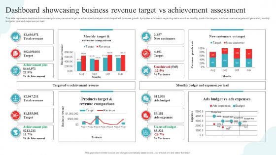
This slide represents dashboard showcasing company revenue target vs achievement analysis which helps track business growth. It provides information regarding metrics such as monthly production targets, business revenue targets and generated, monthly budgeted cost and expenses per lead.
People who downloaded this PowerPoint presentation also viewed the following :
Dashboard Showcasing Business Revenue Target Vs Achievement Assessment with all 7 slides:
Use our Dashboard Showcasing Business Revenue Target Vs Achievement Assessment to effectively help you save your valuable time. They are readymade to fit into any presentation structure.





FAQs for Dashboard Showcasing Business Revenue Target
Ok so there's basically four things you gotta check. Data accuracy first - like, are your sources actually reliable and updating right? Wrong numbers will tank everything instantly. User experience matters too - can people find stuff without getting frustrated? Loading times are huge because nobody waits around for slow dashboards anymore. Oh and make sure the metrics you're showing actually help with real decisions, not just fancy eye candy. Honestly I'd just make a basic checklist for these areas and go through it every few months with whoever uses the thing.
Honestly, good visual design is what separates usable dashboards from total disasters. Color should highlight the stuff that actually matters - like when something's broken or hitting targets. Icons are clutch because people recognize symbols way faster than reading text. Charts over tables every single time. I mean, who has patience for endless rows of data? Your brain processes visual patterns instantly. Oh, and don't underestimate white space - cramped dashboards give me anxiety just looking at them. Figure out what your users care about most first, then build everything around that. Every element needs a job, not just pretty filler.
Look at three things: how fast it loads, whether people actually use it, and if your data's right. Honestly, speed matters more than most people think - anything over 3-4 seconds and users just give up. I've watched gorgeous dashboards totally flop because they were sluggish. Check if people are clicking around, using filters, actually digging into the data or just glancing and leaving. And yeah, data accuracy is obvious but worth mentioning - one bad number and nobody trusts you again. Start by timing your load speeds, then peek at your analytics to see where people bail out.
Dude, user feedback is a lifesaver - it shows you what's actually busted instead of what you're just paranoid about. People get stuck in the weirdest places you'd never expect. Those metrics you spent forever perfecting? Half your users probably ignore them completely. I swear, some of the prettiest dashboards are nightmares to navigate. Even doing super casual 15-minute tests with like 3-4 people will reveal so much. You'll spot confusing parts right away and figure out what to fix first. Trust me, it beats guessing what users want and building something nobody ends up using.
Honestly, data accuracy is make-or-break for dashboards. Wrong data = everything becomes worthless, and people will never trust you again. I watched this happen at my last job actually - gorgeous charts, but they found one bad calculation and suddenly nobody cared about any of our reports. You've got to validate your sources and run quality checks regularly. Also be upfront about limitations or weird assumptions you made. Trust me, stakeholders will find inconsistencies eventually, and rebuilding credibility after that? Good luck. It's way harder than just getting it right the first time.
Talk to your users right from the start - seriously, don't just guess what they want. Interview them about their actual problems and how they work day-to-day. Mock up some wireframes first and get their take before you start coding anything major. I've watched so many beautiful dashboards just sit there unused because nobody figured out what people really needed. Get a few early versions in front of a small group. Watch how they actually use it (not just what they say). Then keep tweaking based on what you see. It's more like an ongoing conversation than a one-and-done thing.
Start with tons of whitespace - seriously, don't cram everything together. Make your key metrics bigger and bolder so they actually stand out. I'd stick to maybe 2-3 fonts max, and please don't go crazy with colors (I've seen too many dashboards that look like a unicorn exploded). Group similar stuff together and line everything up properly. The whole point is someone should glance at it and instantly know what's up. Oh, and test it with real people first - you'll be surprised what confuses them that seems obvious to you.
Start with your most important KPIs - the ones that actually matter to the business. After that, only add other metrics if they help tell the story or guide decisions. I use this "5-second rule" where someone should glance at your dashboard and instantly get it. Honestly, too many flashy charts just become distracting noise. Your users shouldn't be hunting around for insights. Test it with real stakeholders and see where they look first. If they're confused or squinting at the screen, it's too complicated. Just keep tweaking until it feels natural.
Don't just look at dashboards by themselves - you need to actually watch how people use them day-to-day. Pretty charts are nice but honestly, if the data's wrong or it's clunky to navigate, nobody cares how good it looks. Stakeholders usually have no clue what metrics they actually need (learned this the hard way). Resist cramming everything onto one screen just because the real estate's there. Performance testing matters too - I've seen beautiful dashboards get ditched because they load like molasses. Shadow some real users first. That's where you'll find the actual problems.
Dude, interactive stuff is what separates good dashboards from those boring ones nobody uses. Add some filters and clickable elements so people can actually dig into what matters to them. Static charts are honestly just fancy screenshots - kinda pointless. Once users can drill down and customize their view, they'll start checking it regularly instead of ignoring it. Filters are probably the easiest place to start. You'll be shocked how much more engaged people get when they can slice the data their way. Turns a basic report into something they actually find useful.
Look, quarterly reviews are the baseline, but it really comes down to how crazy your data gets. Daily sales or user stuff? Check monthly for sure. Strategic KPIs that barely budge? Yeah, quarterly's fine. Honestly, you'll know when things are broken - people start bitching about slow dashboards, half your metrics are irrelevant now, or everyone's eyes glaze over during presentations. I always forget to do this stuff though, so set actual calendar reminders. Pick your busiest dashboard and audit it this week. You'll probably find more issues than you expect.
Start with whatever analytics you're already using - Google Analytics or Tableau both have decent dashboard monitoring built in. Hotjar's heatmaps are honestly kind of addictive once you see how people actually click around your dashboards. Crazy Egg does similar stuff. UserTesting lets you watch real people struggle through your dashboard workflows, which is painful but super helpful. You can also set up custom event tracking to see what buttons people actually use. I'd probably add Maze if you need more structured usability testing, but honestly? Just start with your current analytics and see what's missing first.
Think of your dashboard like you're telling a story - big picture stuff goes at the top, then break it down into the details that explain what's actually happening. I usually sketch out the flow first before I even touch the software (saves me from redoing everything later). Group related stuff together and use the same colors for things that connect. The trick is anticipating what questions people will have next and answering them before they even ask. Visual hierarchy is huge here. It's basically like leaving breadcrumbs so people can follow your thinking without getting lost in all the data.
Okay so static dashboards are basically just fixed reports - everyone sees the exact same thing, no interaction. Dynamic ones let you actually play around with the data, filter stuff, drill down into specifics. Setting up static is definitely less of a headache at first. But here's the thing - dynamic dashboards are honestly way more useful for assessment stuff. You can break down student data by groups, compare different time periods, whatever you need in the moment. If you want people to actually dig into the data instead of just glancing at standard reports, go dynamic. Your team will thank you later.
Dude, real-time data is seriously worth it. Your dashboard becomes something you can actually use to make decisions instead of just looking at old stuff. When metrics update live, you catch problems as they're happening - not days later when it's too late. Teams get way more proactive instead of just putting out fires all the time. Plus stakeholders actually trust what they're seeing because it shows what's going on right now. Oh, and don't go crazy with refresh rates - if you only check it weekly, you don't need updates every second. That's just overkill.
-
“Superb. What a great finding. Thankful for SlideTeam. We were paying people to make slides which went all in vain. We are so happy to have found you.”
-
Wonderful ideas and visuals. I'm really pleased with the templates, which are unique and up to date.