


Dashboard To Track Performance Of Digital Loan Applications Omnichannel Banking Services




Try Before you Buy Download Free Sample Product
 Impress Your
 Audience
 100%
100% Editable
 Save Hours
 of Time


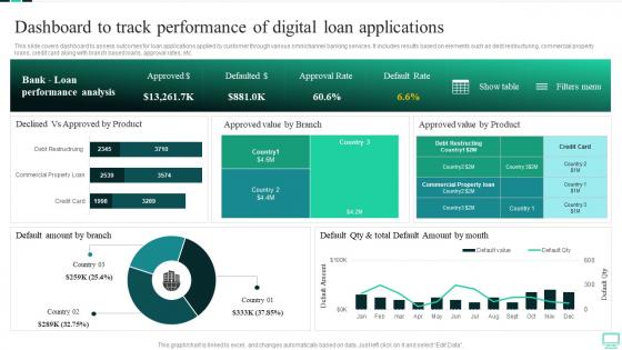
This slide covers dashboard to assess outcomes for loan applications applied by customer through various omnichannel banking services. It includes results based on elements such as debt restructuring, commercial property loans, credit card along with branch based loans, approval rates, etc.
People who downloaded this PowerPoint presentation also viewed the following :
Dashboard To Track Performance Of Digital Loan Applications Omnichannel Banking Services with all 7 slides:
Use our Dashboard To Track Performance Of Digital Loan Applications Omnichannel Banking Services to effectively help you save your valuable time. They are readymade to fit into any presentation structure.





FAQs for Dashboard To Track Performance Of Digital Loan Applications
Track your loan volume, approval rates, and how fast you're making decisions first. Default rates and delinquency percentages by loan type are crucial - this stuff will save your ass. Customer experience metrics like abandonment rates matter more than people think. Net Promoter Scores too. Profitability-wise, watch your yield and customer acquisition costs because nice charts don't help if you're losing money. Set alerts for anything jumping 10-15% week-over-week. Trust me, catching problems early beats explaining them to your board later.
Honestly, real-time analytics is a game changer - you can catch issues before they blow up into major problems. Monthly reports? Totally useless when you're dealing with fast-moving situations. It's like knowing your car's overheating right now versus finding out weeks later at the mechanic. You'll spot payment issues and weird borrower patterns immediately, then actually do something about it. Adjust your lending rules, call risky borrowers before they default, make decisions with fresh data instead of stale numbers. Figure out which metrics actually matter for your loan types first though.
Line charts are your go-to for tracking default trends month by month. Bar charts work well when you're comparing different loan types or risk groups. Heat maps are actually pretty useful here - they'll show you patterns by location or demographics without drowning you in numbers. You can also throw in gauge charts to show where you stand against target rates. Honestly, skip the pie charts though. They're terrible for catching small changes that might matter. I'd start with the line chart since that's what people usually want to see first, then add the others based on what questions keep coming up.
Honestly, loan segmentation is what makes or breaks your dashboard design. Different loan types need totally different metrics - like, a 30-day delinquency on a $5K personal loan isn't the same beast as one on a $500K mortgage, you know? Your stakeholders want different things too. Consumer lending folks obsess over approval rates while commercial teams are all about portfolio concentration. Build flexible filters so people can slice by segment, geography, risk tier - whatever matters for their specific book. Oh, and don't forget auto loans behave weird compared to everything else.
So basically ML digs through all your old loan data and spots patterns you'd never catch on your own. It tracks borrower habits, payment records, economic trends - honestly way too many variables for any human to juggle. The cool part? These algorithms actually get better over time as they crunch more info. You can use what it finds to tweak your lending rules and set smarter interest rates. Plus it'll flag risky loans before they blow up on you. I mean, it's not perfect but it's pretty close to having a crystal ball for your portfolio.
Honestly, just put the stuff they check most at the very top - don't make people dig for their key numbers. Group similar data together so it actually makes sense. I swear, half the dashboards I've used look like someone just threw charts at a wall. Keep your colors and icons consistent throughout, and always give context - like is 5% good or terrible? Map out how your users actually work first, then build around that flow. Oh, and definitely test it with real people who'll use it every day. Short bursts of info work better than cramming everything into one view.
Ugh, data inconsistencies are gonna be your worst enemy. Your loan system, payment processors, and credit bureaus all speak different languages - different field names, date formats, the whole mess. API rate limits will slow you down constantly, and nothing syncs on the same schedule which kills real-time reporting. Missing loan IDs and duplicate records? Yeah, those'll break everything. Honestly the credit bureau APIs are particularly finicky in my experience. Map out each data source first and write down all their weird quirks. Then build your ETL with solid error handling or you'll be troubleshooting forever.
So basically, map out what each team actually needs first - that's the secret sauce. Risk folks want delinquency trends and credit scores. Executives? High-level stuff like ROI and portfolio growth. Sales teams are obsessed with conversion rates (no surprise there). Operations needs the nitty-gritty - processing times, exception reports, all that granular data. Set up role-based access so people only see what matters to them. Oh, and customizable widgets are clutch. Don't overthink it though - just start with what they're already asking for daily and build from there.
Start with role-based access controls - that's your biggest win right off the bat. Multi-factor auth is non-negotiable too. Encrypt everything in transit and at rest, obviously need SSL certs. Set up audit logging so you know who's poking around and when. Data masking is clutch for sensitive stuff like SSNs, especially if some users just need to see trends without full customer details. Oh, and automatic session timeouts - people always forget to log out. Honestly, I'd probably do a security review every quarter or so just to stay on top of things. But yeah, tackle the access controls first.
So those interactive features are actually pretty useful - you can dig way deeper than just seeing "defaults went up 2%." Click around and filter by loan type or when they originated, and you'll spot exactly what's driving the problem. Tooltips and clickable charts make the data way more useful than staring at boring spreadsheets. Honestly, it's like actually talking to your numbers instead of just looking at them. I'd start with whatever's bugging you most, then keep filtering down until you find the real issue. That's where you'll get the good stuff.
You can check loan performance from anywhere with mobile dashboards, which is honestly a game changer when issues pop up. I'll review delinquency rates on the train or check portfolio health from a coffee shop. Way better than trying to read tiny desktop charts on your phone screen - learned that the hard way! Real-time alerts hit your device instantly, so performance drops don't blindside you. Set up alerts for your key metrics first though. That's what'll actually save your butt when things go sideways.
Compliance requirements basically control your whole dashboard design. You'll need specific data fields for reporting - HMDA data, fair lending metrics, risk stuff. Different regulations want the data shown completely different ways too, which is annoying. Don't forget audit trails for calculations and matching data retention periods. Your dashboard has to handle different reporting schedules - monthly, quarterly, whatever. Honestly, I'd map out compliance requirements first, then build around those instead of trying to fix it later. Way easier that route.
Skip the slideshow presentations - get everyone actually clicking around the dashboard with real loan data instead. Pair up your tech people with anyone who's struggling (honestly works way better than group training). Different roles need different training though, so don't make your loan officers sit through risk analyst stuff. Record everything so people can rewatch later when they're confused. Oh, and make a cheat sheet with shortcuts and common tasks. The big thing? Follow up in a few weeks once they've been using it for real. That's when the actual questions come up.
Real-time AI analytics are taking over - they'll catch defaults way earlier than we do now. Mobile design is everything since nobody uses desktops for banking anymore (seriously, when's the last time you did?). These dashboards are getting crazy personalized too, like having a financial advisor who actually knows you. Open banking data and even social media are getting pulled in for better borrower profiles. Regulatory stuff will automate itself, which honestly can't happen fast enough. Oh, and IoT devices are somehow part of this now? Wild. Start looking into AI partnerships soon though - this shift is happening fast.
Look, your users are basically your best product team - they'll tell you exactly what's broken and what actually matters. Survey your loan officers regularly and see which dashboard sections they're ignoring (trust me, there will be some). Run quick user tests when you roll out new stuff. The metrics they use daily? Those are gold. Pretty dashboards that nobody touches are honestly just expensive decorations. Set up an easy way for feedback and actually respond to it - even a simple Slack channel works. Oh, and track engagement on different sections. Your managers will probably want totally different views than your front-line people anyway.
-
The slides come with appealing color schemes and relevant content that helped me deliver a stunning presentation without any hassle!
-
Innovative and creative templates with high-quality designs. Helped me with my presentation as the slides were easy to edit.