


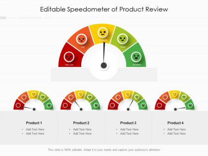
Editable speedometer of product review




Try Before you Buy Download Free Sample Product
 Impress Your
 Audience
 100%
100% Editable
 Save Hours
 of Time


Our Editable Speedometer Of Product Review are topically designed to provide an attractive backdrop to any subject. Use them to look like a presentation pro.
People who downloaded this PowerPoint presentation also viewed the following :
Editable speedometer of product review with all 2 slides:
Use our Editable Speedometer Of Product Review to effectively help you save your valuable time. They are readymade to fit into any presentation structure.
FAQs for Editable speedometer
Key features include customizable speed ranges, adjustable color schemes, multiple needle styles, flexible labeling options, and various gauge designs. These elements enable professionals to create compelling performance dashboards, progress tracking systems, and KPI visualizations across industries like automotive, manufacturing, and project management, ultimately delivering clear visual communication and enhanced stakeholder engagement.
Editable speedometer designs enhance data visualization by providing intuitive gauge representations, customizable color coding, real-time progress tracking, and clear performance benchmarks that audiences instantly understand. These visual elements streamline complex metrics presentation, with organizations in sales, manufacturing, and project management finding that speedometer formats dramatically improve stakeholder comprehension and decision-making speed.
**INPUT**: What software is best suited for customizing speedometer templates? **OUTPUT**: Professional design software like Adobe Illustrator, Canva Pro, and PowerPoint offer robust speedometer customization capabilities, along with specialized dashboard tools like Tableau and Power BI. These platforms enable organizations to modify colors, scales, data connections, and branding elements seamlessly, with many businesses finding that integrated presentation software delivers the most versatile solutions for executive reporting and performance tracking needs.
Yes, industry-specific speedometer templates are available for sectors like finance, healthcare, manufacturing, and retail, featuring relevant KPIs, compliance metrics, and sector-appropriate visual elements. These specialized templates streamline reporting by incorporating industry standards, regulatory requirements, and common performance indicators, with many organizations finding that tailored dashboards enhance stakeholder communication and accelerate decision-making processes.
Color schemes significantly impact speedometer readability through contrast ratios, visual hierarchy, and cognitive processing speed. High contrast between needle and background colors, strategic use of red for danger zones, and complementary palettes enhance quick data interpretation, with many dashboard designers finding that monochromatic schemes with accent colors deliver optimal readability while maintaining professional aesthetics across various lighting conditions.
Common mistakes include using excessive visual elements that clutter the display, selecting inappropriate color schemes that hinder readability, failing to establish clear data ranges, and neglecting mobile responsiveness. These design oversights can confuse stakeholders in sectors like automotive manufacturing and logistics, where precise performance metrics are critical, ultimately undermining the speedometer's effectiveness in delivering actionable insights and strategic decision-making capabilities.
Animated speedometers increase audience engagement by providing visual storytelling, real-time data representation, and interactive progress tracking that transforms static metrics into compelling narratives. These dynamic elements capture attention through movement, simplify complex performance data for immediate comprehension, and create memorable moments that resonate with viewers, ultimately delivering more impactful presentations and enhanced audience retention.
Performance metrics like sales velocity, project completion rates, customer satisfaction scores, operational efficiency percentages, and financial KPIs translate most effectively into speedometer graphics. These visual representations excel at displaying single-value metrics with clear target ranges, enabling organizations to quickly assess performance against benchmarks, with many finding that speedometers enhance stakeholder understanding of complex data through intuitive, at-a-glance insights.
Speedometers can be effectively integrated into analytical dashboards to display KPIs, performance metrics, progress toward targets, and real-time status indicators with immediate visual impact. Through customizable ranges and color-coded zones, organizations streamline performance monitoring across sales, operations, and financial reporting, enabling stakeholders to quickly identify critical thresholds and make data-driven decisions with enhanced operational efficiency.
Design elements significantly impact speedometer effectiveness through readability, visual hierarchy, cognitive processing speed, and user engagement across different applications. Larger gauges with clear numerical spacing enhance quick recognition in automotive dashboards, while compact circular designs work better in mobile apps, with many presentation designers finding that proportional scaling and high contrast colors ultimately deliver faster data interpretation and improved audience comprehension.
Effective speedometer integration involves aligning metrics with your story arc, positioning them at decision points, using consistent color coding throughout slides, and ensuring data supports your narrative flow. These visual elements enhance audience comprehension by creating memorable data moments, reinforcing key performance insights, and maintaining engagement momentum, with many presenters finding that strategic speedometer placement significantly improves message retention and stakeholder buy-in.
Font choice significantly influences speedometer readability and data perception through legibility, visual hierarchy, brand alignment, and user trust factors. Sans-serif fonts like Arial or Helvetica enhance clarity in automotive dashboards and industrial control panels, while consistent typography sizing guides attention to critical metrics, ultimately delivering faster decision-making and reduced interpretation errors across high-stakes monitoring environments.
Traditional gauges excel in scenarios requiring precise numerical readings, regulatory compliance, or minimal visual distraction, such as industrial monitoring, aviation cockpits, and medical equipment where exact measurements are critical. While speedometers enhance presentations and dashboards, traditional gauges deliver superior accuracy for technical documentation, safety-critical applications, and environments where users need specific data points rather than visual approximation, ultimately ensuring precision over aesthetic appeal.
**INPUT**: What resources or tools can assist in creating custom speedometer designs from scratch? **OUTPUT**: Custom speedometer design resources include vector graphics software like Adobe Illustrator, dashboard creation platforms, UI/UX design tools, template libraries, and specialized gauge development frameworks. These tools streamline visualization development by offering pre-built components, customizable templates, and drag-and-drop functionality, with many organizations finding that combining multiple platforms ultimately delivers faster prototyping and enhanced user experiences. [Word count: 55 words]
User feedback improves editable speedometer templates by identifying confusing visual elements, highlighting readability issues, and revealing functionality gaps that designers might overlook. Through systematic testing with actual users, organizations can streamline color schemes, enhance data visualization clarity, and optimize interactive features, with many finding that iterative feedback cycles ultimately deliver more intuitive dashboards and improved decision-making capabilities.
-
Presentation Design is very nice, good work with the content as well.