

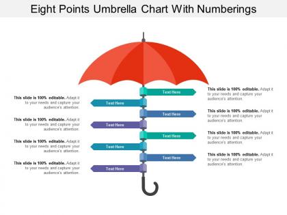
Eight points umbrella chart with numberings




Try Before you Buy Download Free Sample Product
 Impress Your
 Audience
 100%
100% Editable
 Save Hours
 of Time


Folks end up buying with our Eight Points Umbrella Chart With Numberings. They believe they have a good bargain.
People who downloaded this PowerPoint presentation also viewed the following :
Eight points umbrella chart with numberings with all 5 slides:
Get your ideas in harmony with our Eight Points Umbrella Chart With Numberings. They will emerge a coherent force.
FAQs for Eight points umbrella
Key components of an effective umbrella chart include a central main topic, clearly defined sub-categories, logical hierarchical relationships, consistent visual styling, and balanced information distribution across branches. These elements work together by creating intuitive navigation, enabling comprehensive data organization, and facilitating quick decision-making, with many organizations finding that well-structured umbrella charts significantly enhance strategic planning and stakeholder communication across departments.
Umbrella charts enhance data visualization by organizing complex hierarchical relationships, showing clear parent-child connections, and displaying multi-level data structures in an intuitive format. These visual tools streamline audience comprehension by presenting organizational frameworks, project dependencies, and strategic breakdowns more effectively than traditional charts, ultimately delivering clearer communication and faster decision-making in business presentations.
Umbrella charts are most effectively utilized for visualizing hierarchical relationships, organizational structures, decision trees, and multi-level categorizations where clear parent-child connections are essential. These charts excel in strategic planning presentations, corporate restructuring scenarios, and project management frameworks, with many consulting firms and enterprises finding that umbrella structures streamline complex information delivery while enhancing stakeholder comprehension.
Umbrella charts organize hierarchical relationships and multi-layered categories under central themes, while pie charts show proportional parts of a whole and bar charts compare discrete values across categories. Through their branching structure, umbrella charts enable comprehensive visualization of complex organizational data, process flows, and categorical breakdowns, with many businesses finding that they streamline strategic planning and resource allocation more effectively than traditional comparison charts.
Umbrella charts excel in project management by visualizing project hierarchies, resource allocation across multiple initiatives, stakeholder relationships, and budget distributions within program portfolios. Project managers leverage these charts to streamline complex multi-project oversight, enhance cross-functional communication, and deliver comprehensive status reporting, with many organizations finding that umbrella visualization significantly improves strategic alignment and operational efficiency.
**INPUT**: What software or tools are best suited for creating umbrella charts? **OUTPUT**: Top software for creating umbrella charts includes Microsoft PowerPoint, Excel, Visio, Lucidchart, and specialized presentation platforms like SlideTeam. These tools streamline hierarchical visualization by offering customizable templates, drag-and-drop functionality, and professional formatting options, with many organizations finding that dedicated presentation software delivers superior visual impact and faster creation times. [Word count: 54 words]
Color schemes significantly impact umbrella chart readability by creating visual hierarchy, ensuring adequate contrast between data segments, and facilitating quick pattern recognition across hierarchical levels. Strategic color choices enhance data interpretation by distinguishing parent-child relationships, reducing cognitive load during analysis, and enabling faster decision-making, with many organizations finding that consistent, accessible color palettes ultimately deliver clearer insights and improved stakeholder comprehension.
**INPUT**: What best practices should be followed when designing an umbrella chart? **OUTPUT**: Best practices for umbrella chart design include maintaining clear hierarchical structure, using consistent visual elements, ensuring readable text sizing, applying strategic color coding, and balancing information density across segments. These design principles streamline complex data presentation by enhancing visual clarity, improving stakeholder comprehension, and enabling faster decision-making, with many organizations finding that well-designed umbrella charts significantly improve meeting efficiency and strategic alignment. [Word count: 60]
Umbrella charts aid strategic planning by organizing complex hierarchical relationships, visualizing organizational structures, mapping decision pathways, and illustrating cross-functional dependencies within business frameworks. These visual tools streamline executive presentations by consolidating multiple strategic elements into coherent overviews, with many leadership teams finding that umbrella formats enhance stakeholder alignment and accelerate consensus-building during critical planning sessions.
Umbrella charts work best with hierarchical data showing branching relationships, categorical data with subcategories, organizational structures, process flows with multiple pathways, and comparative datasets across related groups. These visualizations excel when displaying complex information like departmental breakdowns, product categories with variants, decision trees, or multi-level classification systems, ultimately delivering clear visual organization that enhances comprehension and strategic decision-making.
Interpreting umbrella chart hierarchical relationships involves analyzing the central hub concept and its radiating sub-categories, examining how each branch connects to the main topic and relates to peer elements. These visual structures streamline complex organizational data by displaying parent-child relationships, categorical divisions, and system dependencies, with many businesses finding that umbrella charts enhance strategic planning and operational clarity.
Common mistakes include overcrowding charts with too many data points, using inconsistent scaling across sub-charts, and failing to establish clear hierarchical relationships between parent and child elements. These errors compromise data visualization effectiveness, with many organizations finding that proper spacing, standardized metrics, and logical groupings ultimately enhance clarity and decision-making accuracy.
Case studies include McKinsey's strategy presentations showing market hierarchies, healthcare systems displaying patient care pathways, and consulting firms presenting organizational restructuring plans to executives. These umbrella charts enhanced stakeholder comprehension by clearly mapping complex relationships, reducing meeting times, and enabling faster decision-making, with many organizations finding that visual hierarchy presentations increased client approval rates significantly.
Umbrella charts integrate into presentation storytelling by establishing overarching themes, breaking down complex narratives into digestible segments, and creating visual hierarchies that guide audience understanding. These charts enable presenters to introduce main concepts first, then systematically explore supporting details, while maintaining narrative flow and ensuring key messages resonate, ultimately delivering more coherent and memorable presentations.
When creating umbrella charts, consider your audience's technical expertise, decision-making level, and familiarity with hierarchical data structures. These visualizations work best for executives needing strategic overviews, project managers tracking multiple initiatives, and stakeholders requiring clear categorical breakdowns, with many organizations finding that tailored complexity levels enhance comprehension and drive more informed business decisions.
-
Easily Editable.
-
Awesome use of colors and designs in product templates.