


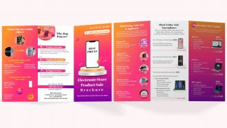
Electronic Brochure Trifold





Try Before you Buy Download Free Sample Product
 Impress Your
 Audience
 100%
100% Editable
 Save Hours
 of Time


Sell technologies, hardware, digital machines, etc. with highly engaging Electronic Brochure. Refer this brochure to showcases your stores key unique selling propositions such as in-home services, product selection and employee expertise. Highlight your outlets combo offers to increase sales and drive more customer visits. Promote Black Friday sales to increase sales of Laptops, Mobile Phones, Telvisions, Appliances, etc.
People who downloaded this PowerPoint presentation also viewed the following :
Electronic Brochure Trifold with all 1 slides:
Use our Electronic Brochure Trifold to effectively help you save your valuable time. They are readymade to fit into any presentation structure.
FAQs for
Honestly, the cost savings alone make it worth it - no more reprinting when you need to change prices or whatever. But the real game changer? You actually know if people are reading your stuff. Like, you can see which sections they click on and how long they stay. Interactive elements are pretty sweet too - videos, clickable buttons, all that. Your audience can forward them instantly, which is huge for getting more eyeballs on it. Oh, and they just look way more professional than PDFs. I'd probably test it out with whatever brochure you update most often first.
Dude, electronic brochures are so much better than regular presentations. People can actually click around and explore stuff instead of just zoning out. You can throw in videos, links, all that interactive stuff - way more engaging than static slides. Your audience bookmarks what they care about and comes back to it later. Plus you get to see which parts people actually spend time on, which is pretty cool data to have. Oh, and they don't have to sit through boring sections that don't apply to them. Just convert your next deck into a clickable PDF with some embedded links and you'll see what I mean.
Honestly, just keep it clean and readable - good fonts, consistent colors, proper contrast so people can actually see it. White space saves lives, trust me. Don't jam everything together or it looks awful. Get decent images that make sense with your content. Most people just skim anyway, so break stuff up with bullets and headers. Oh, and test it on your phone first since that's probably where half your audience will see it. Lead with the important stuff and throw in a clear call-to-action somewhere.
Yeah, so HTML5 video tags work great for embedding stuff directly, or just link to YouTube/Vimeo if you don't want to deal with hosting. CSS animations are pretty smooth, JavaScript libraries give you more control, and honestly GIFs still work fine even though they're kinda bulky. Most platforms like Canva or FlipHTML5 let you drag and drop everything in. Oh, and watch your file sizes - nobody wants to wait forever for a brochure to load. I'd try one video per section first, see how it runs, then add more from there.
Honestly, Canva's where I'd start - super easy to use and has a ton of templates that look pretty decent. If you want to get fancy later, Adobe InDesign is what the pros use, but fair warning: there's definitely a learning curve there. Adobe Express and Figma are solid middle-ground options too, especially if you're working with other people since they're good for collaboration. I mean, you could jump straight to InDesign if you're feeling ambitious, but why make things harder on yourself? Try Canva first, see how it goes, then upgrade if you need more control over the design stuff.
So basically, where you distribute your brochure totally changes who sees it and if they'll actually care. Email's pretty solid if your subject line isn't garbage - decent open rates. Social media though? Way more reach since people share stuff and algorithms do their thing. Direct links are perfect when you're targeting people who already showed interest in what you're doing. Oh, and website embeds work well for catching visitors already checking out your site. You'll need different tracking for each - email's all about opens/clicks, social focuses on engagement. Just pick 2-3 methods where your people actually spend time.
So there's a bunch of stuff you should track. Open rates and click-throughs are the obvious ones. Time spent on each page matters too - shows if people actually care about your content. Download rates are huge since that means they want to keep it. The real money maker though? Setting up conversion goals for leads or whatever action you want them to take. Oh, and don't sleep on sharing metrics because these things can spread pretty fast if they're good. Google Analytics is probably your best bet for tracking all this automatically, or just use whatever your email platform offers.
Ugh, the worst thing is cramming way too much text in there. People just scan emails, they don't actually read every word - so break up those paragraphs! Also skip the crazy animations and flashy stuff. Seriously slows everything down and looks super dated. Make sure your fonts work on phones (learned this the hard way). Oh and test your links first - nothing's more embarrassing than broken ones. Keep your contact info visible and stick to one main point per section. Simple is better, trust me.
Definitely go mobile-first - design for phones then work your way up to desktop. Keep your fonts big enough that people don't have to squint (seriously, tiny text is the worst). Buttons need to be at least 44px so they're actually tappable. Compress those images hard because mobile data can be brutal. Test on real phones, not just Chrome's dev tools - they lie sometimes. Keep everything snappy and load under 3 seconds if you can. Oh, and don't dump paragraphs of text on mobile users. They're usually multitasking anyway.
So basically, don't go crazy with your branding but make sure it's there. Your logo should be visible - just not plastered everywhere like a NASCAR car. Stick with your brand colors and fonts (or close web alternatives). The copy needs to match your brand's voice too - if you're normally funny, don't suddenly sound corporate and boring. Photos and graphics should feel cohesive with everything else you do. Oh, and definitely check how it looks on mobile because that's where most people browse anyway. Think of it like getting dressed - you want to look put-together but still like yourself.
Skip the boring feature lists - tell a story instead. Start with a problem your readers actually face, then walk them through finding your solution. Real customer stories work way better than vague benefits, trust me. Digital brochures are perfect for this since you can reveal the story bit by bit through clickable stuff, videos, whatever. People can even choose their own path through the content. I'd probably map out your customer's journey first - like, what are they thinking at each step? Then build your brochure around those moments.
Oh totally! Name and company personalization is like the bare minimum these days. But you can get way more creative - swap out product recommendations based on what they've bought before, change images to match their location, adjust pricing for different customer tiers. Dynamic content blocks are pretty sick too, they'll show different stuff depending on where someone clicked from your site. Actually just realized I'm probably overthinking this lol. Start simple with names plus maybe one other variable, see how it performs, then add more layers once you figure out what actually works for your audience.
Honestly, interactivity is what makes electronic brochures actually worth doing. Without it, you're just making a fancy PDF that people will skim through. Add some clickable buttons or videos though? Now you've got their attention. People remember way more when they can mess around with your content instead of just reading walls of text. The cool part is you get data back too - like which sections people actually care about or where they're spending time. I'd start simple with expandable sections or basic buttons first. Don't go crazy right away, but definitely don't skip this stuff entirely.
Honestly, digital brochures are pretty flexible once you get creative with them. I'd scatter them across different spots - email campaigns, social media posts, as freebies on your landing pages. QR codes work great too if you're still doing any print stuff. Track which channels actually get people clicking though, that's where the real insights are. Make sure everything matches your brand voice obviously. The cool thing is they're way more versatile than old-school paper ones - you can update them instantly when something changes. Just don't overthink the placement, test a few spots and see what sticks.
Honestly, everyone's going crazy for interactive stuff right now - clickable hotspots, embedded videos, all that. Personalization is huge too, like content that changes based on what users do. Oh and mobile-first design is basically non-negotiable since we're all glued to our phones anyway lol. Those little micro-animations are everywhere now and they do make things look way more professional. CRM integration's getting popular so you can pull live data into brochures. But here's the thing - don't try to do everything at once. Just nail mobile optimization first, maybe add one cool interactive thing, then see what people actually use.
-
I’ve been your client for a few years now. Couldn’t be more than happy after using your templates. Thank you!
-
Great product with highly impressive and engaging designs.