


Historical Brochure Trifold




Try Before you Buy Download Free Sample Product
 Impress Your
 Audience
 100%
100% Editable
 Save Hours
 of Time


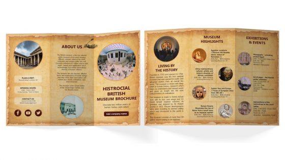
Advertise your British museum by using our seemingly engaging Historical British gallery Trifold Brochure Template. Use museum pamphlet presentation template to give a brief information about museum history and contact information etc. With the assistance of the museum gallery brochure PowerPoint theme, you can talk about the vivid history of the museum. Employ this professionally designed PPT brochure to showcase the museum highlights such as Egyptian sculpture, diversity of African continent, Sutton hoo and Europe story and Roman Empire. Leverage this Historic British museum brochure PowerPoint template to mention various exhibitions and events held that engage visitors.
People who downloaded this PowerPoint presentation also viewed the following :
Historical Brochure Trifold with all 1 slides:
Use our Historical Brochure Trifold to effectively help you save your valuable time. They are readymade to fit into any presentation structure.
FAQs for
Start with killer visuals - old photos, maps, whatever you can find. Your headline can't be boring like "History of Main Street" (yawn). People love stories way more than random dates, so focus on the juicy stuff that actually happened. A timeline helps readers follow along without getting lost. Oh, and if you're writing about an actual place, throw in the practical details like hours and directions - people always need that. Honestly, the whole thing should feel more like a documentary than a textbook. Balance the educational stuff with entertainment or you'll lose everyone.
Honestly, break that complex stuff into smaller chunks with good headings - makes a huge difference. Don't try cramming every detail in there. People's attention spans are terrible these days, so focus on the most interesting storylines instead. Timelines and maps work great for showing how events connect. I always think of it like making a documentary trailer, not writing some boring textbook chapter. Throw in some quotes from primary sources too - adds that authentic feel without going overboard. Oh, and definitely test it on someone who doesn't know the topic. They'll spot the confusing parts you missed.
Honestly, white space is your best friend here - historical stuff gets crazy dense otherwise. Go with serif fonts for the main text and create clear sections for different time periods. I made a Civil War brochure once that looked absolutely terrible because I crammed everything together! Simple color palette works best. Throw in some timelines and maps to break things up. People's brains just shut off when they see walls of text and dates. Keep chunks small so readers don't get overwhelmed. Also, larger headings really help guide people through the content.
Honestly, visuals make all the difference when you're writing about history. Nobody wants to slog through pages of just text about battles and dates - that's brutal. Maps are super helpful for showing where stuff actually happened and how armies moved around. Photos from the time period make everything feel more real too. Like, when you see actual faces of Civil War soldiers instead of just reading about them? Way more powerful. Oh, and don't just throw in random pictures to fill space - pick ones that actually connect to what you're talking about. The whole thing becomes way more engaging when readers can visualize what went down.
Honestly, font choice can make or break your whole brochure. Pick something that feels right for the time period - like, don't use Comic Sans for a Civil War thing (please). You'll want one nice display font for headers, then pair it with something super readable for the body text. The typography literally sets the mood and makes people trust that you know what you're talking about. Dense historical info needs good hierarchy so readers can actually follow along. I always think of fonts as the first impression - get it wrong and people won't even read your content.
Okay so basically you gotta think about who's actually reading this stuff. Students need interactive things - timelines, QR codes for videos, discussion questions that match what they're learning in class. Tourists? Totally different story. They want tons of photos, maps, and the highlights they can hit quickly. Let's be real - most tourists just want the pretty spots for their photos and some fun facts to tell people later. Oh and watch your tone too. Academic language works for teachers, but keep it casual for regular visitors. Definitely test it with real people first before you print everything!
Oh man, the worst thing you can do is cram way too much text on there - like, who's gonna read a novel on a poster? Also double-check your facts because nothing's more embarrassing than getting called out on basic stuff. Skip the fancy academic words that'll just confuse people. Visual hierarchy matters too - make the important bits actually pop out. And this might be obvious but always credit your images properly. I learned that one the hard way in college! Get someone who actually knows the topic to review your dates and historical details before you print. Honestly, if you start with a solid outline focusing on maybe 3-4 main points, you'll dodge most of these problems.
Think of it like a mini-documentary but on paper. Start with something that grabs people right away about that time period, then build up the drama through major events. Make sure you've got clear "characters" - the historical figures people can actually relate to. Throw in real quotes and descriptions that help readers picture the scenes. Each section should end with something that makes you want to flip to the next part. Honestly, chronological usually works best. Oh, and read it out loud when you're done - if it sounds weird or choppy, that's your cue to fix those parts.
Honestly, digital brochures are so much better than print for this stuff. You can throw in videos, interactive maps, audio clips - really makes the history come alive. Plus updating is instant when you find new info, and once it's made, distribution costs nothing. The analytics alone are worth it - you'll actually see what people care about most. People can pull it up on their phones anywhere, and you're not stuck with printing bills or boxes of brochures collecting dust in your garage (been there). Just start with a basic PDF and add fancy features later.
Go with the flow people read naturally - left to right or top to bottom. Horizontal timelines look really clean on fold-outs, plus you get more space without cramming stuff together. Vertical ones are solid for tri-folds too. Stick with the same visual markers throughout - dots, icons, whatever. Color coding different eras is clutch. Make your dates stand out but keep text short and punchy. Honestly, just sketch out a few layouts first. You'll know pretty quick which one clicks with your content. Way easier than trying to perfect it digitally right away.
So MLK and Rosa Parks are huge hits with people right now - everyone connects their fights to what's happening today. WWII stuff works great too because it's got that obvious good vs evil thing going on. Honestly, I'd focus on anyone who went against authority or broke through barriers. Suffragettes, labor activists, scientists who dealt with discrimination - that kind of thing. People love underdogs fighting the system, you know? Oh, and definitely throw in some "then vs now" comparisons in your brochure. Makes it way easier for readers to see why this stuff still matters.
Skip Wikipedia and go straight to actual historians - they know their stuff. Museums and historical societies are your best bet for primary sources like original docs and photos. History nerds will absolutely roast you for getting dates wrong (learned that the hard way). Cross-reference everything against multiple academic sources, especially names and visual details. Oh, and definitely have a historian look over your final draft. Way better than discovering you messed up after printing 5,000 copies.
QR codes are your best bet - link them to audio tours or video stuff people can pull up instantly. Fold-out timelines are weirdly addictive when done right. I'd also try scratch-off sections for "hidden" facts or those transparent overlay sheets for before/after photos. Oh, and perforated postcards with historical images work great since visitors love taking stuff home. The whole point is getting people to actually DO something instead of just skimming text. Honestly, physical interaction beats fancy design every time. Start small with one element though - see what clicks before you go overboard with bells and whistles.
Dude, culture is huge for this stuff. You'll want to think about who's actually reading your brochure first - like, a Civil Rights pamphlet for tourists hits way different than one for historians, you know? The events you pick, how formal you write, even your design choices all depend on your audience's background. Some communities remember the same historical moments totally differently too, which gets tricky. Honestly, controversial topics are the hardest part. I'd probably run a draft by someone from the community you're targeting - saves you from looking clueless later. Just do your homework on cultural context before you start writing.
Oh definitely check out National Park Service brochures - they're honestly perfect at giving you history without making your brain hurt. Colonial Williamsburg's stuff is amazing too, they make old timey things actually interesting somehow. The Smithsonian does these museum trail guides that are pretty solid, love how they use timelines and visuals. You know what though? Don't sleep on local historical societies. Sure, they're working with like zero budget, but they get super creative since they actually know their people. Grab a few different styles and see what clicks for your thing.
-
I am glad to have come across Slideteam. I was searching for some unique presentations and templates for my business. There are a lot of alternatives available here.
-
You guys are life-saver when it comes to presentations. Honestly I cannot do much without your services. Thank you!!!