


Business Conference Brochure Trifold




Try Before you Buy Download Free Sample Product
 Impress Your
 Audience
 100%
100% Editable
 Save Hours
 of Time


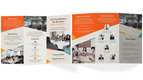
Advertise your business conference by using our visually appealing Business Conference Trifold Brochure Template. Use this pamphlet presentation template to provide information about the conference day, date and time. With the assistance of the Business Conference brochure PowerPoint theme, you can talk about details and benefits of becoming a member. Employ this professionally designed PPT brochure to showcase featured speakers such as talent expert, digital marketing expert, etc. Further, this brochure covers goals which includes empower entrepreneurs, motivate business people, etc. It also represents contact details such as phone number, website link and social media accounts.
People who downloaded this PowerPoint presentation also viewed the following :
Business Conference Brochure Trifold with all 1 slides:
Use our Business Conference Brochure Trifold to effectively help you save your valuable time. They are readymade to fit into any presentation structure.
FAQs for Business
Focus on three things: killer speakers, clear benefits, and all the basic details. Your headline needs to grab them - skip the corporate buzzwords that make people's eyes glaze over. Speaker photos and bios are huge since people want to know who they're listening to. Include a solid agenda so they know what they're actually signing up for. Obviously cover dates, location, cost, and how to register. Past attendee quotes help a ton if you've got them. Design should pop but not be overwhelming. Test it on a couple coworkers first - honestly, if they seem meh about it, your real audience will be too.
Oh man, good design makes such a huge difference! Nobody wants to stare at a wall of text. Keep it clean with lots of white space and make sure your colors match your brand. Use different font sizes so people know what's important - biggest for the main stuff, smaller for details. Honestly, I've seen so many terrible brochures where you can't even find the date! High-quality photos help a lot, and throw in some icons to break things up. Your registration info needs to jump off the page or people won't bother. Test it on a couple people first - if they're squinting and confused, you've got more work to do.
Your conference brochure needs solid branding - otherwise it'll just blend into everyone else's pile of boring materials. Stick to your company's colors, fonts, and logo placement religiously. I mean, people should know it's YOUR event before they even start reading. The whole thing should feel polished and legit, not like some last-minute Word doc someone threw together. Make sure your branding actually connects to your conference theme too. Oh, and pull up those brand guidelines first - they're your bible here. Think of the brochure as part of your brand experience, not just info dumping. Trust me, consistency matters way more than you'd think.
You'll want to make different versions based on what each group actually cares about. Executives? Hit them with ROI and big picture stuff. Tech people want the nitty-gritty details and how things actually work. End users just want to know it won't make their lives harder - honestly, they're probably the smartest audience because they cut through all the BS. Switch up your headlines, throw in relevant case studies, maybe even change colors if you're feeling fancy. The trick is really understanding who's going to be there. Map out your main attendee types first. What problems are they dealing with? Then speak directly to those pain points.
Start with the basics - conference name, dates, and location right at the top. That's non-negotiable stuff. Your main theme should be next, something that screams "this is why you need to be here." Oh, and don't do what half these events do with sponsor logos eating up the entire cover - it looks terrible. Big-name speakers? Yeah, definitely include those if you've got them. The whole thing needs to be scannable in maybe 3 seconds max. I always think of it like a movie poster - someone rushing past should immediately get what it is and when it's happening.
Honestly, testimonials are huge for conferences because they prove you're not just overselling. Real quotes from past attendees about networking wins or what they actually learned? That stuff sells itself way better than you listing features. I always go for specific testimonials over the generic "amazing event!" garbage - nobody believes that anymore. You want maybe 2-3 good ones that cover different angles like content, connections, and the overall vibe. It's basically letting your happy customers do the convincing for you, which is pretty smart if you think about it.
Honestly, just go with something clean like Helvetica or Arial for the main text. Sans-serif fonts are way easier to read when people are speed-scanning through your brochure. Don't get fancy with more than two font families - I learned that the hard way on a project last year. Body text should be at least 10-11pt because nobody wants to squint. You can create hierarchy by playing with bold and different sizes instead of switching fonts entirely. Oh, and definitely print a test page first! Stuff always looks different on paper than your screen.
Honestly, infographics are a game-changer for conference brochures. People barely glance at these things – maybe 10 seconds if you're lucky. Visual stuff catches their attention way better than blocks of text. Instead of writing "80% of attendees found value," just show it with a simple chart or cool icons. Makes the info actually stick, you know? I'd definitely try a visual timeline of the conference day or maybe map out networking spots. Works great for speaker bios too – way more interesting than boring bullet points. Complex stats become digestible when they're visual. Your brochure will actually stand out instead of getting tossed immediately.
Colors totally matter before people even look at the text. Blue and green scream "professional" - great for business stuff. Red feels urgent and exciting. Orange is energetic but way more approachable. Purple looks expensive, though it might be too much depending on your crowd. Yellow catches eyes but honestly gets annoying fast if you overdo it. You'll want to match whatever vibe your conference has. Also think about what your audience expects. I'd definitely run a couple options by some coworkers first to see what actually works.
Give your keynote speakers a full page with great headshots - don't cram tiny photos together like most events do. Write compelling bios that show why they're perfect for your audience. Their social media handles are clutch so people can follow them beforehand. Add a teaser about their talk topic too. Oh, and grab quotes from their previous speaking gigs if you can - it shows they actually know how to work a room. Makes such a difference when attendees can get a feel for their style ahead of time.
Honestly, just make it scannable - headings, bullet points, the works. People don't read these things, they hunt for what they need. Stick a table of contents up front because nobody's got time to flip through pages looking for the keynote info. Oh, and group similar stuff together - all the speaker bios here, parking details there, you know? Don't cram everything together either; white space actually helps people breathe. Maybe throw in some icons for different session types if you're feeling fancy. But seriously, hand it to a coworker first and see if they can find the important stuff quickly. If they're squinting and flipping pages, you've lost.
You definitely need digital versions for your conference brochure. Most people expect to find stuff online these days, and honestly, physical copies just sit around collecting dust. Digital lets you email them instantly, post on social media, throw them on your website - way more reach than print ever could. Plus you can actually see who's downloading and clicking through, which is pretty useful data. Oh, and make sure it looks good on phones since that's probably where people will see it first. Way easier for attendees to share with their coworkers too.
Honestly, urgency is everything. Slap on early bird pricing with countdown timers or "limited seats remaining" warnings. People will bookmark your event and forget about it otherwise - I've done this myself like 20 times. Instead of vague "networking opportunities," get specific: "meet 500+ industry leaders including CEOs from Tesla, Google, etc." Show actual speaker headshots and list exactly what attendees will learn. The "first 100 get bonus materials" thing works surprisingly well too. Make registration stupidly easy - one click if you can swing it. End with a huge "Register Now" button.
Look, spacing is everything when it comes to brochures - cramped text just screams "corporate junk mail" and gets tossed instantly. You need white space so people's eyes can actually rest somewhere. Make your headlines pop with clear hierarchy, and create a natural flow that guides readers through without them realizing it. It's like decorating a room, honestly - too cluttered feels chaotic, but too bare looks weird. Here's what I always do: print a rough draft and see where your eye goes first. That'll show you exactly where to adjust the spacing so everyone else follows the same path through your content.
Ugh, don't cram everything onto one page with microscopic text - nobody's squinting to read your brochure. Skip those cheesy stock photos of suit people shaking hands, they're so overdone. Put your date, time, and location front and center because people literally won't bother if they can't find the basics immediately. Registration info needs to be super obvious too. White space is your friend, seriously. Oh and this might seem obvious but I've seen it happen - triple check everything before you print because typos on 500 brochures are expensive mistakes.
-
The designs are super attractive. Me and my team love using SlideTeam’s presentations.
-
No second thoughts when I’m looking for excellent templates. SlideTeam is definitely my go-to website for well-designed slides.