


Hotel Brochure Trifold




Try Before you Buy Download Free Sample Product
 Impress Your
 Audience
 100%
100% Editable
 Save Hours
 of Time


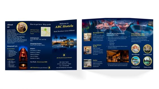
Show off your hotel in print Weve got professionally designed hotel brochure templates that you can customize and use for printing, social networks, etc. Use this hotel flyer to provide a brief introduction of your history and city along with amenities such as kitchen, lounge bar, casino, spa, Wi-Fi, etc. With the assistance of this PowerPoint catalogue, you can highlight rooms and suites offered by your hotel along with their pricing details. Employ this professionally designed PowerPoint leaflet to showcase your highly attractive and vibrant restaurant and bar. Leverage this cafe brochure by showing key services such as conference hall, swimming pool, fitness and gym, etc.
People who downloaded this PowerPoint presentation also viewed the following :
Hotel Brochure Trifold with all 1 slides:
Use our Hotel Brochure Trifold to effectively help you save your valuable time. They are readymade to fit into any presentation structure.
FAQs for
Start with the obvious stuff - room photos, amenities, location perks, and how to book. Food's huge too, so definitely highlight your restaurant situation. What sets you apart from every other hotel? Spa, business center, walking distance to cool stuff - whatever it is, play that up. Clean layout matters since people barely read these things anyway (honestly, I usually just look at pictures). Throw in a little map if you have space. The whole point is helping people picture staying there and figuring out why yours beats the Holiday Inn down the street.
Honestly, skip the generic stock photos - they're the worst. Walk through your place and find those spots that actually make people stop and stare. Get real shots of guests using your amenities, not some random people who could be anywhere. Your fonts and colors need to match your actual vibe too. Like if you're sleek and modern, don't go with some fancy script that screams Victorian mansion. Focus on the weird little details that make your place different - maybe it's that crazy light fixture in the lobby or your rooftop setup. Those Instagram moments? That's your goldmine right there.
Dude, typography can totally make or break your hotel brochure. I've seen amazing properties with gorgeous photos that look cheap because of awful fonts - it's wild how much difference it makes. Pick something that feels upscale but isn't hard to read when people are quickly flipping through. Your headings need to create clear sections so guests can jump straight to rooms or amenities or whatever they care about. Play around with different font weights and sizes to guide their eyes through everything. Just make sure it matches your hotel's vibe while staying readable.
Definitely highlight what's around you - it's what separates you from every other hotel. People aren't just booking a bed, they want the whole experience. Your brochure should mention nearby museums, restaurants, trails, whatever makes your area special. Guests can picture their trip better when they see what they'll actually do. I'd include how far everything is too (nobody wants to walk 2 miles to dinner). Maybe cut deals with local spots for guest discounts? That's honestly where you'll see the biggest impact on bookings.
Dude, real photos of your hotel beat stock images every single time. Guests want to see what they're actually getting - your lobby, your rooms, the real deal. Stock photos look nice but they're basically lying to people, which leads to angry reviews when reality doesn't match. Most people can spot fake photos anyway and it just makes you look sketchy. I mean, would you book somewhere that couldn't even show their own property? Get a decent photographer in there to shoot your place properly. It's worth spending the money to show off what makes your hotel special instead of some generic bedroom that could be anywhere.
Make a whole section just for green stuff - show off your solar panels, water-saving systems, local food sourcing. Numbers are huge here, like "cut energy use by 30%" or "completely eliminated single-use plastics." Photos work great too - your rooftop garden, recycling setup, bike rentals, whatever you've got. These eco-travelers aren't messing around, they actually research this stuff thoroughly. Skip the generic "we're eco-friendly" nonsense because honestly? It just sounds fake. Throw in any certifications you've earned. Oh, and if you won a sustainability award or something, definitely mention it.
Okay so first thing - stick to your brand guidelines like glue. Colors, fonts, tone, all of it. Don't go rogue here! Your photos need to actually match what your hotel looks like (I've seen too many places use fancy resort shots when they're clearly a cozy downtown spot). Put your logo somewhere prominent but not weird about it. The writing should sound like YOU - fancy and polished or chill and approachable, whatever fits. Oh and definitely have someone who gets your brand look it over before you print. They'll catch stuff you missed.
Skip the basic "amazing stay!" stuff - you want testimonials with real details. Like "Sarah from Denver, anniversary weekend" because people need to picture themselves there. Honestly, fake reviews are so obvious and just look desperate. Mix up where you put them too, don't just dump everything on one page. The best ones mention your actual amenities or specific experiences. I'd use some longer testimonials for credibility, then throw in short punchy quotes to break things up visually. Oh, and make sure they sound like real people actually wrote them - that's huge.
Honestly, go digital-first because that's where most designs fall apart. Design at 300 DPI but don't get fancy with tiny fonts or cramped layouts - phones will hate you for it. High contrast colors are your friend. I've watched so many beautiful print pieces look like garbage on screens, it's painful. Keep files small enough to actually share digitally while maintaining print quality. Test on real devices, not just your computer screen. Oh, and create one master file you can tweak for both formats. You'll thank me later when you're not rebuilding everything from scratch.
Okay so first thing - put your best deals in the top third of the brochure because that's where people look first. Use bold colors and bigger fonts to make promotions stand out from your regular room descriptions. I swear, some hotels just bury their deals in tiny text at the bottom like they don't want anyone to find them lol. Call-out boxes work great too, especially with contrasting colors. Leave some white space around your promotional stuff so it doesn't get lost in the clutter. Oh and whatever your strongest offer is? Give it the best spot on the page - that's your money maker right there.
QR codes are huge right now - link them to virtual tours or booking discounts. Fold-out maps are pretty cool too, plus little pop-up windows that show off amenities. Honestly, scratch-off sections are way more fun than they should be, guests go crazy for revealing special offers that way. Tear-out cards work well for restaurant recs. AR stuff's getting cheaper if you've got the budget. Just don't go overboard with gimmicky crap - I'd test everything with actual guests first. Oh, and make sure each thing actually helps them, not just looks fancy.
Go with gold and deep blues - they instantly scream luxury and make people feel secure. High-end hotels nail this combo every time. Green's perfect if you're pushing spa stuff or eco features since it feels naturally calming and sustainable. Avoid bright reds though! I see hotels do this constantly thinking it shows energy, but honestly it just comes off aggressive in brochures. Blues are your safest bet for that trustworthy vibe. Just make sure everything flows together when you're picking colors - you want guests imagining their actual stay, not getting distracted by clashing designs.
Okay so first thing - figure out where people will actually see this brochure. Lobby rack? Go with tri-fold because people just want to grab and scan while they're standing around. But if you're putting them in hotel rooms, bi-fold is way better since desk space is usually pretty cramped. I swear, I've seen so many beautiful brochures that are completely the wrong size for where they end up. Super annoying. Don't squeeze a ton of text into some tiny format just because it looks clean - that never works out well. Oh, and definitely test the size in the real spots before you print a million of them.
Don't just say "visit our website" - that's boring and nobody cares. Make it urgent and specific, like "Book by Friday, save 25% on weekend trips" with an actual link or QR code. Honestly, I've seen so many gorgeous brochures that just... stop. No clear next step, which drives me crazy. Put your main CTA on the back cover, maybe add a smaller one halfway through since some people decide fast. Oh, and make it time-sensitive! Include phone, email, whatever - give them options to actually reach you.
Ugh, biggest mistake? Making your brochure look like every other generic template out there. Skip the obviously fake stock photos - they're the worst. Also don't cram a novel's worth of text that nobody's gonna read anyway. What makes your hotel special should be super obvious in like 3 seconds. Pick 2-3 things that actually set you apart. Use real photos that don't look cheesy. Oh and please make the font readable - I swear some places think we all carry magnifying glasses! Your contact info needs to be easy to spot too.
-
A library of engaging, customizable and content-ready templates.
-
I joined SlideTeam last month and there’s no doubt that I tend to find our bond only strengthening over time. Best place to find world-class themes, templates, and icons.