


Graphic Design Company Brochure Trifold




Try Before you Buy Download Free Sample Product
 Impress Your
 Audience
 100%
100% Editable
 Save Hours
 of Time


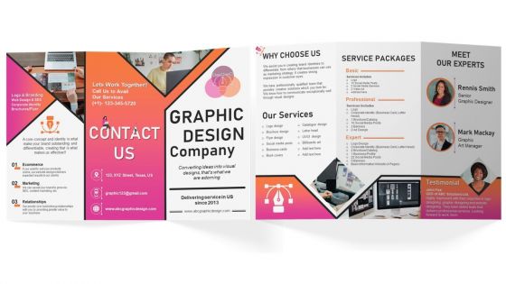
Advertise your graphic design company by using our visually appealing Graphic Design Company Trifold Brochure. Use this pamphlet presentation template to provide information about top service offerings such as logo designing, social media posts, business cards, book covers, letterhead, UX design, etc. With the assistance of the Graphic Design Company brochure PowerPoint theme, you can talk about the service packages such as basic, professional, and expert that show included services. Employ this professionally designed PPT brochure to showcase the unique offerings such as website design to get expected results, and assist in SEO and content marketing. Further, this brochure covers the expert team such as the senior graphic designer and graphic art manager along with the client testimonial.
People who downloaded this PowerPoint presentation also viewed the following :
Graphic Design Company Brochure Trifold with all 1 slides:
Use our Graphic Design Company Brochure Trifold to effectively help you save your valuable time. They are readymade to fit into any presentation structure.
FAQs for Graphic Design
Look, start with a headline that actually grabs people - none of that corporate fluff. Then create a clear flow down the page with plenty of white space so it's not overwhelming to look at. I swear, half the brochures I see are just word vomit trying to fit everything in. Stick to your brand colors and fonts, obviously. Your copy needs to be concise but actually mean something, you know? And for the love of god, include a call-to-action that tells people what to do next. Oh, and definitely test it on someone who doesn't know your business - they'll catch stuff you missed.
Honestly, color theory is a game changer for brochures. Start with your brand colors as the base, then pick accent colors that match your vibe. Want high contrast? Go with complementary colors. Prefer something more chill? Analogous colors work great together. Reds and oranges scream urgency - perfect for sales stuff. Blues and greens? They're trustworthy and calm, which is why every bank uses them lol. I'm probably overthinking this, but testing different combos really shows what clicks with people. The key is keeping everything cohesive so it doesn't look like a rainbow exploded on your page.
Oh man, typography can totally make or break your brochure! I've seen so many gorgeous designs that nobody reads because the font's too tiny or weirdly fancy. Your body text needs to be readable above all else - match your brand vibe, sure, but don't sacrifice clarity. Make your headings way bigger than subheadings, which should be bigger than body text. People scan first, then dive in. Stick to maybe 2-3 fonts max (I learned this the hard way). And seriously, print a test copy! What looks fine on screen can be awful in print.
Ok so first things first - get your brand guidelines locked down. Colors, fonts, logo rules, how you usually talk to people. I'm talking exact hex codes here, not just "kinda blue-ish." Your brochure should feel like it belongs with your website and other stuff. Don't stretch your logo weird or use random fonts that have nothing to do with your brand. Honestly, I've seen way too many brochures that look like they're advertising a totally different company. Once you've got everything designed, just lay it next to your other materials and see if they actually look related. It's pretty obvious when they don't match.
Pick images that actually support what you're saying and fit your brand vibe. Custom photos beat stock images every time - stock stuff just screams "generic brochure" to me. Keep your color scheme consistent throughout, and don't fill every single space with graphics. White space looks way cleaner. Here's the thing though - test print everything first because colors always look different on paper than your screen. I'd start by collecting tons of image options, then be brutal about cutting them down. Only keep the ones that really work. Your text and visuals should complement each other, not fight for attention.
Honestly, layout makes or breaks whether people actually read your stuff. You need clear headings and white space so it doesn't look like a hot mess - I've literally watched people toss gorgeous brochures because they were too cluttered to bother with. Short sentences help. Breaking up text with images keeps people interested instead of getting that "wall of text" panic. Oh, and don't forget about the fold thing - put your best info where they'll see it first when they open it. The inside's perfect for extra details once you've hooked them.
Hey! So first thing - don't cram everything onto there with tiny text. Nobody's gonna squint to read that mess. Use decent quality images too, pixelated stuff looks amateur when printed. I learned this the hard way lol. Stick to maybe 2 fonts max, otherwise it gets chaotic real quick. Your fold lines need to work right - text vanishing into creases is the worst. White space is your friend, let things breathe a bit. Oh and definitely print a test copy first! You'll catch weird layout stuff that looks fine on screen but terrible printed.
Honestly, digital brochures are so much better for flexibility. You can throw in videos, clickable buttons, animations - all that interactive stuff that obviously won't work on paper. No weird size constraints either, so your design can actually be creative. People scroll instead of flipping pages, which totally changes how they read through everything. The best part? You can fix mistakes or update info instantly without reprinting a million copies. I've saved clients so much money that way when they inevitably change their minds. Just heads up though - if they later want print versions, you might need to redesign some elements.
Honestly, just go with InDesign if you can afford it - everyone in the industry uses it and there's a reason why. It handles multi-page stuff perfectly, plus all your text and image placement is super clean. You'll probably want Illustrator too for any custom graphics. Photoshop's obviously great for photo work, though I feel like people overuse it sometimes. Can't swing Adobe's pricing? Canva Pro is actually pretty decent now, or check out Affinity Publisher. Just make sure whatever you pick can spit out high-res PDFs with bleed settings. Trust me, InDesign's learning curve isn't as brutal as people make it sound.
Look, audience research stops you from creating something gorgeous that totally flops. Find out their age and industry knowledge first - executives want clean, simple stuff while creative people dig more experimental vibes. Their pain points should guide your color choices and imagery too. I swear, I've watched so many pretty brochures bomb because nobody bothered asking what actually resonates with people. Survey a few folks or peek at competitor materials your audience already loves. Way better than just winging it and hoping for the best.
Put your CTAs where people actually look - bottom right corners work great, or right after you list benefits. Don't go overboard with the sales-y language though, nobody wants to feel cornered. Instead of "Contact us" try something like "Schedule your consultation." Bold colors help them pop, plus leave some white space around buttons so they're not crammed in there. Oh, and stick to 2-3 CTAs tops - any more and people get decision paralysis. I'd definitely test different spots to see what clicks with your audience.
Honestly, infographics are a game-changer for making data actually interesting. Instead of dumping paragraphs on people, you can turn stats, processes, or comparisons into something visual they'll actually look at. Think charts, icons, step-by-step illustrations – stuff that breaks up all that text. Way more memorable too. I always start by finding my most boring sections (you know, the ones that make your eyes glaze over) and figure out which ones could work as simple visuals instead. Makes everything so much easier to scan through.
Minimalist stuff is everywhere right now - tons of white space with bold fonts and those subtle geometric shapes. QR codes finally caught on (about time lol). Muted, earthy colors are way better than those super bright ones from before. Interactive features are popping up more, especially AR if you've got the budget. Oh, and everyone's obsessed with sustainability messaging - eco-friendly paper is a must. You'll want to work these in slowly so you don't look outdated.
Oh man, the format changes EVERYTHING. Tri-folds are tricky - you've got to nail what people see first when they open it, and those skinny panels mean everything needs to be super scannable. Booklets are honestly way easier because you get actual space to work with and can do proper storytelling across pages. Z-folds work amazing for like step-by-step stuff since they flow naturally. Gate-folds are cool for big reveals but kinda gimmicky sometimes? Definitely mock yours up though - I've learned this the hard way but designs that look perfect on screen can be disasters when folded.
Templates are total game changers - I used to think they were cheating but honestly they save SO much time. You're not starting from zero every project, and everything stays consistent with your branding. When clients want stuff done yesterday (which is always), templates keep you from making dumb spacing mistakes or typography fails. Find like 3-4 solid template sets you actually like, then just swap in your colors and fonts. I swear it cuts design time in half. Plus your work still looks professional even when you're scrambling to hit deadlines.
-
Thank you for offering such helpful pre-designed templates. They are really beneficial to me in my job.
-
Wonderful ideas and visuals. I'm really pleased with the templates, which are unique and up to date.