


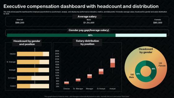
Executive Compensation Dashboard With Headcount And Distribution




Try Before you Buy Download Free Sample Product
 Impress Your
 Audience
 100%
100% Editable
 Save Hours
 of Time


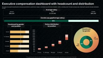
The slide showcases the dashboard for employee payroll which is used to track, analyze, and display key performance indicators, metrics, and data points. It includes average salary, headcount by gender and salary distribution by level.
People who downloaded this PowerPoint presentation also viewed the following :
Executive Compensation Dashboard With Headcount And Distribution with all 7 slides:
Use our Executive Compensation Dashboard With Headcount And Distribution to effectively help you save your valuable time. They are readymade to fit into any presentation structure.





FAQs for Executive Compensation Dashboard With
Track total comp first - base, bonus, equity all rolled up. CEO pay ratios are massive right now because shareholders won't shut up about it, so definitely include that vs median worker pay. Performance stuff tied to variable pay matters too, like revenue growth or stock numbers. Peer benchmarking data helps, plus say-on-pay results and equity dilution percentages. The comp mix breakdown showing fixed vs variable is clutch - boards eat that up. Oh and don't skip the performance metrics actually tied to bonuses. Start there and see what your execs obsess over, then add whatever else they're always asking about.
Honestly, spreadsheets are brutal for compensation stuff. Charts make it so much easier to see if your CEO pay is getting crazy compared to how the company's actually doing. You can spot executive pay gaps right away, plus comparing year-over-year trends or industry benchmarks becomes simple. Heat maps show you which parts of compensation are driving the big increases. I mean, trend lines will tell you if your approach is even sustainable long-term. Dashboards basically turn boring data into an actual story – way better than staring at endless rows of numbers.
Look, benchmarking is everything when you're building a comp dashboard that actually works. Without external market data, you're basically flying blind - and nobody wants that mess. Pull together 10-15 real peer companies first, then build your dashboard around those comparisons. Board members need to see exec pay stacked against industry peers, similar company sizes, performance stuff like that. Make it visual though, because nobody has time to dig through spreadsheets anymore. Honestly, if the comparisons aren't easy to digest at a glance, you've already lost half the room.
So basically you get this real-time view of whether exec pay actually matches company performance. Track revenue growth, profit margins, stock stuff - then compare it to what they're getting paid. Honestly, it's wild when you see the data laid out like that. Some execs are making bank while missing every target lol. The dashboard helps you set up performance-based pay and tweak things when they're not delivering. You can benchmark against competitors too and show the board what's really happening. Start with maybe 3-5 metrics that actually matter to your business and build from there.
Okay so for your comp dashboard you'll need a few data sources. HRIS gives you the base salary and bonus stuff. Equity data comes from your stock plan platform - usually a different system because why make it easy, right? Benefits data is the worst part honestly, it's always spread across like 5 different places. You'll want benchmarking data too from Radford or Mercer so you can see how you compare to market. Oh and get your data governance sorted first. Otherwise you're just gonna end up with messy reports that don't make sense.
Start by pulling your exec comp data and breaking it down by whatever demographic info you have - that's where you'll spot the big gaps. Most companies track gender and racial pay differences, plus who's actually in leadership roles. HR typically handles collecting that demographic stuff so it doesn't get awkward. Compare your ratios across different groups and set some diversity goals for the C-suite. Honestly, the hardest part is just getting quality data without making people uncomfortable about it. Once you see the patterns, benchmark against what others in your industry are doing and make actual plans to fix the gaps.
Honestly, transparency comes down to three main things. Break down every piece of compensation clearly - base salary, bonuses, equity, all of it. People get suspicious when you lump stuff together in weird categories. You should also throw in some benchmarking data so everyone can see how your execs compare to similar companies. That context matters. And definitely explain any weird spikes in pay - like if someone got a retention bonus or whatever. I mean, the whole thing should tell a story, not just be random numbers on a screen. Start by looking at what you're showing now and figure out where the gaps are.
So basically it puts all your exec comp data in one spot instead of those awful spreadsheet dumps. Board members can actually see pay ratios, benchmarking against peers, performance stuff - all visually laid out. Way better than those binders we used to haul into meetings (honestly those were the worst). You can spot trends faster and run scenarios on the fly when someone suggests changes. Plus it shows compliance status and how everything looks from a shareholder perspective. Makes board discussions way more productive since everyone's looking at the same clear picture instead of hunting through pages of numbers.
So basically you need different dashboards for different people. Board members just want the big picture stuff and how you stack up against competitors. HR needs all the nitty-gritty department breakdowns. Executives are obsessed with those pay-vs-performance charts - they eat that stuff up honestly. Legal wants compliance tracking (obviously), and shareholders need simple overviews they can actually understand. Oh, and make sure people can switch between different time periods. Start by figuring out what questions each group bugs you about most, then build views that answer those. Way easier than trying to make one dashboard do everything.
Ugh, regulatory changes are such a pain - you basically have to rebuild your whole dashboard every time new rules drop. Remember when pay ratio requirements came out? Total chaos trying to add median employee comp tracking overnight. Now we're stuck monitoring clawback triggers, ESG stuff, and risk adjustments in real-time. Your dashboard can't just show numbers anymore - compliance status and audit trails are mandatory now. Honestly, I'd build some flexibility into whatever you're using so you don't have to start over when the next round hits.
I'd go with Tableau or Power BI for the main dashboard - both handle compensation data really well and execs actually use them. Power BI's probably cheaper if you're already using Microsoft stuff. You'll need somewhere to store all the payroll and equity data too, so maybe Snowflake or SQL Server. Oh, and don't underestimate how much of a pain data integration is - tools like Alteryx help pull everything from your different HR systems. Honestly though? Start by figuring out where all your data lives first. That part always takes longer than you think it will.
So basically you want to see how much of their pay is short-term stuff (quarterly numbers) versus long-term goals (stock performance over 3-5 years). Most good dashboards let you filter by executive level and compare ratios across departments. Honestly, when someone's getting like 90% short-term bonuses, they usually make pretty sketchy decisions - learned that the hard way at my last company. You can track vesting schedules too, which is super helpful. The whole point is spotting red flags and benchmarking against industry standards so people actually do what you want them to do.
Honestly, just ask your users what they actually want to see. Drop quick surveys right in the dashboard - people will fill them out if they're short. Watch what sections they ignore vs. what they're always screenshotting. That's your real data right there. The trick is making feedback super easy to give, then actually doing something with it. I see so many teams collect feedback and then... nothing. Push updates based on what people tell you, then let them know you listened. Creates this whole cycle where they feel heard and keep giving you better input. Plus you'll stop building stuff nobody uses.
Honestly, the worst thing you can do is cram everything onto one screen - executives just want key metrics, not information overload. Missing benchmarks against peer companies makes your dashboard pretty pointless for actual decisions. I've watched so many teams build these gorgeous dashboards that look amazing but have zero context. Your data sources better be solid and updating regularly too, because stale comp data will bite you. Oh, and definitely test all the filtering stuff before you go live - learned that one the hard way. Start simple with core metrics, then add complexity as people actually use it.
Honestly? Do it monthly if you can swing it. Most companies stick to quarterly updates since that lines up with board meetings and earnings reports - which makes total sense because that's usually when comp decisions get made anyway. But if you're in a crazy competitive industry, monthly keeps you way more on top of things. Your benchmarking data gets stale fast otherwise. Oh and definitely set up a calendar reminder right now or you'll totally forget about it. Trust me on that one - I've seen too many dashboards gather dust for months.
-
Informative presentations that are easily editable.
-
Stunning collection! With a wide variety of options available, I was able to find a perfect slide for my presentation. Thank you, SlideTeam!