


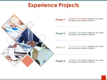
Experience projects ppt design templates




Try Before you Buy Download Free Sample Product
 Impress Your
 Audience
 100%
100% Editable
 Save Hours
 of Time


Give folks the correct image of your concept with our Experience Projects Ppt Design Templates. It helps illustrate your doctrine.
People who downloaded this PowerPoint presentation also viewed the following :
Experience projects ppt design templates with all 5 slides:
Draw customers into your fold with our Experience Projects Ppt Design Templates. Be able to build intimate bonds.
FAQs for Experience projects
Effective experience project presentation templates include clear visual hierarchy, dedicated sections for project outcomes, timeline frameworks, before-and-after comparison layouts, and professional imagery placeholders. These elements streamline complex project narratives by highlighting measurable results, demonstrating progression through visual storytelling, and enabling stakeholders to quickly grasp project impact, ultimately delivering compelling presentations that showcase organizational capabilities and strategic value to clients.
Color schemes significantly influence project experience perception by establishing emotional tone, reinforcing brand identity, enhancing readability, and guiding audience attention throughout presentations. Strategic color choices create psychological responses that shape how stakeholders perceive project credibility and professionalism, with many organizations finding that cohesive palettes increase audience engagement and message retention, ultimately delivering stronger project buy-in and clearer communication outcomes.
Bar charts, line graphs, customer journey maps, heatmaps, and satisfaction trend charts work best for visualizing experience project data. These visualization tools enhance stakeholder understanding by displaying user feedback patterns, engagement metrics, and improvement trajectories, with many organizations finding that clear data presentation accelerates project approval and implementation timelines.
Customizing presentation templates to align with project or organizational branding is crucial for maintaining professional consistency, building stakeholder trust, and reinforcing brand recognition throughout client interactions. This strategic approach enables organizations to streamline their visual identity across all communications, enhance audience engagement, and ultimately deliver more cohesive project narratives that strengthen competitive positioning.
Storytelling techniques for presentation templates include narrative arcs with clear beginnings and conclusions, character-driven case studies, problem-solution frameworks, emotional hooks through visuals, and progressive revelation structures. These approaches enhance audience engagement by creating memorable journeys rather than static information dumps, with many organizations finding that story-based presentations increase retention rates and drive stronger stakeholder buy-in.
Presenters can effectively balance text and visuals by using the 6x6 rule (maximum six bullet points with six words each), incorporating high-quality images that directly support key messages, and ensuring white space comprises at least 30% of each slide. Experience project templates work best when visuals like infographics, process diagrams, and customer journey maps replace dense paragraphs, ultimately delivering clearer communication and enhanced audience engagement.
Typography significantly influences presentation readability through font size, spacing, hierarchy, and contrast, while enhancing aesthetic appeal via style consistency, visual balance, and brand alignment. Strategic typography choices enable presenters to guide audience attention, improve information retention, and create professional impressions, with many organizations finding that well-designed typographic systems streamline content delivery and strengthen overall message impact.
Experience project presentation templates should avoid cluttered layouts, excessive animations, inconsistent color schemes, small unreadable fonts, and overly complex graphics that distract from key insights. These design pitfalls can undermine stakeholder engagement and comprehension, while clean, consistent templates with strategic white space and clear visual hierarchy enhance message delivery, with many organizations finding that simplified designs ultimately drive better decision-making and project buy-in.
Multimedia elements can be integrated into PowerPoint templates through embedded video files, audio narrations, interactive buttons, hyperlinked media assets, and optimized file formats that maintain quality while ensuring compatibility. Strategic placement of these elements enhances audience engagement and information retention, with many organizations finding that templates incorporating multimedia deliver more impactful presentations while streamlining content creation across teams.
**INPUT**: What best practices should be followed for slide transitions and animations in experience project presentations? **OUTPUT**: Best practices include using subtle, consistent transitions like fade or push effects, limiting animations to 2-3 per slide, and ensuring timing supports narrative flow rather than distracting from content. These techniques enhance storytelling by emphasizing key project milestones, user journey phases, and outcome demonstrations, with many design teams finding that strategic animation ultimately delivers greater audience engagement and clearer communication of complex experience concepts. *[Word count: 60]*
Different industries significantly influence experience project templates through sector-specific visual languages, compliance requirements, color psychology, and audience expectations. Healthcare templates prioritize clean, trustworthy designs with medical imagery, while tech companies favor dynamic layouts with data visualizations, and financial services emphasize conservative aesthetics with charts and graphs, ultimately enabling presenters to communicate more effectively within their industry's established professional standards.
Pre-designed templates offer significant time savings, professional visual consistency, structured content organization, cost-effectiveness, and access to expert design principles that many non-designers lack. These templates streamline presentation development by providing proven layouts, cohesive color schemes, and strategic information flow, with many organizations finding that template-based approaches reduce preparation time by 60-70% while delivering polished, impactful presentations.
Feedback from previous presentations informs future template designs through audience engagement analysis, content flow assessment, visual clarity evaluation, and technical performance review. By examining which slides generated questions, where audiences lost focus, and what design elements enhanced comprehension, organizations can refine templates to deliver more impactful presentations, with many finding that iterative improvements based on presenter and stakeholder input significantly enhance communication effectiveness and project outcomes.
Slide layouts can be optimized through flexible grid systems, modular content blocks, strategic white space allocation, and scalable typography hierarchies. These design approaches enable seamless content adaptation by establishing clear visual zones, implementing consistent spacing ratios, and utilizing progressive disclosure techniques, with many presentation designers finding that modular templates deliver both versatility and professional polish across diverse content volumes.
High-quality images and graphics for experience project templates can be sourced from stock photo platforms like Shutterstock and Unsplash, design resources such as Canva and Adobe Creative Cloud, and professional template libraries including SlideTeam's curated collections. These resources streamline visual storytelling by offering industry-specific imagery, customizable graphics, and brand-consistent elements, with many organizations finding that strategic visual integration enhances stakeholder engagement and project communication effectiveness.
-
Very unique and reliable designs.
-
Unique and attractive product design.