

F248 Dashboard For Retail Store Inventory Retail Store Operations Performance Assessment




Try Before you Buy Download Free Sample Product
 Impress Your
 Audience
 100%
100% Editable
 Save Hours
 of Time


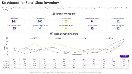
This slide depicts the retail store inventory dashboard providing information regarding expired items, low stock items, returned goods. It also covers details of stock demand planning.
People who downloaded this PowerPoint presentation also viewed the following :
F248 Dashboard For Retail Store Inventory Retail Store Operations Performance Assessment with all 7 slides:
Use our F248 Dashboard For Retail Store Inventory Retail Store Operations Performance Assessment to effectively help you save your valuable time. They are readymade to fit into any presentation structure.





FAQs for F248 Dashboard For Retail Store Inventory Retail Store
So F248's got this drag-and-drop widget thing that actually works without coding (shocking, I know). Real-time charts that you can customize however you want. Your team can comment right on the metrics too, which is pretty handy. Most other templates force you into their layouts, but this one adapts to however you work. Works on any device, connects to popular data sources automatically. Honestly? Just try their demo first - you'll see what I mean about how easy the setup is. Way better than wrestling with rigid dashboards.
Honestly, F248 Dashboard is a game changer for presentations. It turns your boring spreadsheet data into interactive charts that actually look professional. Live data updates automatically, so you'll never have that awkward "oops this is from last month" situation again. The drag-and-drop thing is super easy - I'm terrible with design but still made decent-looking stuff. You can customize colors and layouts to match whatever vibe you're going for. Start with their templates though, seriously saves so much time. Way better than fumbling around with static charts.
Look, the F248 Dashboard really pays off when you're dealing with tons of data streams and need to see everything happening in real-time. High-volume periods? System monitoring? Troubleshooting across different departments? That's where it absolutely kills it. Honestly, if you're still drowning in spreadsheets (been there), this thing will save your sanity. Perfect for teams that need to look at data together and make fast decisions. Oh, and don't try to do everything at once - start with your most critical metrics first, then build out from there.
So F248 works great for manufacturing, logistics, healthcare, and financial stuff - basically anywhere you're tracking real-time metrics. It's super solid when you've got complex workflows or multiple data streams happening at once. Retail chains dig it too, which honestly surprised me since that wasn't their main focus originally. Really comes down to whether you need centralized monitoring and fast decisions based on live data. I'd map out what reporting you're doing now first. Then you can see where F248 might actually help instead of just adding another dashboard to ignore.
Yeah, the F248 Dashboard is pretty user-friendly. No coding needed - just log in and start clicking around. Visual charts and simple labels make it easy to understand what's what. Your non-tech people can figure it out in like 5 minutes, maybe less if they're not completely hopeless with computers lol. Drag-and-drop works well for customizing stuff. There are tooltips everywhere too which helps. I'd maybe have someone walk them through it once, then they can mess around on their own and get comfortable with it.
Yeah, the F248 Dashboard has tons of customization stuff you can mess with. Color schemes, different chart types like bar/line/pie charts, moving widgets around - all that's pretty straightforward. Time ranges and custom filters are adjustable too. Oh, and you can white-label it with your company's branding, which is nice I guess. Start with layout changes first since they make the biggest difference visually. Then tweak colors and filters based on what your users actually care about seeing. The settings panel's where all the good stuff lives - just gotta poke around in there.
So the F248 Dashboard is actually pretty slick - it pulls everything through APIs and automated pipelines, meaning you're always looking at current data. No more smashing that refresh button like a maniac. The analytics engine just runs constantly in the background, updating your charts as new info comes in. You can set custom alerts when things hit certain thresholds, plus automated reports that fire off when data changes. Honestly, the coolest part is customizing refresh rates per widget. Critical stuff updates every few seconds while other metrics can chill and refresh hourly. Way better than our old system.
Yeah, F248 Dashboard handles all the usual stuff - REST APIs, SQL databases, CSV uploads, webhooks for real-time data. Cloud platforms too if you're on AWS, Azure, or GCP. Honestly their API docs are pretty solid, which is rare these days. I'd go with REST API first since it's easiest to get running. Oh, and double-check your data format matches their schema upfront - trust me on this one, it'll save you hours of headaches later. The whole setup is pretty straightforward once you get going.
Yeah, it works pretty well on mobile! Just pull it up in your browser and the layout adjusts automatically. Charts look good when they scale down. Some of the busier widgets get a little squished on phones though - kind of annoying but not terrible. I'd go with a tablet if you've got one, makes a huge difference. Or just stick to the main summary screens instead of diving into all the detailed stuff. Oh, and there's a presentation mode somewhere in settings that cleans up the interface. Removes all the extra buttons and makes it look way cleaner for your audience.
Oh nice, F248 actually handles scaling pretty well. Small businesses get the basics - analytics and reporting - without all the expensive enterprise stuff. Bigger companies unlock advanced integrations, multi-user setups, custom dashboards, all that. You can start small and add modules later, or honestly just go all-in from the start if you've got the budget. What's cool is nobody gets stuck paying for features they don't use. I'd check their pricing page to see what matches your team size - should give you a good idea of what you're looking at cost-wise.
Hey! So with the F248, don't try to shove everything on one screen - trust me on this one. Pick your top 3-5 metrics first and build out from there. Keep your color coding consistent across charts, and make sure the really important stuff sits at the top where people will actually see it. I swear, half the dashboards I've worked with are just data vomit because nobody thinks about the end user. Group your KPIs logically and throw in some context or benchmarks so people aren't just staring at random numbers. Clean hierarchy beats cramming every metric you can think of.
Honestly, F248 Dashboard is a game-changer for making your data actually tell a story instead of just... existing there as numbers. Map out what story you want to tell first - that's key. Then set up the dashboard sections to follow that flow. Way better than randomly throwing charts at people and hoping something sticks! During presentations, you can drill into details without everything falling apart, which is clutch for Q&A sessions. Plus you can customize views for different audiences. My boss loves different stuff than our dev team, you know?
Okay so the biggest trap is thinking you're seeing live data when there's actually a 15-minute delay. Made that mistake early on and it sucked. Those filter settings at the top? They reset every time you log in and default to 7 days, which probably isn't what you want. Export caps at 10K rows too - no heads up or anything, just cuts off. Oh and honestly the date ranges are weirdly finicky. Always refresh before you make any decisions because stale data will absolutely screw you over.
Hey! So basically F248 turns your whole team workspace into this shared thing where everyone sees what's happening live. You can comment right on data points and tag people when you need their input. Honestly, the notifications are actually decent - they don't blow up your phone every two seconds like most apps do. Multiple people can jump in and build reports together, which is pretty neat. Oh, and there's version history so you won't accidentally wreck someone's work (learned that one the hard way). Set up a shared workspace for your next project - way better than those endless email chains.
Yeah, check out the resource library - there's a whole "Success Stories" section with case studies. The manufacturing one really stood out to me, honestly pretty impressive stuff. Teams have cut incident response times by 40% and gotten way better visibility between departments. Each study breaks down the actual metrics, timelines, and what they learned along the way. Oh, and definitely find one that matches your industry first - you'll save yourself a headache trying to adapt something totally different. Then just tweak their approach to fit what your team's actually doing.
-
Happy to found you SlideTeam. You guys are value for money. Amazing slides.
-
I never had to worry about creating a business presentation from scratch. SlideTeam offered me professional, ready-made, and editable presentations that would have taken ages to design.