


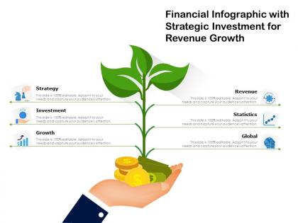
Financial infographic with strategic investment for revenue growth




Try Before you Buy Download Free Sample Product
 Impress Your
 Audience
 100%
100% Editable
 Save Hours
 of Time


Canvas for better infrastructure with our Financial Infographic With Strategic Investment For Revenue Growth. Convince folks to improve facilities.
People who downloaded this PowerPoint presentation also viewed the following :
Financial infographic with strategic investment for revenue growth with all 2 slides:
Convince folks to improve facilities with our Financial Infographic With Strategic Investment For Revenue Growth. Canvas for better infrastructure.
FAQs for Financial infographic with strategic investment
Effective financial infographics include clear data visualization, compelling headlines, consistent color schemes, logical information flow, and credible source citations. These components work together by simplifying complex financial concepts, enhancing audience engagement, and improving data retention, with many financial institutions finding that well-designed infographics significantly increase client understanding and decision-making confidence.
Financial infographics transform complex data into digestible visual narratives by combining charts, graphs, icons, and strategic color coding to highlight key trends, comparisons, and insights. These visual tools enable financial institutions, investment firms, and corporate teams to communicate quarterly results, market analysis, and budget allocations more effectively, ultimately enhancing stakeholder understanding and faster decision-making processes.
Effective financial infographic design principles include clear data hierarchy, consistent color coding, minimal text with impactful visuals, strategic use of charts and graphs, and intuitive information flow. These principles work together by enhancing data comprehension, reducing cognitive load, and maintaining professional credibility, with many financial institutions finding that well-designed infographics significantly improve client engagement and decision-making processes.
Colors significantly influence financial data interpretation by triggering psychological responses, creating visual hierarchies, and establishing emotional connections with numerical information. Red typically signals losses or urgent attention, green represents growth or positive trends, while blue conveys trust and stability, with many financial institutions finding that strategic color choices enhance comprehension and decision-making accuracy.
**INPUT**: What types of financial data are most commonly represented in infographics? **OUTPUT**: Financial infographics commonly represent budget breakdowns, revenue trends, investment portfolios, expense categories, and performance metrics like ROI and profit margins. These visual formats enhance stakeholder communication by simplifying complex financial data, enabling faster decision-making, and improving transparency, with many organizations finding that infographics significantly increase engagement and comprehension during presentations. **Word count: 54 words**
Storytelling in financial infographics incorporates narrative arcs, progressive data reveals, and emotional connections through visual sequences that guide viewers from problem to solution. Through strategic use of characters, timelines, and cause-and-effect relationships, organizations create compelling narratives around budget transformations, investment journeys, and performance outcomes, ultimately making complex financial data more memorable and actionable for stakeholders.
Common mistakes include overcrowding data, using inconsistent color schemes, neglecting visual hierarchy, choosing inappropriate chart types, and failing to cite credible sources. These design flaws undermine comprehension by creating confusion, reducing trust, and overwhelming viewers, with many financial institutions finding that clean, well-structured infographics significantly enhance client understanding and engagement while building credibility.
Financial infographics can be tailored through audience-specific data visualization, terminology adjustment, complexity levels, and relevant use cases that resonate with each segment's priorities and expertise. Investment firms might emphasize portfolio performance metrics, while retail banking clients benefit from simplified budgeting visuals, ultimately enhancing comprehension and engagement across diverse financial stakeholder groups.
**INPUT**: What tools or software are recommended for creating financial infographics? **OUTPUT**: Recommended tools for creating financial infographics include Canva, Adobe Illustrator, Tableau, PowerBI, and Piktochart, each offering specialized features for data visualization and design flexibility. These platforms streamline complex financial data presentation by providing customizable templates, automated chart generation, and collaborative features, with many financial institutions finding that professional design tools ultimately enhance client communication and deliver more compelling investment presentations. **Word count: 60 words**
Financial infographics enhance presentations and reports by transforming complex data into visually compelling, easily digestible formats that improve audience comprehension and engagement. These visual tools streamline communication of budget analyses, performance metrics, and financial forecasts, with many organizations finding that infographics significantly reduce presentation time while increasing stakeholder buy-in and decision-making speed.
Typography significantly impacts financial infographic readability through font hierarchy, size consistency, contrast optimization, and strategic spacing that guides viewer attention through complex data. Well-designed typography enables financial institutions, investment firms, and corporate finance teams to present quarterly reports, market analyses, and budget presentations more effectively, ultimately enhancing stakeholder comprehension and decision-making speed.
Infographics aid financial trend understanding by transforming complex data into visual narratives, highlighting patterns through charts, graphs, and timelines that reveal market movements, performance metrics, and economic indicators. These visual tools enable investors, analysts, and stakeholders to quickly identify correlations, seasonal fluctuations, and long-term trajectories, ultimately delivering faster decision-making and enhanced strategic planning capabilities.
Data sourcing and accuracy form the foundation of credible financial infographics, determining stakeholder trust, regulatory compliance, and decision-making effectiveness. Inaccurate data can lead to poor investment choices, regulatory violations, and damaged reputation, while reliable sourcing from verified databases, audited reports, and reputable financial institutions enables organizations to communicate complex financial insights confidently, ultimately delivering transparency and competitive advantage.
Financial infographics enhance social media strategies by simplifying complex data, increasing engagement rates, and building brand credibility through visual storytelling. Banks, investment firms, and insurance companies leverage these tools to explain market trends, share financial tips, and demonstrate expertise, ultimately driving follower growth and client acquisition while establishing thought leadership in an increasingly competitive digital landscape.
Measuring financial infographic effectiveness involves tracking engagement metrics like views, shares, and time spent, comprehension rates through user testing, and conversion metrics such as click-throughs or downloads. Organizations increasingly use A/B testing with different design elements, conduct feedback surveys on clarity and understanding, and monitor social media engagement, ultimately delivering insights that enhance communication strategies and improve audience retention.
No Reviews