


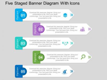
Five staged banner diagram with icons flat powerpoint design




Try Before you Buy Download Free Sample Product
 Impress Your
 Audience
 100%
100% Editable
 Save Hours
 of Time


Expose the different angles with our Five Staged Banner Diagram With Icons Flat Powerpoint Design. They generate fruitful debate.
People who downloaded this PowerPoint presentation also viewed the following :
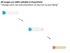
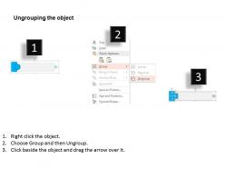
Five staged banner diagram with icons flat powerpoint design with all 4 slides:
When you need to create a presentation go through our many Five Staged Banner Diagram With Icons Flat Powerpoint Design to find what you need. If you can?t find what you need we?ll create it from scratch.
FAQs for Five staged banner diagram with icons
The key components of a Five Staged Banner Diagram include sequential stage headers, descriptive content blocks, connecting flow elements, visual hierarchy markers, and outcome indicators. These components streamline complex process communication by organizing information systematically, enhancing stakeholder understanding, and enabling clear progress tracking, with many organizations finding that structured visual frameworks ultimately deliver improved project alignment and strategic clarity.
The Five Staged Banner Diagram enhances presentation clarity by visually segmenting complex processes into distinct, sequential phases, enabling audiences to follow logical progressions more easily while reducing cognitive overload. This structured approach streamlines information delivery, particularly in project timelines, strategic rollouts, and process explanations, with many presenters finding that audiences retain key insights more effectively and engage more meaningfully with sequential content.
The Five Staged Banner Diagram proves most effective in project management, product development cycles, strategic planning initiatives, process improvement workflows, and organizational change management presentations. This visual framework streamlines complex sequential information by creating clear progression pathways, enabling teams across manufacturing, healthcare, and financial services to communicate multi-phase strategies while enhancing stakeholder understanding and accelerating decision-making processes.
Key design principles for Five Staged Banner Diagrams include maintaining visual hierarchy through consistent sizing, using progressive color schemes that guide the eye naturally, ensuring adequate white space between stages, implementing clear directional flow indicators, and maintaining readable typography throughout. These design elements work together by creating intuitive navigation, reducing cognitive load, and enhancing comprehension, with many organizations finding that well-designed staged diagrams significantly improve audience engagement and information retention.
Color choices significantly enhance Five Staged Banner Diagram effectiveness by improving visual hierarchy, guiding reader flow, reinforcing brand identity, and increasing information retention rates. Strategic color application enables clearer stage differentiation, faster comprehension, and stronger audience engagement, with many organizations finding that thoughtful color schemes deliver more impactful presentations and better communication outcomes.
Adobe Illustrator, PowerPoint, Canva, Lucidchart, and Visio offer excellent capabilities for creating Five Staged Banner Diagrams, each providing templates, vector graphics, and customization features. These platforms enable designers to develop professional presentations by offering intuitive interfaces, collaborative features, and export flexibility, with many marketing teams and consultants finding that PowerPoint and Canva deliver the optimal balance of functionality and accessibility.
The Five Staged Banner Diagram offers superior sequential clarity compared to traditional flowcharts, timelines, or process maps by presenting interconnected stages through visually distinct banner elements that enhance readability and flow. While standard diagrams can appear cluttered or rigid, this approach streamlines complex processes into digestible segments, with many organizations finding that banner-style presentations significantly improve stakeholder comprehension and engagement during strategic presentations.
Common pitfalls include overcrowding stages with excessive text, using inconsistent visual hierarchy, neglecting logical flow between sequential steps, and failing to maintain balanced spacing across all five banners. These design mistakes can confuse audiences and diminish message clarity, with many presenters finding that simplified content, consistent formatting, and clear directional indicators ultimately deliver stronger visual impact and better audience comprehension.
The Five Staged Banner Diagram adapts seamlessly to online presentations through interactive features, animated stage reveals, clickable navigation elements, and integrated multimedia components. These digital enhancements enable presenters to guide audiences through complex processes step-by-step, maintain engagement through visual progression, and deliver more dynamic storytelling, with many organizations finding that virtual presentations become more compelling and memorable when using structured banner formats.
Different industries apply the Five Staged Banner Diagram by adapting its sequential framework to their specific operational needs, with manufacturing using it for production workflows, healthcare for patient care pathways, and financial services for loan processing stages. This strategic visualization enables organizations to streamline complex processes, enhance cross-departmental communication, and identify bottlenecks, ultimately delivering improved operational efficiency and faster service delivery across diverse business environments.
Sequential business processes, project timelines, customer journey stages, product development phases, and strategic implementation roadmaps are best represented in Five Staged Banner Diagrams. These visual formats excel at displaying progression-based information like sales funnels, manufacturing workflows, and service delivery processes, with many organizations finding that banner layouts enhance stakeholder comprehension while streamlining complex multi-step communications.
Storytelling integrates with the Five Staged Banner Diagram by creating a narrative arc across each banner stage, allowing presenters to guide audiences through sequential plot points, character development, or process evolution. This approach transforms static information into compelling journeys, with many organizations finding that narrative-driven banners enhance audience engagement, improve message retention, and deliver more memorable presentations that drive strategic outcomes.
Effectiveness evaluation methods include audience comprehension testing, visual hierarchy assessment, information retention measurement, completion rate tracking, and stakeholder feedback analysis. These approaches streamline evaluation by measuring cognitive load, assessing flow clarity, and analyzing user engagement patterns, with many organizations finding that systematic testing delivers enhanced communication outcomes and strategic presentation advantages.
A Five Staged Banner Diagram improves audience engagement by breaking complex information into digestible visual segments, creating logical flow, and maintaining viewer attention through progressive revelation. This structured approach enables presenters to guide audiences through step-by-step processes, strategic roadmaps, and multi-phase concepts, with many organizations finding that sequential visual storytelling significantly enhances comprehension and retention rates.
Healthcare organizations have successfully used five staged banner diagrams for patient care pathways, financial institutions for loan approval processes, and manufacturing companies for quality control workflows. These visual frameworks streamline complex multi-step procedures by clearly defining each stage's requirements and outcomes, with many organizations finding that standardized banner diagrams reduce processing time and improve team coordination across departments.
-
Qualitative and comprehensive slides.
-
Use of different colors is good. It's simple and attractive.