


Ge Mckinsey 9 Box Matrix With Industry Attractiveness Business Strategy Best Practice





Try Before you Buy Download Free Sample Product
 Impress Your
 Audience
 100%
100% Editable
 Save Hours
 of Time


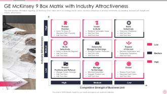
This slide provides information regarding GE McKinsey 9 box matrix which is a strategy tool for various business enterprises to prioritize investments by evaluating business unit strength and industry attractiveness.
People who downloaded this PowerPoint presentation also viewed the following :
Ge Mckinsey 9 Box Matrix With Industry Attractiveness Business Strategy Best Practice with all 6 slides:
Use our Ge Mckinsey 9 Box Matrix With Industry Attractiveness Business Strategy Best Practice to effectively help you save your valuable time. They are readymade to fit into any presentation structure.





FAQs for Ge Mckinsey 9 Box Matrix With Industry Attractiveness Business
So basically the GE McKinsey matrix is like a smarter version of that BCG thing. You plot your business units on market attractiveness vs competitive strength - creates 9 boxes that tell you to invest, hold steady, or dump each one. Way more detailed than other frameworks, which is probably why consulting firms are obsessed with it. The cool part? You get clear "invest/hold/harvest" guidance for your whole portfolio. Perfect when you're juggling multiple business areas and can't figure out where to throw your resources. My old boss swore by this thing, though honestly any framework beats random gut decisions.
So the GE McKinsey Matrix is this 3x3 grid thing where you plot your business units. Market attractiveness goes on the y-axis, competitive strength on the x-axis - each split into high/medium/low. You end up with three buckets: invest/grow (top-left where you're strong in good markets), selectivity/earnings (the middle diagonal), and harvest/divest (bottom-right where everything sucks). It's like BCG but more nuanced, which is nice. The tricky part is actually being honest about where each unit belongs - nobody wants to admit their baby project is in the "divest" corner. Then just match your spending to what the matrix tells you.
Market size and growth rate are definitely your starting points - they matter most. Then check how brutal the competition is and whether you can actually make decent money there. Customer price sensitivity is huge too. I'd also look at how stable the market is (some industries are just roller coasters) and whether there are any regulatory headaches. Oh, and can you even reach your target customers effectively? That sounds obvious but you'd be surprised. Honestly, just pick 5-6 things that really matter for your specific situation and weight them accordingly. Don't get lost in analysis paralysis with a million criteria.
Don't just look at market share - that's honestly pretty misleading on its own. Compare your brand strength, customer loyalty, and distribution against competitors. Financial stuff matters too: margins, cash flow, growth rates. The trickiest part? Being real about where you actually stand. Internal teams always sugarcoat things. Get external data - customer surveys, third-party reports, whatever you can find. I'd create some kind of scoring system for each factor. Weight them based on what actually drives success in your space. Market position might matter more in some industries, cost structure in others.
So basically GE McKinsey is way more detailed - 9 boxes vs BCG's 4. BCG just looks at market share and growth, which is kinda limiting tbh. GE McKinsey factors in tons of stuff like market size, competition, profitability, your company's actual strengths. Way more realistic. The catch is it's super subjective since you're basically making up scores for everything. Takes forever too. I'd go with GE McKinsey if you've got time for deep analysis and don't mind the extra work - it'll give you much better insights than BCG's oversimplified approach.
The GE McKinsey matrix works best when you've got a mixed bag of business units that need totally different strategies. Perfect timing? During budget planning when you're figuring out where to throw money vs. where to pull back. It's super helpful if your businesses are in markets that vary wildly in terms of how attractive they are. The whole nine-box thing looks intimidating at first - not gonna lie. But it forces you to get real about which units are actually performing and which ones are just dead weight. Annual planning sessions are ideal for this, or whenever you're doing a major portfolio cleanup. Really helps you see the bigger picture instead of just guessing where to invest.
So basically you look at where your business units land in the different boxes. Top-left corner (strong position + attractive market)? Pour money into those - they're your winners. Bottom-right is the opposite, so pull cash out and maybe sell them off. Honestly, the visual aspect makes it way easier than trying to remember which units need what. Middle boxes get tricky and need more analysis, but the corners are pretty obvious. I'd map everything out once a year - beats having those endless budget meetings where everyone's fighting for equal slices. Your CFO will probably love the clarity too.
So the GE McKinsey matrix is basically your roadmap for where to dump your cash and energy across different business units. You plot each one using market attractiveness vs competitive strength - honestly, sounds more complicated than it is. Top-left boxes? Those are your golden children that deserve heavy investment. Bottom-right gets harvested for whatever cash you can squeeze out. Everything else falls in the middle somewhere. It stops you from making dumb moves like spreading yourself too thin or pouring money into dying businesses. Perfect for those brutal budget meetings where you gotta decide who gets funding.
Honestly, you should be checking this stuff quarterly at least - monthly if you're in a crazy fast industry. When new competitors pop up or regulations shift, update your market attractiveness scores. Same goes for major customer preference changes. Your business unit strength ratings need refreshing too when competitive positions move or you get new market share data. The real trick is watching leading indicators instead of just waiting for the financials to catch up (learned that one the hard way). Build yourself a simple dashboard tracking the key metrics. Trust me, it'll save you from scrambling later.
Honestly, the data quality thing will probably drive you nuts - getting solid market share numbers is way harder than it should be. Everyone's gonna have different ideas about what makes a market "attractive" too, which gets messy fast. And good luck when you have to tell someone their division is a "dog" - the politics around that are brutal. The whole framework kind of forces complex situations into these clean little boxes when real business is obviously way more complicated. Oh, and spend forever upfront getting people to agree on your criteria and data sources. Trust me on that one - it'll save you headaches later.
Honestly, color coding is your best friend here - green for winners, red for the dogs. Makes everything pop instantly. I'd throw in bubble sizes too so people can see market size at a glance. Interactive dashboards are clutch because executives love playing around with data themselves (weirdly satisfying for them). Heat maps work great for showing clusters. Don't forget arrows between boxes - that's how you show the strategic story over time. The whole thing should be scannable in 30 seconds max so they can spot patterns fast and jump into the good questions.
Pull data from a bunch of different places - financial reports, market research, customer surveys for your business units. Industry stuff needs competitor analysis and growth forecasts. Honestly, talking to your sales and product people is huge since they catch things the spreadsheets miss. Don't just use one source though, everything has gaps. I'd set up some basic scoring system first so you're not all over the place when comparing units. Cross-check everything. Look for patterns that pop up across multiple sources - that's where the real insights usually hide.
Look, those soft factors can totally flip where your business units end up on the matrix. Numbers might show decent market appeal and competitive position, but then brand reputation or customer loyalty pushes things around. Management quality matters too - I've seen units that looked meh on paper suddenly shine because of killer innovation or those unbreakable customer bonds. You don't want qualitative stuff to completely override hard data, but honestly? It's worth serious weight in your final call. Just don't go overboard with it.
P&G did exactly this back in the 2000s when they were cleaning house - kept their winners in good markets, ditched the weak stuff. GE used it too for everything from appliances to their aviation business. Basically helped them figure out where to dump money vs. what to spin off. Honestly, it's kind of a wake-up call when you actually map things out visually like that. You'll probably spot some projects you're throwing resources at that don't deserve it. Worth trying with whatever you're working on - might surprise you what ends up where on the grid.
Honestly, the GE McKinsey matrix works way better when you stack it with other frameworks. Porter's Five Forces is clutch for understanding what's actually driving your market attractiveness scores - like why some markets suck and others don't. SWOT analysis pairs nicely with the business unit strength side too. Oh, and definitely throw in BCG's growth-share matrix if you can. They're basically made for each other. Use the 9-box as your starting point, then dig deeper with these other tools to catch stuff you missed. Sometimes you'll find your initial assumptions were totally off.
-
Enough space for editing and adding your own content.
-
The content is very helpful from business point of view.