


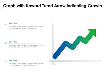
Graph with upward trend arrow indicating growth




Try Before you Buy Download Free Sample Product
 Impress Your
 Audience
 100%
100% Editable
 Save Hours
 of Time


Our Graph With Upward Trend Arrow Indicating Growth are topically designed to provide an attractive backdrop to any subject. Use them to look like a presentation pro.
People who downloaded this PowerPoint presentation also viewed the following :
Graph with upward trend arrow indicating growth with all 2 slides:
Use our Graph With Upward Trend Arrow Indicating Growth to effectively help you save your valuable time. They are readymade to fit into any presentation structure.
FAQs for Graph with upward trend
You'll want clear time periods on your x-axis and consistent metrics on the y-axis. Title should actually tell people what they're looking at - sounds obvious but you'd be surprised. Make your data points visible. Trend lines help if the growth pattern isn't super clear. Stick with simple colors like blue and gray for business stuff. Don't get fancy with rainbow charts or whatever. Always throw the data source and time frame somewhere on there. If you need more than one sentence to explain your graph, it's probably too messy. Oh, and start with your current numbers then work backward to show how you got there.
Dude, your growth graphs will hit so much harder if you turn them into actual stories. People zone out looking at plain numbers - I swear half our team does this in meetings. Drop in some annotations or color changes when major stuff happened, like that campaign launch or strategy shift. Short callouts explaining the "why" behind those spikes make all the difference. Maybe add little icons for key events? It's way easier to remember a story than random data points. Trust me, viewers want context - they need to know what caused those crazy jumps, not just see the lines going up and down.
Honestly? **Tableau** and **Power BI** are your best bet for interactive stuff with tons of customization. **Excel** is still legit for quick charts - people underestimate how clean it can look. Want more design control? **Adobe Illustrator** or **Figma** let you make really polished graphics, but you're doing way more manual work. If you code, **D3.js** or **Python's matplotlib** give you crazy flexibility. But real talk - start with whatever you already have. Google Sheets can look surprisingly decent if you mess around with the colors and formatting a bit. No point buying new software if you don't need to yet.
So basically, your growth type totally changes what chart you should pick. Linear growth? Just use regular line or bar charts - they show that steady climb perfectly. But exponential stuff gets tricky. Everything looks boring and flat until BAM, it shoots up at the end (which honestly looks cool but isn't always useful). You might need log scales or break it into chunks. Really depends what story you're telling though. Want drama? Keep the linear scale and watch people's jaws drop. Need to actually see patterns the whole time? Go logarithmic, even though it's less exciting.
Start your y-axis at zero if you can, or mark the breaks clearly. Too much data on one chart? Total mess - nobody's gonna read that. Watch out for those sketchy timeframes that make growth look amazing (like starting right before a big spike, classic move). Keep your intervals the same throughout and label stuff properly. The real key though? Give context about what's actually happening. Market changes, new policies, whatever. I've seen so many charts that look impressive until you realize there was some major event driving everything. Raw numbers by themselves are pretty useless honestly.
Show three lines on your graph - best case, realistic, and worst case scenarios. Different colors work great for this. Honestly, investors love seeing you've actually thought about the downside instead of just showing some crazy hockey stick growth. Mark your key milestones right on the timeline so they know what's driving each jump. Label everything clearly - revenue, users, whatever metric actually matters for your business. I wouldn't go past 5 years though, gets way too speculative after that. The whole point is proving you get both the opportunity and the real challenges you're facing.
Honestly, color choice can make or break your growth graphs. High contrast is key - your lines need to pop against the background. Never use red and green together though, colorblind people literally can't tell them apart (I made that mistake once and felt terrible). Blue, orange, and green work great if you space them out properly. Oh, and here's something that saved me tons of headaches - convert everything to grayscale first to check if the contrast still holds up. If it looks good without color, you're golden. Most people skip this step but it's a game changer.
You can totally adapt growth graphs for any industry - just swap out the metrics and timing. Tech companies usually track user acquisition or daily active users over short sprints. Finance is more about portfolio performance and ROI measured quarterly or yearly. Healthcare gets weird though - could be patient outcomes, treatment success rates, whatever makes sense for them. Pick KPIs your stakeholders actually care about, then match your timeframe to how your business operates. I'd start by figuring out what "growth" even means for your situation first. Then build the chart around those numbers that matter most.
Your audience totally dictates how you design that growth graph. Executives? Keep it super clean with big-picture trends - they've got like 30 seconds of attention span, honestly. Analysts though? They actually want all the messy details and multiple data points. Time frames matter too - some groups care about quarterly stuff, others want daily breakdowns. I usually pick colors based on what clicks with each crowd. Oh and always think about what decision they're trying to make with your data first. That'll guide everything else. Makes the whole process way easier once you nail down their actual needs.
Hey! So first thing - label your axes with units and timeframes, like "Revenue ($M)" and "Quarter." Don't label every data point though, that's just chart chaos. Pick the important stuff - milestones, big changes, targets you're hitting (or missing lol). Make your text big enough to actually read during presentations. Nobody wants to squint. If you've got multiple metrics, throw in different colors or line styles with a legend. Oh and honestly? Less is more here. You want people focused on what the data's telling them, not playing detective with your formatting.
Honestly, growth graphs are a game-changer for tracking market trends. Just plot your key metrics like sales or customer numbers against time and boom - you can actually see what's happening instead of staring at boring spreadsheet rows. The visual makes it so much easier to catch patterns you'd totally miss otherwise. Seasonal dips, sudden spikes, gradual declines - it all jumps out at you. Pick your most important metric first (probably sales if you're not sure) and start plotting it monthly. Way more satisfying than I expected when I first started doing this!
Look at your min and max values first - that'll give you the right bounds so your line isn't squished or flying off the chart. Growth rate matters a ton too. Linear stuff works with normal scaling, but exponential growth? You'll probably want log scale. I've made this mistake before - picked a scale that made boring data look crazy dramatic, or made actual significant changes look totally flat. Consider your audience and timeframe too. Pick something that shows the real changes without being misleading. Oh, and label everything clearly because unlabeled axes are the worst.
Dude, context changes everything with those growth numbers. That 50% spike might look sick until you find out it's just from some week-long free trial promo - then it's basically meaningless. Time frames matter huge. So do your starting numbers, what else was happening, how your competitors are doing. Like, 10% monthly growth could actually be insane if you're in a boring established market or just completely changed direction. I always get suspicious when people show me charts without the backstory, you know? Don't make moves based on numbers that might be telling you lies.
Honestly, start simple with animated growth over time - that alone gets people way more engaged than static charts. Tableau and Power BI are solid for hover tooltips and clickable data points, but PowerPoint's gotten surprisingly good at this stuff too. Google Sheets works if you're on a budget since the charts update live when you mess with the data. People do love clicking things during presentations (weird but true). Once you get comfortable, add filters so they can toggle between metrics or date ranges. I'd pick one feature first though - don't go crazy right away or you'll hate yourself later.
Honestly, don't mess with misleading scales - that's the big one. Start your y-axis at zero unless there's a good reason not to. I see so many "hockey stick" charts that are basically zoomed-in nonsense when you look at the real data. Keep your time intervals consistent too. Are you tracking vanity metrics or stuff that actually matters? Be honest about that upfront. Give people enough context so they can figure out if your growth is legit impressive or just looks good on paper. Nobody likes feeling manipulated by cherry-picked timeframes, you know?
-
Content of slide is easy to understand and edit.
-
The Designed Graphic are very professional and classic.
-
Informative design.