


Headcount Comparison Powerpoint Ppt Template Bundles





Try Before you Buy Download Free Sample Product
 Impress Your
 Audience
 100%
100% Editable
 Save Hours
 of Time


Our Headcount Comparison Powerpoint Ppt Template Bundles are topically designed to provide an attractive backdrop to any subject. Use them to look like a presentation pro.
People who downloaded this PowerPoint presentation also viewed the following :
Headcount Comparison Powerpoint Ppt Template Bundles with all 17 slides:
Use our Headcount Comparison Powerpoint Ppt Template Bundles to effectively help you save your valuable time. They are readymade to fit into any presentation structure.
-

Headcount Comparison
-
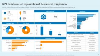
KPI dashboard of organizational headcount comparison
-
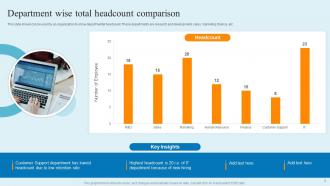
Department wise total headcount comparison
-
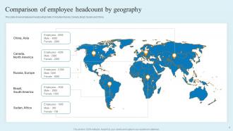
Comparison of employee headcount by geography
-
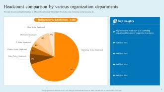
Headcount comparison by various organization departments
-
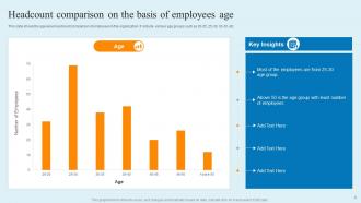
Headcount comparison on the basis of employees age
-
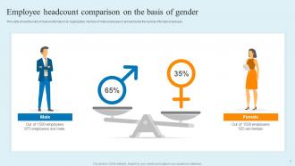
Employee headcount comparison on the basis of gender
-
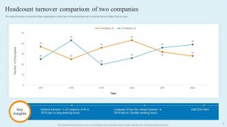
Headcount turnover comparison of two companies
-
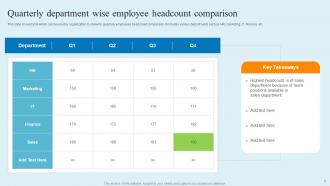
Quarterly department wise employee headcount comparison
-
Icon for comparison of employee headcount in organization
-
HR department employee headcount comparison
-

Headcount Comparison
-

-

-

-

-

FAQs for Headcount Comparison Powerpoint
Look at headcount-to-revenue ratio and cost per employee first. Productivity stuff like output per FTE matters too. Don't sleep on hiring velocity and turnover rates. Span of control is huge though - like how many people each manager has under them. Most companies totally miss this but it shows you everything about how efficient your org actually is. Oh and newer teams will obviously have weird ratios compared to established departments, so factor that in. Start with industry benchmarks, then dig into each department to see what's really going on behind those numbers.
So headcount comparisons basically help you figure out where you're actually overstaffed or missing people. You compare your current team sizes to past quarters, other departments, maybe industry standards - honestly, it's one of those things that seems obvious but most companies skip. Pull your quarterly headcount numbers and match them against performance data. You'll spot patterns pretty fast - like which teams actually drive results versus which ones just... exist. Short version: it gives you real data instead of guessing when someone says "we need more people." Super helpful for avoiding those awkward overhiring mistakes.
Start with your HRIS - it's usually the cleanest data you'll get for current headcount. Pull everything at the same intervals, like month-end snapshots, so you're not comparing random dates. Define what headcount actually means first though (FTE vs total people, contractors or nah, etc). I always cross-check with payroll because people get coded in weird ways sometimes. Honestly, the methodology consistency thing is huge - pick one approach and stick with it across all your time periods. Set up automated reports if you can swing it, saves you from doing this dance every month.
So basically, leadership looks at headcount numbers when they're dividing up budget money. They want to see which teams are actually productive vs just bloated with people. Higher ups love this stuff because the math feels concrete, you know? If your team has too many people compared to what you're bringing in, expect cuts. But if you're lean and crushing your goals? You'll probably get more money for hiring or better tools. Honestly, I'd start by comparing your team's efficiency to similar departments - gives you solid ammo when you're asking for budget increases.
Honestly, the automation is a lifesaver for headcount stuff. Your HRIS can probably pull data automatically and set up dashboards that actually refresh themselves - no more of that copy-paste nightmare we all know too well. Most systems let you create custom rules and spit out reports pretty easily. The best part? You can get alerts right when numbers don't match instead of finding out weeks later during some random audit. Even basic automation beats manual work every time. I'd just start with whatever reporting tools you've already got in your HR system first.
So you're gonna want external data to make sense of your headcount numbers. Your internal stuff only tells half the story, you know? Industry benchmarks show if you're actually staffed right compared to competitors. Super helpful for catching if departments are bloated or stretched too thin. Compensation surveys usually have staffing ratios buried in them - worth digging through even if they're kinda boring. Makes your analysis way more useful for budget talks. It's basically sanity-checking your org chart against what everyone else is doing.
So basically, when you compare headcount across similar companies, you'll spot the weird stuff pretty quick. Like if you've got way more admin people than everyone else - that's obviously a problem. Revenue per employee is another good metric to check. You might find out you're paying for three layers of managers who literally do nothing, or that one department is drowning while another has too many people sitting around. The trick is finding companies that are actually comparable - same size, same industry, that whole thing. Just grab your current numbers and pick 2-3 similar orgs to stack up against.
Tell the story, not just the raw numbers. Context is everything - explain if those headcount changes match your business plan or if it's just seasonal stuff. Charts beat spreadsheets every time because people zone out looking at tables. I learned this the hard way lol. Have your explanations ready for any weird spikes before they even ask. Compare different time periods so they can actually see trends. Be honest about data gaps or if you changed how you count things. The key thing? Connect it back to what they actually care about - revenue per person, productivity, budget impact. That's what gets their attention.
Dude, company size totally screws with headcount comparisons - even in the same industry. Big companies have crazy specialized roles and like 10 layers of management. Small ones? Everyone's doing three jobs at once. The ratios are all over the place, honestly makes no sense sometimes. Don't even bother comparing a 50-person startup to some massive 5,000-person company - you'll get garbage data. Stick to companies that are maybe 2x your size max. That's where you'll actually find useful benchmarks that mean something.
Dude, headcount comparisons are like workplace kryptonite for morale. People immediately think layoffs when they see their team getting measured against others. The whole office goes from chill to paranoid real quick. Be upfront about why you're running these numbers. Context is everything - tell them what it actually means before they start spiraling. Get people involved in the conversation if you can. Honestly, I've seen teams implode just because leadership went radio silent and let everyone's imagination run wild. Don't be that manager. Fill the silence before the rumor mill does, trust me.
So basically, you map your current team size against what you actually need to get done. Compare it to industry benchmarks too. You'll spot the obvious gaps pretty quick - like when engineering is drowning but marketing has people twiddling their thumbs. Pull up your org chart and stack it against next quarter's priorities. Look at both the number of people AND if you have the right skills. Honestly, it's wild how clear things become when you see all the work your team's juggling at once. Don't just count heads though - make sure you're comparing similar roles across departments.
Look, transparency is everything here. Use the same criteria for every department - don't move the goalposts. People freak out when they see headcount spreadsheets (honestly, who wouldn't?), so be upfront about why you're doing this analysis. Each team's got different contexts and workloads, so don't just look at raw numbers. If this might lead to layoffs or changes, loop in HR now. Also communicate with the teams directly - they're actual humans, not budget items. Quick decisions based on spreadsheets alone? That's how you mess things up badly.
I'd go with monthly if you can swing it. Gives you way better insight into what's actually happening before things get weird. Quarterly works too if your company's pretty chill and not changing much. Honestly, I've watched teams burn themselves out doing this weekly - total waste unless you're scaling like crazy. The real trick is just being consistent about it. Monthly also syncs up nicely with your finance stuff which is convenient. Just pick whatever frequency doesn't make your team want to hide, then actually stick to it. And definitely set up that recurring meeting now or it'll never happen.
Dude, trust me on this - charts beat spreadsheets every single time. Bar charts work great for comparing department sizes, and line graphs show hiring trends over months. Heat maps? Perfect for spotting gaps across teams. I swear, I've watched so many execs just zone out when you throw tables of numbers at them. Interactive dashboards let you dig deeper into specific areas. Color-coding makes problem spots pop instantly. Start with whatever you know - even basic Excel charts are way better than raw data. Actually, my old boss used to say data without visuals is just... well, boring numbers nobody remembers.
Yeah headcount alone is super misleading honestly. One senior dev can outproduce like three juniors, but they all show up as the same "1" on your spreadsheet. Doesn't tell you anything about actual output or who's working on what priorities. Plus you've got contractors coming and going, people taking leave, part-timers - the numbers are all over the place. I learned this the hard way at my last job. You really gotta look at performance metrics alongside headcount, otherwise you're basically flying blind on team efficiency.
-
Really like the color and design of the presentation.
-
My search for complete decks ended with SlideTeam. Such a surplus collection of HD PowerPoints. Moreover, their standard and widescreen formats have helped me in delivering bullseye presentations.