

Income statement graphical representation powerpoint slides




Try Before you Buy Download Free Sample Product
 Impress Your
 Audience
 100%
100% Editable
 Save Hours
 of Time


Dwell on the subject to any length. Our Income Statement Graphical Representation Powerpoint Slides will go all the way.
People who downloaded this PowerPoint presentation also viewed the following :
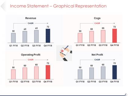
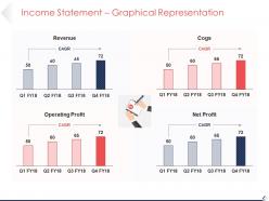
Income statement graphical representation powerpoint slides with all 5 slides:
Our PIncome Statement Graphical Representation Powerpoint Slides are good till the culmination. You will excel all along.


FAQs for Income statement graphical
**INPUT**: What are the key components of an effective income statement chart? **OUTPUT**: Key components include revenue breakdowns, cost of goods sold, operating expenses, EBITDA margins, and net income trends across multiple periods. These visual elements streamline financial analysis by highlighting profit patterns, expense ratios, and performance trajectories, with many organizations finding that well-structured charts enable faster decision-making and enhanced stakeholder communication.
Visual representation enhances income statement understanding by transforming complex numerical data into intuitive charts, graphs, and trend lines that reveal patterns, comparisons, and relationships at a glance. Through interactive dashboards and visual analytics, financial teams streamline reporting processes, identify revenue trends more quickly, and communicate performance insights to stakeholders more effectively, ultimately delivering clearer decision-making capabilities.
Bar charts, waterfall charts, line graphs, pie charts, and combo charts effectively present income statement data. Bar charts excel at comparing revenues across periods, while waterfall charts visualize profit progression from revenue to net income, with financial services and retail organizations finding these approaches streamline stakeholder communications and enhance decision-making processes.
Income statement charts can be customized through selective data highlighting, visual formatting adjustments, comparative timeframes, and stakeholder-specific metrics emphasis. Financial teams might focus on detailed expense breakdowns while executives prefer high-level trend visualizations, with many organizations finding that tailored presentations enhance decision-making speed, improve stakeholder engagement, and ultimately deliver clearer financial transparency across departments.
Common mistakes include using inconsistent formatting, overcrowding charts with excessive detail, misaligning time periods, and neglecting to highlight key metrics like revenue growth or margin trends. These visualization errors can mislead stakeholders and obscure critical financial insights, with many organizations finding that streamlined, consistently formatted charts enhance decision-making, improve investor presentations, and ultimately deliver clearer financial transparency.
Color theory enhances income statement readability through strategic contrast, semantic coding, and visual hierarchy techniques. By using complementary colors for revenue versus expenses, consistent green-red associations for profits and losses, and varying saturation levels to highlight key metrics, financial teams can streamline data interpretation, reduce analysis time, and improve stakeholder comprehension during presentations.
Trends in income statement charts influence strategic business decisions by revealing revenue patterns, cost structures, and profitability trajectories that guide resource allocation, market expansion, and operational adjustments. Through analyzing these financial trends, executives can identify declining profit margins, seasonal fluctuations, and growth opportunities, ultimately enabling data-driven decisions about investments, cost reduction initiatives, and strategic pivots.
**INPUT**: What software or tools are best suited for creating professional income statement charts? **OUTPUT**: Professional income statement chart creation tools include Microsoft Excel, PowerPoint, Tableau, Power BI, and specialized presentation platforms like SlideTeam. These platforms streamline financial visualization by offering pre-built templates, automated data integration, and customizable formatting options, with many finance teams finding that PowerPoint combined with Excel delivers optimal balance between analytical depth and executive-ready presentation quality. [Word count: 58 words]
Narrative elements can be integrated through strategic annotations, trend callouts, contextual explanations, and visual storytelling techniques that highlight key financial milestones and performance drivers. By incorporating commentary boxes, milestone markers, and comparative analysis within the charts, organizations can transform raw financial data into compelling business stories that communicate growth trajectories, operational improvements, and strategic achievements to stakeholders more effectively.
Annotations significantly enhance income statement chart clarity by highlighting key financial trends, explaining unusual variances, providing context for major expense categories, and identifying seasonal patterns or one-time events. Through strategic labeling and callouts, these visual elements help stakeholders quickly understand revenue fluctuations, cost drivers, and profitability changes, ultimately enabling faster decision-making and more effective financial communication across organizations.
Income statement charts enable companies to benchmark against industry standards by visualizing key financial ratios, profit margins, revenue trends, and expense patterns alongside sector averages. Through standardized formatting and comparative analysis, organizations can identify performance gaps, competitive positioning, and operational efficiency opportunities, with many finding that visual benchmarking reveals strategic insights for improving profitability and market competitiveness.
Bar charts excel for income statement presentations by clearly showing comparative values, trends over time, and detailed breakdowns of revenue and expense categories, while pie charts effectively illustrate proportional relationships within total revenue or expenses. Many financial analysts find that bar charts deliver superior clarity for stakeholder presentations and board meetings, ultimately enabling faster decision-making and enhanced financial transparency.
Income statement charts should be updated monthly for internal management purposes and quarterly for external reporting, with many organizations also implementing real-time dashboards for key metrics. This frequency enables timely decision-making, regulatory compliance, and strategic adjustments, while automated financial systems streamline the update process, ultimately delivering accurate performance tracking and enhanced stakeholder transparency.
**INPUT**: What best practices should be followed to ensure income statement charts are compliant with financial reporting standards? **OUTPUT**: Best practices include following GAAP or IFRS guidelines, maintaining consistent formatting across reporting periods, clearly labeling all line items, and ensuring accurate data sourcing and calculations. These standards enable organizations to deliver transparent financial reporting, streamline audit processes, and enhance stakeholder confidence, with many publicly traded companies finding that standardized chart presentation ultimately reduces compliance risks while improving investor relations. [Word count: 59 words]
Income statement charts attract investor interest by visualizing revenue growth trends, profit margin evolution, expense management efficiency, and year-over-year performance comparisons in easily digestible formats. These visual representations enable investors to quickly identify financial trajectories, assess operational effectiveness, and benchmark performance against industry standards, with many investment firms finding that clear chart presentations significantly enhance credibility and facilitate faster decision-making processes.
-
Great product with effective design. Helped a lot in our corporate presentations. Easy to edit and stunning visuals.
-
Out of the box and creative design.